day37-定位(css完结)
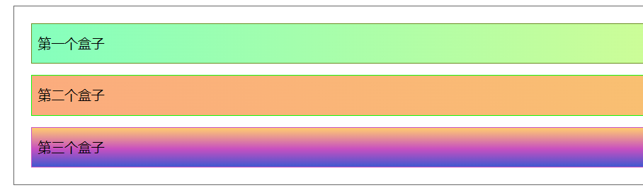
默认形态例子

1 <!DOCTYPE html> 2 <html lang="en"> 3 <head> 4 <meta charset="UTF-8"> 5 <title>Title</title> 6 <style> 7 div{ 8 margin: 10px; 9 padding: 5px; 10 font-size: 12px; 11 line-height: 25px; 12 13 } 14 #father{ 15 border: 1px solid #666; 16 17 } 18 #first{ 19 20 background-image: linear-gradient(90deg, #85FFBD 0%, #FFFB7D 100%); 21 border: 1px solid olivedrab; 22 } 23 #second{ 24 25 background-image: linear-gradient(62deg, #FBAB7E 0%, #F7CE68 100%); 26 border: 1px solid #15f50c; 27 } 28 #third{ 29 30 background-image: linear-gradient(0deg, #4158D0 0%, #C850C0 46%, #FFCC70 100%); 31 border: 1px solid #C850C0; 32 } 33 </style> 34 </head> 35 <body> 36 37 38 <div id="father"> 39 <div id="first">第一个盒子</div> 40 <div id="second">第二个盒子</div> 41 <div id="third">第三个盒子</div> 42 43 </div> 44 45 46 </body> 47 </html>
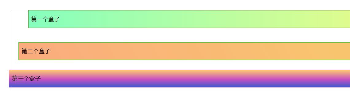
相对定位
使用position:relative,相对于原来的位置,进行指定的偏移
相对定位仍在标准文档流中,原来的位置不会改变
top left bottom right上左下右
 #first{

     background-image: linear-gradient(90deg, #85FFBD 0%, #FFFB7D 100%);
     border: 1px solid olivedrab;
     position: relative;/* 相对定位 :上下左右*/
     top: -20px;
     left: 20px;
 }
 #second{

     background-image: linear-gradient(62deg, #FBAB7E 0%, #F7CE68 100%);
     border: 1px solid #15f50c;
 }
 #third{

     background-image: linear-gradient(0deg, #4158D0 0%, #C850C0 46%, #FFCC70 100%);
     border: 1px solid #C850C0;
     position: relative;/* 相对定位 :上下左右*/
     bottom: -10px;
     right: 20px;
 }
绝对定位
基于xxx的定位
 2.1 没有父级元素定位的前提下,相对于浏览器绝对定位
 2.2 父级元素存在定位,相对父级元素进行偏移(在父级元素范围内移动)
 相对父级或者浏览器位置进行偏移,他不在标准文档流中,原来的位置不会被保留
将父级元素设置成相对定位
#father{ border: 1px solid #666; position: relative; } #second{ background-image: linear-gradient(62deg, #FBAB7E 0%, #F7CE68 100%); border: 1px solid #15f50c; position: absolute; right: 30px; top: 10px; }
子元素绝对定位就是相对于父级元素定位
固定定位
固定定位定死,不会移动
<!DOCTYPE html>
 <html lang="en">
 <head>
     <meta charset="UTF-8">
     <title>Title</title>
     <style>
         body{
             height: 1000px;
         }
         div:nth-of-type(1){/*绝对定位:相对于浏览器*/
             width: 100px;
             height: 100px;
             background: red;
             position: absolute;
             right: 0;
             bottom: 0;
         }
         div:nth-of-type(2){/*fixed 固定定位*/
             width: 50px;
             height: 50px;
             background: yellow;
             position: fixed;
             right: 0;
             bottom: 0;
         }
     </style>
 </head>
 <body>
 <div>div1</div>
 <div>div2</div>
 </body>
 </html>
z-index
图层优先级,默认是0,最高无限
opacity:0.5,背景透明度
<!DOCTYPE html> <html lang="en"> <head> <meta charset="UTF-8"> <title>Title</title> <link rel="stylesheet" href="css/style.css"> </head> <body> <div id="content"> <ul> <li><img src="image/b.png" alt=""></li> <li class="tipsText">学习学习</li> <li class="tipsBg"></li> <li>时间:2099-01-01</li> <li>地点:月球一号基地</li> </ul> </div>
11
 1  #content{
 2      width: 400px;
 3      margin: 0;
 4      padding: 0;
 5      overflow: hidden;
 6      font-size: 12px;
 7      line-height: 25px;
 8      border: 1px solid #000;
 9  }
10  ul,li{
11      margin: 0;
12      padding: 0;
13      list-style: none;
14  }
15  /*父级元素相对定位*/
16  #content ul{
17      position: relative;
18  }
19  .tipsText,.tipsBg{
20      position: absolute;
21      width: 400px;
22      height: 25px;
23      top: 15px;
24  }
25  .tipsText{
26      color: wheat;
27      z-index: 999;
28  /*    层级设定*/
29  }
30  .tipsBg{
31      background: black;
32      opacity: 0.5;
33  /*    背景透明度*/
34  }


【推荐】国内首个AI IDE,深度理解中文开发场景,立即下载体验Trae
【推荐】编程新体验,更懂你的AI,立即体验豆包MarsCode编程助手
【推荐】抖音旗下AI助手豆包,你的智能百科全书,全免费不限次数
【推荐】轻量又高性能的 SSH 工具 IShell:AI 加持,快人一步
· 25岁的心里话
· 闲置电脑爆改个人服务器(超详细) #公网映射 #Vmware虚拟网络编辑器
· 基于 Docker 搭建 FRP 内网穿透开源项目(很简单哒)
· 零经验选手,Compose 一天开发一款小游戏!
· AI Agent开发,如何调用三方的API Function,是通过提示词来发起调用的吗