vue+echarts的各种问题
echarts官网:https://echarts.apache.org/examples/zh/index.html#chart-type-line
1:一个页面存在多个echarts图形,resize失效,图形自适应窗口大小。
当一个页面有两个echarts图形,想要页面大小发生改变,重新绘制图形如果还写为
myChart.setOption(option);
window.onresize = myChart.resize;
则只有一个图形可自适应窗口大小,另外一个则不能随窗口大小而改变图形大小,
解决办法为在每一个echarts图形页面将上面代码改为如下代码:
myChart.setOption(option);
window.addEventListener("resize",function(){
myChart.resize();
});
例如:
//这个设置echart的自适应高度,切记一定要给id的父级设置宽高,不然无法渲染图标的高度。
<div class="chartBorderBox">
	<!-- <div id='yieldChart' style='height:250px'></div> -->//官网是直接设置固定高度
	<div id='yieldChart' class="board-border"></div>
</div>
css:
.chartBorderBox{width:100%;height:100%};//如果图标外部有标题,需要减去标题的高度比如1.5rem的高度:height: calc(100% - 1.5rem)
.board-border { width: 100%; height: 100%; border: 1px solid #0d2451; position: relative; overflow: hidden; // background: #151456; }
 //以上2个盒子的设置即可自适应窗口高度的变化。
js:
OeeChart(dataText, data1, data2, data3) {
				// 温度趋势数据开始------------------------
				let yieldChart = this.$echarts.init(document.getElementById('yieldChart'))
				let option = {
					title: {
						text: '',
						textAlign: 'center',
						textStyle: {
							color: '#80FFFF',
							fontSize: 12
						}
					},
					legend: {
						data: ['OEE', '时间移动', '性能稼动'],
						textStyle: {
							color: "white"
						}
					},
					grid: {
						left: '2%',
						right: '2%',
						top: '20%',
						bottom: '5%',
						containLabel: true
					},
					tooltip: {
						trigger: 'axis' //鼠标悬浮提示
					},
					xAxis: {
						type: 'category',
						data: dataText,
						axisLine: { //这是x轴文字颜色
							lineStyle: {
								color: "#ccc",
							}
						},
						axisLabel: {
							interval: 0,
							rotate: 40,
							show: true,
						},
					},
					yAxis: {
						type: 'value',
						splitLine: {
							show: true,
							lineStyle: {
								type: 'dashed' //分割线为虚线
							}
						},
						axisLabel: {
							formatter: '{value}',
							textStyle: {
								color: '#ccc'
							}
						}
					},
					series: [{
							name: 'OEE',
							data: data1,
							type: 'line',

							itemStyle: {
								normal: {
									color: '#54AAFB',
									lineStyle: {
										color: "#54AAFB" //折线的颜色
									},
								}
							},
							label: {
								show: true
							},

						},
						{
							name: '时间移动',
							data: data2,
							type: 'line',
							symbol: 'emptyCircle',
							symbolSize: 8,
							itemStyle: {
								normal: {
									color: 'green',
									lineStyle: {
										color: "green" //折线的颜色
									},
								}
							},
							label: {
								show: true
							},

						}, {
							name: '性能稼动',
							data: data3,
							type: 'line',
							symbol: 'emptyCircle',
							symbolSize: 8,
							itemStyle: {
								normal: {
									color: 'yellow',
									lineStyle: {
										color: "yellow" //折线的颜色
									},
								}
							},
							label: {
								show: true
							},

						}
					]
				};
				// 绘制图表
				yieldChart.setOption(option);
				// 温度趋势数据结束------------------------

				setTimeout(function() {
					window.onresize = function() {
						yieldChart.resize();
					}
				}, 300)
			}
--------------------2022/3/29更新------------------------------------------------------------------------------------------------------------
以上问题只能改变浏览器窗户的大小改变而自适应,同样现实场景还有可能通过页面某个按钮点击来改变内部窗口大小,这个时候就不完全实用了,所以以下:
首先自定义指令:
在main.js里引用:import './utils/btnDirectives'
btnDirectives.js:
import Vue from 'vue'
import router from '../router/index'

Vue.directive('resize', {
    bind(el, binding) { // el为绑定的元素,binding为绑定给指令的对象
        // console.log(el, "绑定", binding);
        let width = '', height = '';
        function isReize() {
            const style = document.defaultView.getComputedStyle(el);
            if (width !== style.width || height !== style.height) {
                binding.value({ width: style.width, height: style.height });  // 关键(这传入的是函数,所以执行此函数)
            }
            width = style.width;
            height = style.height;
        }
        el.__vueSetInterval__ = setInterval(isReize, 300);
    },
    unbind(el) {
        clearInterval(el.__vueSetInterval__);
    }
})
// 按钮权限自定义指令 =============== 使用方法
// 页面组件上 v-resize= 'monResize'
应用:
<template>
	<div id="top5Chart"  v-resize='monResize'></div>
</template>
methods:{
monResize(){
		let completedRate=localStorage.getItem("completedRate")
		this.progressChart(completedRate)//这个方法就是重新调用一下能够渲染图表的方法,比如也可以直接调用请求后台接口的方法(若渲染图标是在请求接口后直接调用渲染方法progressChart的时候)
},
progressChart(data) {
				let progressChart = this.$echarts.init(document.getElementById('progressChart'))
				let option = {
					series: [{
						type: 'gauge',
						radius: "90%",
						center: ['50%', '50%'],
						axisLine: {
							lineStyle: {
								width: 20,
								color: [
									[0.3, '#67e0e3'],
									[0.7, '#37a2da'],
									[1, '#fd666d']
								]
							}
						},
						pointer: {
							width: 5,
							itemStyle: {
								color: 'auto',
							}
						},
						axisTick: {
							distance: 10,
							length: 8,
							lineStyle: {
								color: '#fff',
								width: 2
							}
						},
						splitLine: {
							distance: -10,
							length: 10,
							lineStyle: {
								color: '#fff',
								width: 4
							}
						},
						axisLabel: {
							color: 'auto',
							distance: 15, //内盘距离
							fontSize: 10
						},
						detail: {
							valueAnimation: true,
							fontSize: 20, //表盘数据
							formatter: '{value} %',
							color: 'auto'
						},
						data: [{
							value: data
						}]
					}]
				};
				// 绘制图表
				option && progressChart.setOption(option);
				progressChart.resize();

			},

}
以上即可实现
--------------------2022/9/9更新------------------------------------------------------------------------------------------------------------
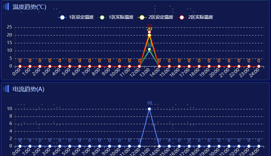
主要是为了解决折线图、柱状图数据大小差距过大,导致图形高低差距太大的问题以及相关展示问题,当使用不均匀刻度后,出现Y轴数据不正确的情况,主要是因为
log轴要求横坐标数据大于0,这是由对数函数性质决定的。所以对于数据中含有0图形会出现上面的异常:
解决思路:将返回的数据0.1全部遍历修改为0.1,然后再echart中将0.1处理为0,同时悬浮的数字也相对应处理:
参考:https://blog.csdn.net/yanxiaomu/article/details/104557851
for(let i=0;i<y_zkData.length;i++){
					if(y_zkData[i]==0){
						y_zkData[i]=0.1
					}
				}
this.getChart3('zkID', y_zkData, x_data)
tooltip: {
						trigger: 'axis',
						formatter:function(params){
								    let html = params[0].name
								    params.forEach((item,index)=>{
								        html+=(`<br/>${item.marker+item.seriesName}: ${item.value===0.1 ? 0 : item.value}`)
								    })
								    return html;
								}
					},
yAxis: [{
						// type: 'value',
						type: 'log', //value是均匀分布的,log是根据数据差别太大设置的
						axisLabel: {
							        formatter: function (value) {
							            return value === 0 ? 0.1 : value;
						            }
								},
						// name: '1区设定温度',

					}],
					dataZoom: { // x轴数据量大的时候放大和缩放
						type: 'inside'
					},


【推荐】国内首个AI IDE,深度理解中文开发场景,立即下载体验Trae
【推荐】编程新体验,更懂你的AI,立即体验豆包MarsCode编程助手
【推荐】抖音旗下AI助手豆包,你的智能百科全书,全免费不限次数
【推荐】轻量又高性能的 SSH 工具 IShell:AI 加持,快人一步
· 震惊!C++程序真的从main开始吗?99%的程序员都答错了
· winform 绘制太阳,地球,月球 运作规律
· 【硬核科普】Trae如何「偷看」你的代码?零基础破解AI编程运行原理
· 上周热点回顾(3.3-3.9)
· 超详细:普通电脑也行Windows部署deepseek R1训练数据并当服务器共享给他人