INFO213 in-class exercise - KNN (课堂练习笔记)
KNN
Let us implement the KNN algorithm using a set of example data about favorite programming languages for data scientists in different cities.
cities = [(-86.75,33.5666666666667,'Python'),(-88.25,30.6833333333333,'Python'),(-112.016666666667,33.4333333333333,'Java'),(-110.933333333333,32.1166666666667,'Java'),(-92.2333333333333,34.7333333333333,'R'),(-121.95,37.7,'R'),(-118.15,33.8166666666667,'Python'),(-118.233333333333,34.05,'Java'),(-122.316666666667,37.8166666666667,'R'),(-117.6,34.05,'Python'),(-116.533333333333,33.8166666666667,'Python'),(-121.5,38.5166666666667,'R'),(-117.166666666667,32.7333333333333,'R'),(-122.383333333333,37.6166666666667,'R'),(-121.933333333333,37.3666666666667,'R'),(-122.016666666667,36.9833333333333,'Python'),(-104.716666666667,38.8166666666667,'Python'),(-104.866666666667,39.75,'Python'),(-72.65,41.7333333333333,'R'),(-75.6,39.6666666666667,'Python'),(-77.0333333333333,38.85,'Python'),(-80.2666666666667,25.8,'Java'),(-81.3833333333333,28.55,'Java'),(-82.5333333333333,27.9666666666667,'Java'),(-84.4333333333333,33.65,'Python'),(-116.216666666667,43.5666666666667,'Python'),(-87.75,41.7833333333333,'Java'),(-86.2833333333333,39.7333333333333,'Java'),(-93.65,41.5333333333333,'Java'),(-97.4166666666667,37.65,'Java'),(-85.7333333333333,38.1833333333333,'Python'),(-90.25,29.9833333333333,'Java'),(-70.3166666666667,43.65,'R'),(-76.6666666666667,39.1833333333333,'R'),(-71.0333333333333,42.3666666666667,'R'),(-72.5333333333333,42.2,'R'),(-83.0166666666667,42.4166666666667,'Python'),(-84.6,42.7833333333333,'Python'),(-93.2166666666667,44.8833333333333,'Python'),(-90.0833333333333,32.3166666666667,'Java'),(-94.5833333333333,39.1166666666667,'Java'),(-90.3833333333333,38.75,'Python'),(-108.533333333333,45.8,'Python'),(-95.9,41.3,'Python'),(-115.166666666667,36.0833333333333,'Java'),(-71.4333333333333,42.9333333333333,'R'),(-74.1666666666667,40.7,'R'),(-106.616666666667,35.05,'Python'),(-78.7333333333333,42.9333333333333,'R'),(-73.9666666666667,40.7833333333333,'R'),(-80.9333333333333,35.2166666666667,'Python'),(-78.7833333333333,35.8666666666667,'Python'),(-100.75,46.7666666666667,'Java'),(-84.5166666666667,39.15,'Java'),(-81.85,41.4,'Java'),(-82.8833333333333,40,'Java'),(-97.6,35.4,'Python'),(-122.666666666667,45.5333333333333,'Python'),(-75.25,39.8833333333333,'Python'),(-80.2166666666667,40.5,'Python'),(-71.4333333333333,41.7333333333333,'R'),(-81.1166666666667,33.95,'R'),(-96.7333333333333,43.5666666666667,'Python'),(-90,35.05,'R'),(-86.6833333333333,36.1166666666667,'R'),(-97.7,30.3,'Python'),(-96.85,32.85,'Java'),(-95.35,29.9666666666667,'Java'),(-98.4666666666667,29.5333333333333,'Java'),(-111.966666666667,40.7666666666667,'Python'),(-73.15,44.4666666666667,'R'),(-77.3333333333333,37.5,'Python'),(-122.3,47.5333333333333,'Python'),(-89.3333333333333,43.1333333333333,'R'),(-104.816666666667,41.15,'Java')]
cities = [([longitude, latitude], language) for longitude, latitude, language in cities]
cities[:3]
[([-86.75, 33.5666666666667], 'Python'),
 ([-88.25, 30.6833333333333], 'Python'),
 ([-112.016666666667, 33.4333333333333], 'Java')]
The following is a helper function for plotting US state borders.
数据集文件预览:
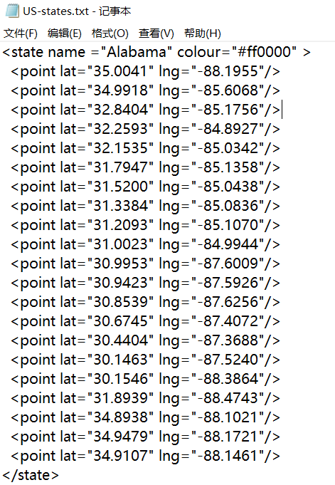
# 导入库
import re
import matplotlib.pyplot as plt
%matplotlib inline

segments = []
points = []

#正则表达式,匹配到的是数据行
lat_long_regex = r"<point lat=\"(.*)\" lng=\"(.*)\""

#逐行读取文件
with open("US-states.txt", "r") as f:
    lines = [line for line in f]

# 遍历每行
for line in lines:
    if line.startswith("</state>"):
        #每条记录的开头
        for p1, p2 in zip(points, points[1:]):
            #p1, p2分别对应每条记录全部数据/第二条及以后所有数据
            segments.append((p1, p2))
        #清空points
        points = []
    #对line进行正则匹配
    s = re.search(lat_long_regex, line)
    if s:
        #匹配到结果
        lat, lon = s.groups()
        #讲lon数据,lat数据加入points中
        points.append((float(lon), float(lat)))

#def plot_state_borders(color='0.8'):
def plot_state_borders(color = 'black'):
    for (lon1, lat1), (lon2, lat2) in segments:
        #x坐标从lng1(对应y坐标lat1)到lng2(对应lat2)绘线
        plt.plot([lon1, lon2], [lat1, lat2], color=color)

plot_state_borders()
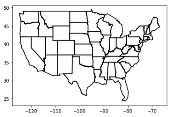
def plot_cities():
    #绘制城市

    # key is language, value is pair (longitudes, latitudes)(经度,纬度)
    plots = { "Java" : ([], []), "Python" : ([], []), "R" : ([], []) }

    # we want each language to have a different marker and color
    #Java:红色圆点,Python:蓝色方块,R:绿色三角
    markers = { "Java" : "o", "Python" : "s", "R" : "^" }
    colors  = { "Java" : "r", "Python" : "b", "R" : "g" }

    for (longitude, latitude), language in cities:
        #遍历cities中的所有数据行,([longitudes, latitudes], language)
        #指定语言的城市经度
        plots[language][0].append(longitude)
        #指定语言的城市纬度
        plots[language][1].append(latitude)

    #图片大小
    plt.figure(figsize = (15, 9))
    # create a scatter series for each language
    for language, (x, y) in plots.items():
        #对每个城市绘制代表相应语言的散点
        plt.scatter(x, y, color=colors[language], marker=markers[language],
                          label=language, zorder=10)

    plot_state_borders()    # assume we have a function that does this

    plt.legend(loc=0)          # let matplotlib choose the location
    plt.axis([-130,-60,20,55]) # set the axes
    plt.title("Favorite Programming Languages") # set title
    plt.show()

plot_cities()
Let’s say we’ve picked a number k like 3 or 5. Then when we want to classify some new data point, we find the k nearest labeled points and let them vote on the new output. To do this, we’ll need a function that counts votes. One possibility is:
from collections import Counter
import math, random

def raw_majority_vote(labels):
    votes = Counter(labels)
    winner, _ = votes.most_common(1)[0]
    #winner = votes.most_common(1)[0]
    #winner是频数最高的元素,_是相应频数
    return winner

labels = [2, 3, 3, 4, 4, 5]
#labels里面出现最多(top1)的数字和频次
#print(raw_majority_vote(labels))
Counter(labels).most_common(1)
#Counter(labels).most_common(2)
[(3, 2)]
What happens if there are several labels having equal majority votes? We need a strategy to break the tie. There are several options:
* Pick one of the winners at random.
* Weight the votes by distance and pick the weighted winner.
* Reduce k until we find a unique winner.
The following implements the third:
def majority_vote(labels):
    """assumes that labels are ordered from nearest to farthest"""
    vote_counts = Counter(labels)
    winner, winner_count = vote_counts.most_common(1)[0]
    #num_winners为出现频数最多的元素有多少个
    num_winners = len([count
                       for count in vote_counts.values()
                       if count == winner_count])

    if num_winners == 1:
        return winner                     # unique winner, so return it
    else:
        return majority_vote(labels[:-1]) # try again without the farthest
#以labels = [2, 3, 3, 4, 4, 5]为例
print(majority_vote(labels))
3
With this, we can create a KNN classifier:
from scipy.spatial import distance
def knn_classify(k, labeled_points, new_point):
    """each labeled point should be a pair (point, label)"""

    # order the labeled points from nearest to farthest
    #以欧式距离进行排序
    by_distance = sorted(labeled_points,
                         key=lambda point_label: distance.euclidean(point_label[0], new_point))

    # find the labels for the k closest
    k_nearest_labels = [label for _, label in by_distance[:k]]

    # and let them vote
    return majority_vote(k_nearest_labels)
To start with, let’s look at what happens if we try to predict each city’s preferred language using its neighbors other than itself:
# try several different values for k
for k in [1, 3, 5, 7]:
    #预测正确的点
    num_correct = 0

    for location, actual_language in cities:

        other_cities = [other_city
                         for other_city in cities
                         if other_city != (location, actual_language)]

        #用knn函数预测
        predicted_language = knn_classify(k, other_cities, location)

        if predicted_language == actual_language:
            num_correct += 1

    print(k, "neighbor[s]:", num_correct, "correct out of", len(cities))
1 neighbor[s]: 40 correct out of 75
3 neighbor[s]: 44 correct out of 75
5 neighbor[s]: 41 correct out of 75
7 neighbor[s]: 35 correct out of 75
Now we can look at what regions would get classified to which languages under each nearest neighbors scheme. We can do that by classifying an entire grid worth of points, and then plotting them as we did the cities:
def classify_and_plot_grid(k=1):
    #以k(若没有传入k,则k=1)进行预测
    plots = { "Java" : ([], []), "Python" : ([], []), "R" : ([], []) }
    markers = { "Java" : "o", "Python" : "s", "R" : "^" }
    colors  = { "Java" : "red", "Python" : "blue", "R" : "green" }

    for longitude in range(-130, -60):
        for latitude in range(20, 55):
            #对于范围内的每个经/纬度
            predicted_language = knn_classify(k, cities, [longitude, latitude])
            plots[predicted_language][0].append(longitude)
            plots[predicted_language][1].append(latitude)

    plt.figure(figsize = (15, 9))
    # create a scatter series for each language
    for language, (x, y) in plots.items():
        #对于每个点(经度/纬度/语言)进行可视化
        plt.scatter(x, y, color=colors[language], marker=markers[language],
                          label=language, zorder=0)

    #用黑色线条画出地图
    plot_state_borders()    # assume we have a function that does this

    plt.legend(loc=0)          # let matplotlib choose the location
    plt.axis([-130,-60,20,55]) # set the axes
    plt.title(str(k) + "-Nearest Neighbor Programming Languages")
    plt.show()

#test k=3
classify_and_plot_grid(3)

The Curse of Dimensionality
k-nearest neighbors runs into trouble in higher dimensions thanks to the “curse of
dimensionality,” which boils down to the fact that high-dimensional spaces are vast.
Points in high-dimensional spaces tend not to be close to one another at all. One way
to see this is by randomly generating pairs of points in the d-dimensional “unit cube”
in a variety of dimensions, and calculating the distances between them.
Let us define a function to compute a list (len = num_pairs) of distances between two points with dimensions dim:
from scipy.spatial import distance
import numpy as np
import random

def random_distances(dim, num_pairs):
#np.random.rand(1, dim)0-1区间内rand出dim个随机坐标的点,并求euclidean距离
return [distance.euclidean(np.random.rand(1, dim), np.random.rand(1, dim))
for _ in range(num_pairs)]
For a range of dimensions between 1 and 101 with stride 5, compute 10000 distances:
dimensions = range(1, 101, 5)
avg_distances = []
min_distances = []

for dim in dimensions:
     distances = random_distances(dim, 10000)  # dis of 10,000 random pairs
     avg_distances.append(np.mean(distances))     # track the average
     min_distances.append(min(distances))      # track the minimum
Plot the ratio between mininum distances and averge distances as the dimension increases:
plt.plot(list(dimensions), list(np.array(min_distances) / np.array(avg_distances)))
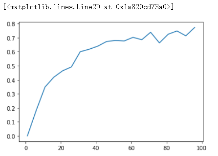
In low-dimensional data sets, the closest points tend to be much closer than average. But two points are close only if they’re close in every dimension, and every extra dimension—even if just noise—is another opportunity for each point to be further away from every other point. When you have a lot of dimensions, it’s likely that the closest points aren’t much closer than average, which means that two points being close doesn’t mean very much (unless there’s a lot of structure in your data that makes it behave as if it were much lower-dimensional).
A different way of thinking about the problem involves the sparsity of higherdimensional spaces.
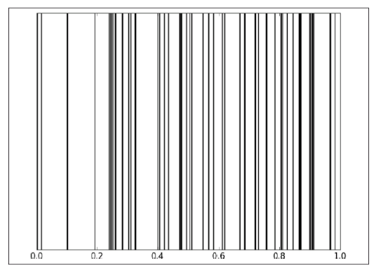
If you pick 50 random numbers between 0 and 1, you’ll probably get a pretty good sample of the unit interval:
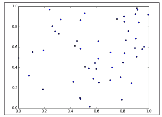
If you pick 50 random points in the unit square, you’ll get less coverage:
And in three dimensions less still:

So if you’re trying to use nearest neighbors in higher dimensions, it’s probably a good idea to do some kind of dimensionality reduction first(降维是很有用的).
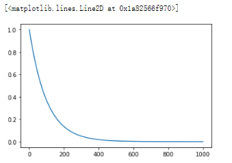
import pandas as pd
import numpy as np
import matplotlib.pyplot as plt

y = []
for n in range(1000):
    y.append(0.99**n)

plt.plot(np.arange(1000), y)
Introduction
The package `sklearn.neighbors` provides functionality for unsupervised and supervised neighbors-based learning methods. Despite its simplicity, nearest neighbors has been successful in a large number of classification and regression problems, including handwritten digits or satellite image scenes. Being a non-parametric and instance-based method, it is often successful in classification situations where the decision boundary is very irregular.
scikit-learn implements two different nearest neighbors classifiers: KNeighborsClassifier implements learning based on the k nearest neighbors of each query point, where k is an integer value specified by the user. RadiusNeighborsClassifier implements learning based on the number of neighbors within a fixed radius r of each training point, where r is a floating-point value specified by the user.
The k-neighbors classification in KNeighborsClassifier is the more commonly used of the two techniques. The optimal choice of the value k is highly data-dependent: in general a larger k suppresses the effects of noise, but makes the classification boundaries less distinct.
The basic nearest neighbors classification uses uniform weights: that is, the value assigned to a query point is computed from a simple majority vote of the nearest neighbors. Under some circumstances, it is better to weight the neighbors such that nearer neighbors contribute more to the fit. This can be accomplished through the weights keyword. The default value, weights = 'uniform', assigns uniform weights to each neighbor. weights = 'distance' assigns weights proportional to the inverse of the distance from the query point. Alternatively, a user-defined function of the distance can be supplied which is used to compute the weights.
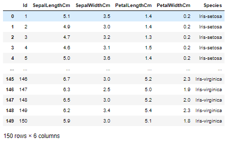
The Iris Flower Data Set
The Iris dataset was used in R.A. Fisher's classic 1936 paper, The Use of Multiple Measurements in Taxonomic Problems, and can also be found on the UCI Machine Learning Repository.
It includes three iris species with 50 samples each as well as some properties about each flower. One flower species is linearly separable from the other two, but the other two are not linearly separable from each other.
The data set consists of 50 samples from each of three species of Iris (Iris setosa, Iris virginica and Iris versicolor). Four features were measured from each sample: the length and the width of the sepals and petals, in centimetres. Based on the combination of these four features, Fisher developed a linear discriminant model to distinguish the species from each other.
The columns in this dataset are:
- Id
- SepalLengthCm
- SepalWidthCm
- PetalLengthCm
- PetalWidthCm
- Species
Load the data
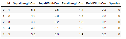
import numpy as np
import pandas as pd
import matplotlib.pyplot as plt
from matplotlib.colors import ListedColormap
from sklearn import neighbors

%matplotlib inline

df = pd.read_csv("Iris.csv")
df
 著名的鸢尾花数据
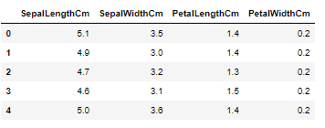
df.sample(5)

df.shape
(150, 6)
species = df.Species.unique()
#分别把三种类型记为0,1,2
label_maps = dict(zip(species, np.arange(len(species))))
label_maps
{'Iris-setosa': 0, 'Iris-versicolor': 1, 'Iris-virginica': 2}
#替换数据集中的种类
df['Species'].replace(label_maps, inplace = True)
df.head()
#df.head(10) 查看前n行的数据,没有参数时默认为5
#训练集,去掉species列
X_train = df.iloc[:, 1:-1]
X_train.head()
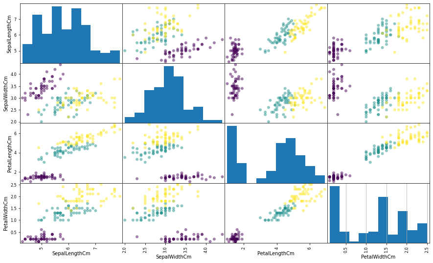
Explore the Data
#训练集的分类标签
y_train = df.Species
#设置图片格式
plt.figure(figsize = (15, 9))
#以训练集数据绘制小倍数图
pd.plotting.scatter_matrix(X_train, figsize = (15, 9), c = y_train, marker = 'o')
plt.grid()
Model and Predict
from sklearn.neighbors import KNeighborsClassifier

#创建sklearn的knn model,k=5,
knn = KNeighborsClassifier(n_neighbors = 5)
#训练
knn.fit(X_train, y_train)
#对model进行评分(准确度)
knn.score(X_train, y_train)
0.9666666666666667
#对训练集数据进行预测
y_pred = knn.predict(X_train)
plt.figure(figsize = (15, 9))
pd.plotting.scatter_matrix(X_train, figsize = (15, 9), c = y_pred, marker = 'o')
plt.grid()

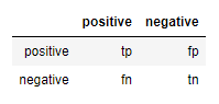
Given a set of labeled data and a predictive model, every data point lies in one of four categories:
- True positive (tp): “This is iris-setosa, we predicted as iris-setosa”
- False positive (fp) (Type 1 Error): “this is not iris-setosa (v or c), we predicted as iris-setosa”
- False negative (fn) (Type 2 Error): “this is iris-setosa, we predicted as not iris-setosa”
- True negative (tn): “this is not iris-setosa, we predicted as not iris-setosa”
We often represent these as counts in a confusion matrix:
df_data = df.set_index('Person')
#对数据进行标准化
df_scaled = (df_data - df_data.mean(axis = 0)) / df_data.std(axis = 0)
df_scaled
df_scaled.mean(axis = 0)
height (cm)       -9.992007e-16
weight (pounds)   -8.881784e-16
height (inches)   -1.332268e-15
dtype: float64
scaled.mean(axis = 0)
array([-1.33226763e-15, -1.11022302e-15, -1.70234197e-15])
scaled.std(axis = 0)
array([1., 1., 1.])
df_data.mean(axis = 0)
height (cm) 169.333333 weight (pounds) 160.333333 height (inches) 66.666667 dtype: float64
scaler.mean_
array([169.33333333, 160.33333333, 66.66666667])
df_data.var(axis = 0)
height (cm) 79.773333 weight (pounds) 110.333333 height (inches) 12.333333 dtype: float64
scaler.var_
array([53.18222222, 73.55555556, 8.22222222])
Use preprocessing.scale():
from sklearn import preprocessing sdf_data = preprocessing.scale(df_data) df_data
sdf_data
array([[-1.27983368, -1.20484922, -1.27872403],
       [ 0.1188417 , -0.0388661 ,  0.11624764],
       [ 1.16099199,  1.24371532,  1.16247639]])