【机器学习】机器学习入门01 - kNN算法
0. 写在前面
*日加入了一个机器学*的学*小组,每周按照学*计划学*一个机器学*的小专题。笔者恰好*来计划深入学*Python,刚刚熟悉了其基本的语法知识(主要是与C系语言的差别),决定以此作为对Python的进一步熟悉和应用。所以,在接下里的八周里,将每周分享一篇机器学*的心得笔记。呐,现在开始吧。
1. 什么是kNN算法
要明确什么是kNN算法,还是要先从什么是机器学*这个更加基本的问题开始谈起。以下摘录一段Wiki百科中的概念解释:
机器学*是人工智能的一个分支。人工智能的研究历史有着一条从以“推理”为重点,到以“知识”为重点,再到以“学*”为重点的自然、清晰的脉络。显然,机器学*是实现人工智能的一个途径,即以机器学*为手段解决人工智能中的问题。机器学*在*30多年已发展为一门多领域交叉学科,涉及概率论、统计学、逼*论、计算复杂性理论等多门学科。机器学*理论主要是设计一些让计算机可以自动“学*”的算法。机器学*算法是一类从数据中进行预测的的算法。因为学*算法中涉及了大量的统计学理论,机器学*与推断统计学联系尤为密切,也被称为统计学*理论。
简而言之,所谓机器学*,就是通过对数据的分析、处理,训练计算机对问题做出判断、决定等行为的过程。
至此,我们再来看kNN算法的含义。
kNN算法的全称是k-NearestNeighbour算法,即k-最邻*算法。它是浩如烟海的机器学*算法中最简单的算法之一。那么首先可以明确的一点,kNN算法是用来让计算机通过已有数据处理新数据的。具体到kNN算法,它用来将输入的对象归类。例如我们接下来要作为例子的——根据病人肿块的大小和发现时间,判断肿瘤为良性或恶性。
那么,为什么说它简单呢?是因为它提供的学*办法非常simple,即:将输入的数据归类为与之最邻*的k个已有数据中出现次数最多的类别。比如,当k=5时,输入了一个数据对象,与其最邻*的5个对象有4个为良性,1个为恶性,则给出判断:输入的对象为良性。
形象地说,就是*朱者赤,*墨者黑。
这就容易看出,kNN算法不需要任何复杂的逻辑,只需要三个关键步骤:对距离的度量;度量结果的比较;对选中对象的种类的统计。完成之后,我们就自然地得到了结果。
明确了含义之后,我们通过上面提到过的肿瘤的例子,来具体看一下实现过程中的一些细节。
2. kNN算法的实现
首先值得一提的是,在实际的应用中,对象之间的“距离”度量可能有很多种方式。严格地说,应该是两个对象的特征量组成的向量之差的某个范数。之所以直接称之为距离,是因为多数情况下,我们选取的特征量往往不超过三个,可以在笛卡尔坐标系中描绘,进而直观地看到其2-范数(也就是其几何距离),并常常以此作为度量。因此在我们的例子中,我们同样采用2-范数进行度量,只是要明确,在需要且合理的情况下,完全可以采用其他范数,如1-范数(对应坐标差的绝对值之和),无穷范数(对应坐标差的绝对值的最大值),这并不影响kNN算法的整体逻辑。
在第1部分中,我们已经提到kNN算法的三个步骤。下面逐个分析用python进行实现的一些流程和细节。
(事实上,sklearn库中有kNN算法的函数,但为了理解算法本身,我们还是从算法的实现开始,而不是机械地套用库函数)
2-0 测试数据的准备和可视化
在真正的步骤之前,我们要先输入一组测试数据,以便我们随时检查所写的代码是否正确。
我们用这样两个数组保存测试数据:
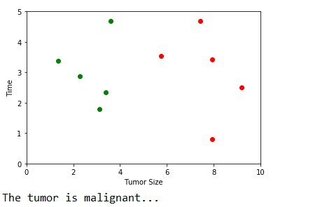
 1 raw_data_x = [[3.393533211, 2.331273381],
 2               [3.110073483, 1.781539638],
 3               [1.343853454, 3.368312451],
 4               [3.582294121, 4.679917921],
 5               [2.280362211, 2.866990212],
 6               [7.423436752, 4.685324231],
 7               [5.745231231, 3.532131321],
 8               [9.172112222, 2.511113104],
 9               [7.927841231, 3.421455345],
10               [7.939831414, 0.791631213]]
11 raw_data_y = [0, 0, 0, 0, 0, 1, 1, 1, 1, 1]
raw_data_x中,存放了10个数对,第一个坐标表示肿块的大小,第二个坐标表示肿块发现的时间。raw_data_y中,存放的是相应肿块是良性(0)或恶性(1)。
为了后续调用numpy库中的函数进行排序等操作,引入numpy库并将其转化为numpy库中的array类型:
1 import numpy as np
2
3 x_train = np.array(raw_data_x)
4 y_train = np.array(raw_data_y)
当然,在做这件事情之前,需要确保已经安装了NumPy库。库的安装方法,这里不再赘述。
此外,尽管暂时并不必须,但为了增强我们对kNN算法的直观理解,我们先利用matplotlib库,对数据集进行可视化。我们先给出代码,再对其中一些细节进行解释。
1 import matplotlib.pyplot as plt
2
3 plt.scatter(x_train[y_train == 0, 0], x_train[y_train == 0, 1], color = 'g')
4 plt.scatter(x_train[y_train == 1, 0], x_train[y_train == 1, 1], color = 'r')
5 plt.xlabel('Tumor Size')
6 plt.ylabel('Time')
7 plt.axis([0, 10, 0, 5])
8 plt.show()
同样,这也需要事先安装好matplotlib库。
这段代码中,调用了5个matplotlib.pyplot中的函数,本着尽可能借此机会了解更多内容的目的,我们依次来看一下。旨在对matplotlib这个强大的库多一些了解。
(注:笔者从matplotlib库的英文原版文档中copy了函数原型和参数说明,本身已经足够详细,因此只做简单必要的解释)
a. matplotlib.pyplot.scatter
这个函数的作用是在坐标图中置入坐标点,前两个参数,即坐标点的横纵坐标是不可缺省的,其他参数均定义了缺省时的默认值。先浏览一下文档:
原型:matplotlib.pyplot.scatter(x, y, s=None, c=None, marker=None, cmap=None, norm=None, vmin=None, vmax=None, alpha=None, linewidths=None, verts=None, edgecolors=None, hold=None, data=None, **kwargs)参数说明:
x, y : array_like, shape (n, )
Input data
s : scalar or array_like, shape (n, ), optional
size in points^2. Default is
rcParams['lines.markersize'] ** 2.c : color, sequence, or sequence of color, optional, default: ‘b’
ccan be a single color format string, or a sequence of color specifications of lengthN, or a sequence ofNnumbers to be mapped to colors using thecmapandnormspecified via kwargs (see below). Note thatcshould not be a single numeric RGB or RGBA sequence because that is indistinguishable from an array of values to be colormapped.ccan be a 2-D array in which the rows are RGB or RGBA, however, including the case of a single row to specify the same color for all points.marker :
MarkerStyle, optional, default: ‘o’See
markersfor more information on the different styles of markers scatter supports.markercan be either an instance of the class or the text shorthand for a particular marker.cmap :
Colormap, optional, default: NoneA
Colormapinstance or registered name.cmapis only used ifcis an array of floats. If None, defaults to rcimage.cmap.norm :
Normalize, optional, default: NoneA
Normalizeinstance is used to scale luminance data to 0, 1.normis only used ifcis an array of floats. IfNone, use the defaultnormalize().vmin, vmax : scalar, optional, default: None
vminandvmaxare used in conjunction withnormto normalize luminance data. If either areNone, the min and max of the color array is used. Note if you pass anorminstance, your settings forvminandvmaxwill be ignored.alpha : scalar, optional, default: None
The alpha blending value, between 0 (transparent) and 1 (opaque)
linewidths : scalar or array_like, optional, default: None
If None, defaults to (lines.linewidth,).
verts : sequence of (x, y), optional
If
markeris None, these vertices will be used to construct the marker. The center of the marker is located at (0,0) in normalized units. The overall marker is rescaled bys.edgecolors : color or sequence of color, optional, default: None
If None, defaults to ‘face’
If ‘face’, the edge color will always be the same as the face color.
If it is ‘none’, the patch boundary will not be drawn.
For non-filled markers, the
edgecolorskwarg is ignored and forced to ‘face’ internally.
首先说明,参数后面的optional表示该参数可缺省,default后的内容是其缺省时的默认值。
而shape(n,)表示该参数是一个长度任意的一维数组。
在上述例子的调用中,对x, y, color这三个参数进行了赋值。color=‘g’表示将数据点的颜色设为绿色(green)。此外,常用的颜色如下:
- b:blue
- g:green
- r:red
- c:cyan
- m:magenta
- y:yellow
- k:black
- w:white
这个函数本身并没有太多值得说明,重点解释一下x和y这两个参数的赋值。
x = x_train[y_train == 0, 0], y = x_train[y_train == 0, 1] ,这种表达方式,对于*惯C系语言的人来说可能比较难以接受(比如笔者本人)。它其实非常简单。我们通过实际操作来研究一下。
我们在逐行模式下载入测试数据后,
输入 y_train == 0 敲回车,得到的输出结果是 [ True True True True True False False False False False]。
输入 x_train[y_train == 0] 敲回车,得到的输出结果是 [[3.39353321 2.33127338] [3.11007348 1.78153964] [1.34385345 3.36831245] [3.58229412 4.67991792] [2.28036221 2.86699021]]
也就是说,array的下标中放一个序列seq,表示将array中对应于seq中的值为True的项的下标取出,组成一个子数组。(有些绕口,不过笔者实在想不到更清楚的表达方法0.0)
而x_train本身是一个二元组的array,因此 x = x_train[y_train == 0, 0] 则表示取上述子数组中各二元组的第一元(index为0)组成最终的一维array,作为待显示点的横坐标数组。
纵坐标同理,不再赘述。
b. matplotlib.pyplot.xlabel
原型:
matplotlib.pyplot.xlabel(s, *args, **kwargs)
这个函数用来设置横轴的标签。不多解释。
c. matplotlib.pyplot.ylabel
与b相同,不述。
d. matplotlib.pyplot.axis
原型:
matplotlib.pyplot.axis(*v, **kwargs)参数说明:
Convenience method to get or set axis properties.
Calling with no arguments:
>>> axis()returns the current axes limits
[xmin, xmax, ymin, ymax].:>>> axis(v)sets the min and max of the x and y axes, with
v = [xmin, xmax, ymin, ymax].:>>> axis('off')turns off the axis lines and labels.:
>>> axis('equal')changes limits of x or y axis so that equal increments of x and y have the same length; a circle is circular.:
>>> axis('scaled')achieves the same result by changing the dimensions of the plot box instead of the axis data limits.:
>>> axis('tight')changes x and y axis limits such that all data is shown. If all data is already shown, it will move it to the center of the figure without modifying (xmax - xmin) or (ymax - ymin). Note this is slightly different than in MATLAB.:
>>> axis('image')is ‘scaled’ with the axis limits equal to the data limits.:
>>> axis('auto')and:
>>> axis('normal')are deprecated. They restore default behavior; axis limits are automatically scaled to make the data fit comfortably within the plot box.
if
len(*v)==0, you can pass in xmin, xmax, ymin, ymax as kwargs selectively to alter just those limits without changing the others.>>> axis('square')changes the limit ranges (xmax-xmin) and (ymax-ymin) of the x and y axes to be the same, and have the same scaling, resulting in a square plot.
The xmin, xmax, ymin, ymax tuple is returned
在本例中,axis方法用来设置了横纵坐标的取值范围。
e. matplotlib.pyplot.show
原型:
matplotlib.pyplot.show(*args, **kw)
说明:
Display a figure. When running in ipython with its pylab mode, display all figures and return to the ipython prompt.
In non-interactive mode, display all figures and block until the figures have been closed; in interactive mode it has no effect unless figures were created prior to a change from non-interactive to interactive mode (not recommended). In that case it displays the figures but does not block.
A single experimental keyword argument, block, may be set to True or False to override the blocking behavior described above.
即显示坐标图。在调用此方法之前,不论做了何种设置,坐标图都不会出现在终端。因此,务必记得调用此方法。
2-1 距离的计算
前面已经提到,我们在本例中将用欧氏距离作为度量。二维平面内,欧氏距离的计算,就是我们熟知的勾股定理。因此,我们需要开平方根的操作。可以从math库中获取。用下面的代码求十组数据与输入点的欧氏距离:
1 from math import sqrt
2 distances = []
3 for x in x_train:
4     d = sqrt((x[0] - x_input) ** 2 + (x[1] - y_input) ** 2)
5     distances.append(d)
当然,在此之前,需要先对x_input和y_input赋值,可以先在程序里直接指定,也可以用input()函数与用户交互。
上面这段代码非常平凡,不作太多多余的解释。
笔者使用了这样一组测试输入:
x_input = 8.90933607318
y_input = 3.365731514
得到的数组distances为:
[5.611968000921151, 6.011747706769277, 7.565483059418645, 5.486753308891268, 6.647709180746875, 1.9872648870854204, 3.168477291709152, 0.8941051007010301, 0.9830754144862234, 2.7506238644678445]
2-2 度量结果的比较
按照kNN算法的思想,下一步应该选出距离最小的k个对象。本例中我们暂时令k=6。
如果是通常的数组排序,我们只要在数组内部调整元素顺序使其递增或递减即可,在Python中,只需调用sort()方法。
我们当然可以将大小、时间、与输入点的距离等属性封装进一个类,创建十个对象来表示这十个测试数据点,在该类对象的数组中对距离这个属性进行排序。但是,现在的情况是,我们的大小、时间数据,与距离数据分别存在于两个数组,靠下标的对应关系联系在一起。因此,我们自然不能单单对数组distances进行排序。那显然会打破这种对应关系。
很容易想到的一种解决方案是,对数组distances进行排序,每次交换元素时,将x_train中的元素同步交换。然而,在Python中提供了排序的函数,不需要我们了解其中细节,因此,使用这些函数意味着我们不可能知道元素在何时发生交换,也就无法调整数组x_train。要想实现这种方案,必须手动重新实现排序算法。冒泡、选择、插入等简单的排序算法容易实现,但O(N2)的时间复杂度在大规模的数据下变得不可接受。归并、快排等O(NlogN)的算法又过于冗长,显然不是Python程序的风格。因此,我们最好能找到一个更好的方法。
事实上,在NumPy库中提供了一个函数:numpy.argsort(arr)
这个函数会返回一个array。假如我们有下面的调用:
nearest = np.argsort(distances)
则nearest[i]表示第i小(从0开始)的元素在distances数组中的下标。
如,上述测试数据下,得到的nearest数组为: [7 8 5 9 6 3 0 1 4 2] nearest[0]=7, 表示最小元素的下标为7.
这样,我们就很容易获取距离最小的k(=6)个的元素的下标了。
1 k = 6
2 topK_y = [y_train[i] for i in nearest[0:k]]
则topK_y中存储了最*的6个数据点的y值,即良性或恶性。结果为 [1, 1, 1, 1, 1, 0]
2-3 对k最邻*对象的y的统计
最后一步,我们只需统计topK_y数组中0和1的个数,选出多的一个,作为对输入对象的估计。
我们当然可以通过遍历topK_y并使用相应计数器变量进行统计。但在Python的collections库中提供了这样的功能。我们只需书写以下代码:
1 from collections import Counter
2
3 votes = Counter(topK_y)
4 predict_y = votes.most_common(1)[0][0]
第三行得到的votes是一个Counter类的对象,可以认为是一个字典类型。如果 print(votes) , 会输出 Counter({1: 5, 0: 1}) 。
第四行调用的Counter.most_common(n)方法,用途是找出Counter对象中统计数最多的n个元素,返回一个二元组的列表,频次递减,每一个二元组的第一个数据是元素的值,第二个数据是频次。
因此, votes.most_common(1)[0][0] 即是频次最高的元素的值,在本例中是1.
这样,我们的kNN算法就完成了。变量predict_y的值,即是我们的机器经过学*,对输入数据的结果的预测。
2-4 完整代码及运行结果
 1 # prepare the data for machine to learn
 2 import numpy as np
 3 import matplotlib.pyplot as plt
 4
 5 raw_data_x = [[3.393533211, 2.331273381],
 6               [3.110073483, 1.781539638],
 7               [1.343853454, 3.368312451],
 8               [3.582294121, 4.679917921],
 9               [2.280362211, 2.866990212],
10               [7.423436752, 4.685324231],
11               [5.745231231, 3.532131321],
12               [9.172112222, 2.511113104],
13               [7.927841231, 3.421455345],
14               [7.939831414, 0.791631213]]
15 raw_data_y = [0, 0, 0, 0, 0, 1, 1, 1, 1, 1]
16
17 x_train = np.array(raw_data_x)
18 y_train = np.array(raw_data_y)
19
20 # show the data point in coordinate system
21 plt.scatter(x_train[y_train == 0, 0], x_train[y_train == 0, 1], c = 'g')
22 plt.scatter(x_train[y_train == 1, 0], x_train[y_train == 1, 1], c = 'r')
23 plt.xlabel('Tumor Size')
24 plt.ylabel('Time')
25 plt.axis([0, 10, 0, 5])
26 plt.show()
27
28 # input the data point to judge
29 x_input = 8.90933607318
30 y_input = 3.365731514
31
32 # calculate the distance between input point and the 10 base point
33 from math import sqrt
34 distances = []
35 for x in x_train:
36     d = sqrt((x[0] - x_input) ** 2 + (x[1] - y_input) ** 2)
37     distances.append(d)
38
39 # find the k nearest points
40 k = 6
41 nearest = np.argsort(distances)
42 topK_y = [y_train[i] for i in nearest[0:k]]
43
44 # count the times for 0 and 1
45 from collections import Counter
46 votes = Counter(topK_y)
47 predict_y = votes.most_common(1)[0][0]
48
49 # output the result
50 if predict_y == 0:
51     print("The tumor is benign!")
52 else:
53     print("The tumor is malignant...")
3. kNN算法的封装
在第二部分中,我们已经实现了kNN算法的流程,但这样的代码显然无法复用,因而没有太多价值。我们需要对其进行一些封装,使其可以随时被灵活调用。
However,这并不是kNN算法本身的内容,牵扯到工程实践中的相关事项,限于篇幅和笔者的精力,不在此文中继续介绍。这篇文章也就到这里停笔。
下周继续~