
Android 基础:常用布局 介绍 & 使用(附 属性查询)
Android 基础:常用布局 介绍 & 使用(附 属性查询)
前言
- 在
Android开发中,绘制UI时常需各种布局 - 今天,我将全面介绍
Android开发中最常用的五大布局
含
Android Studio 2.2中新增的布局:约束布局(ConstraintLayout)介绍
目录

1. 布局类型
在Android中,共有2类、6种布局方式,分别是:
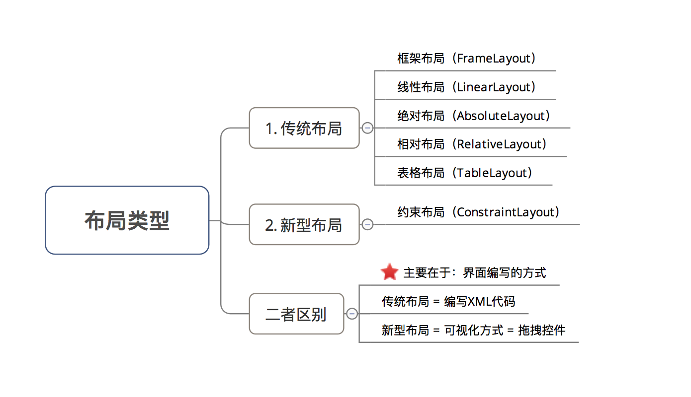
2. 布局介绍
- 具体介绍
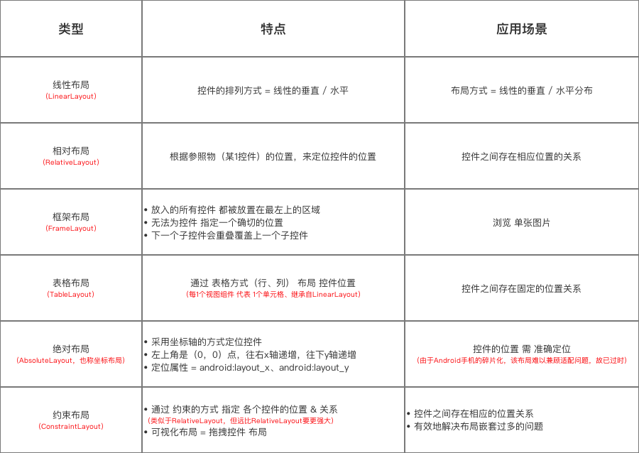
-
本文主要介绍传统的5大布局,关于约束布局
(ConstraintLayout)具体点击查看文章
3. 布局属性
Android的布局属性通过XML配置- 下面,主要讲解布局公有属性 & 特有属性
3.1 公有属性
即 5种布局都具备下述属性
layout_width、layout_heightlayout_margin+方位padding+方位layout_gravitygravity
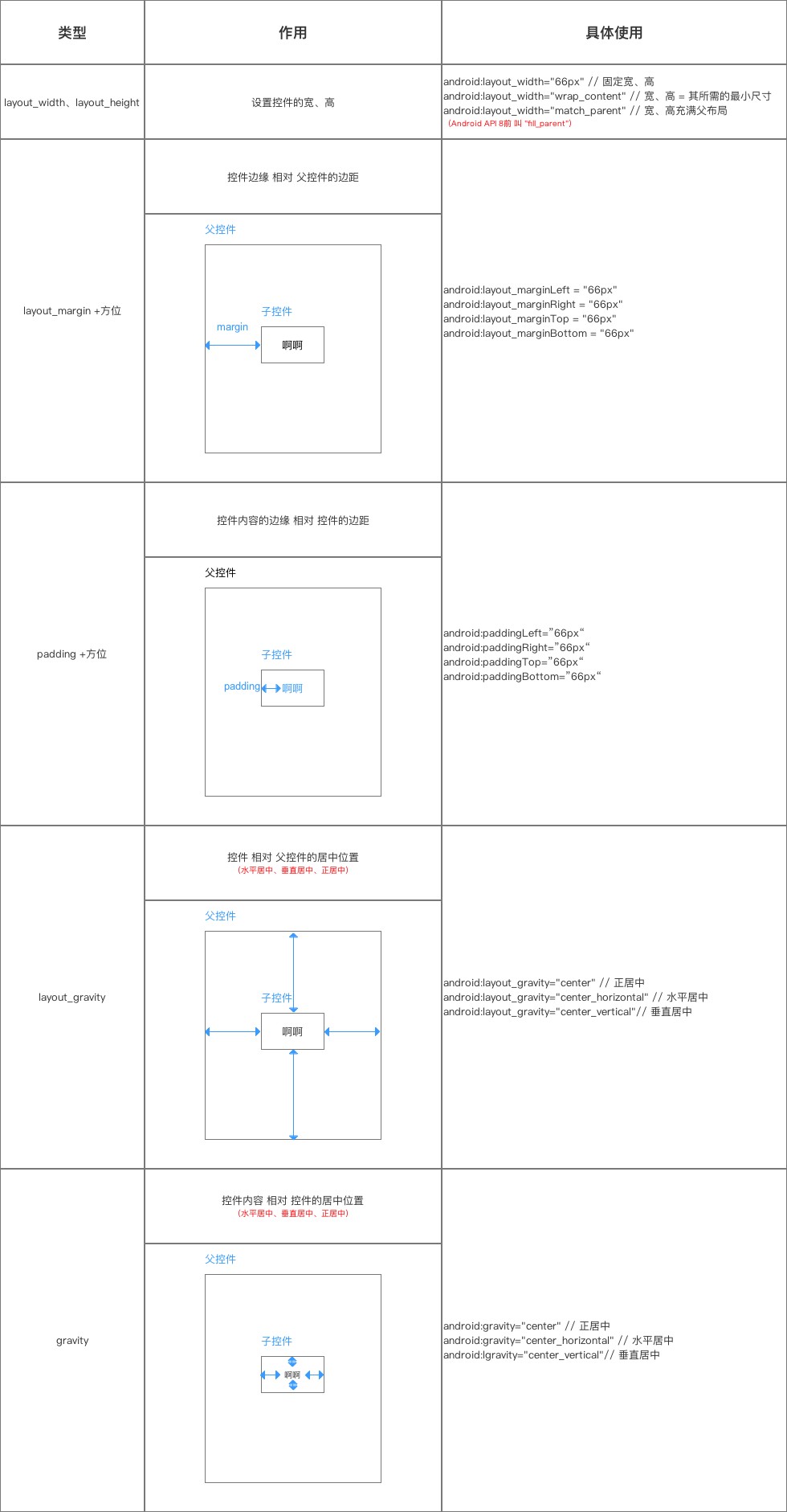
-
3.2 特有属性
- 具体介绍如下

-
3.3 特别注意
- 5个布局元素可相互嵌套使用,从而实现各种不同的效果
- 关于 线性布局(LinearLayout)的权重属性layout_weight请看文章
4. 选择器(Selector)
4.1 作用
通过设置选择器(
selector)可使控件 在不同操作下(默认、点击等) 显示不同样式通过
xml编写 =selector.xml4.2 属性
XML属性 说明 android:drawable 放一个drawable资源 android:state_pressed 按下状态,如一个按钮触摸或者点击。 android:state_focused 取得焦点状态,比如用户选择了一个文本框。 android:state_hovered 光标悬停状态,通常与focused state相同,它是4.0的新特性 android:state_selected 选中状态 android:state_enabled 能够接受触摸或者点击事件 android:state_checked 被checked了,如:一个RadioButton可以被check了。 android:state_enabled 能够接受触摸或者点击事件 注:上述所有属性的取值 =
boolean属性 =true、false4.3 实例说明
在
drawable添加selector.xml资源文件button_selector.xml:
<?xml version="1.0" encoding="UTF-8"?>
< selector xmlns:android="http://schemas.android.com/apk/res/android">

 < !-- 指定按钮按下时的图片 -->
 <item android:state_pressed="true"
       android:drawable="@drawable/start_down"
 />

 < !-- 指定按钮松开时的图片 -->
 <item android:state_pressed="false"
       android:drawable="@drawable/start"
 />

< /selector>
在布局文件main.xml中控件的属性设置:
<Button
  android:id="@+id/startButton"
  android:layout_width="wrap_content"
  android:layout_height="wrap_content"
  android:background="@drawable/button_selector"
/>
5. 布局形状(Shape)
- 作用:设置布局的颜色、边框线
- 使用:通过
xml编写 =shape.xml - 具体使用
<shape xmlns:android="http://schemas.android.com/apk/res/android">

//默认颜色
<solid android:color="#876543"/>
//哪个方向有边框线
  <padding
        android:bottom="0dp"
        android:left="1dp"
        android:right="1dp"
        android:top="1dp" />
     //边框线颜色、大小
    <stroke
        android:width="1dp"
        android:color="#000000" />
在布局文件main.xml中控件的属性设置:
<Button
  android:id="@+id/startButton"
  android:layout_width="wrap_content"
  android:layout_height="wrap_content"
  android:background="@drawable/layout_shape"
/>
6. 总结
- 本文全面介绍了
Android常用布局
