CSS变形
css3 变形/变换
相关属性
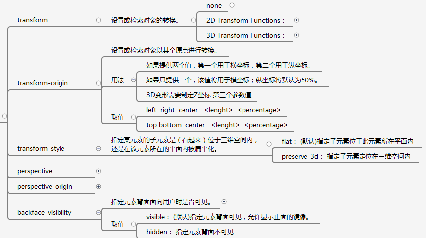
- transform
- transform-origin
- transform-style:flat/preserve-3d
- perspective: 长度单位
- perspective-origin观察者的位置
- backface-visibialbe:visible/hidden
![]()
变形方法 transform-function
- 2d
- translate() 位移(像素/百分号)
- translatex()
- translatey()
- scale() 缩放(倍数)
- scalex()
- scaley()
- rotate() 旋转(角度deg)
- skew() 扭曲(角度)x扭曲y变x不变
- skewx()
- skewy()
- 3d
- translatez()
- translate3d()
- scalez()
- scale3d()
- rotatex()
- rotatey()
- rotatez()
css过渡
相关属性
-
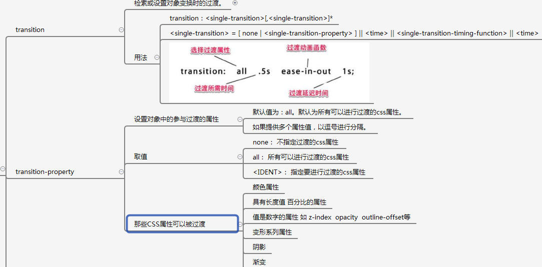
transition
-
transition-property过渡属性
-
none
-
all所有可以进行过渡的CSS属性
![]()
-
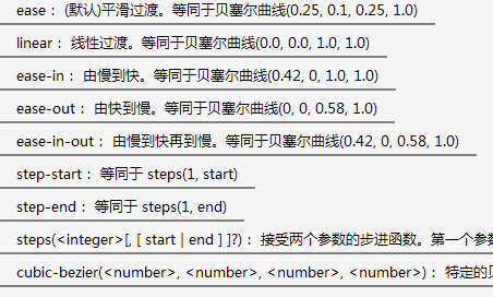
transition-timing-function 过渡方式
-
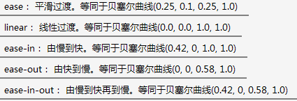
linear: 线性过渡
-
ease: 平滑过渡。
-
ease-in: 由慢到快。
-
ease-out: 由快到慢
-
ease-in-out: 由慢到快再到慢
![]()

- transition-duriation过渡时间
- transition-delay延迟
触发时机
- 伪类选择器
- JS
- 媒体查询
CSS3动画
相关属性
-
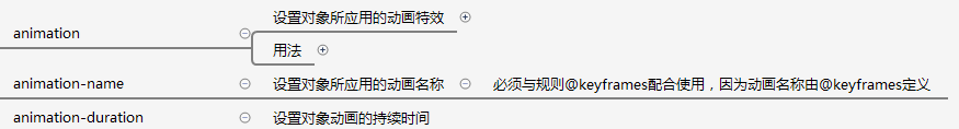
animation
-
animation-name动画名称
-
animation-iteration-count循环次数infinite无限循环
-
animation-duration动画持续时间
![]()
-
animation-timing-function动画的过渡类型
-
linear: 线性过渡
-
ease: 平滑过渡。
-
ease-in: 由慢到快。
-
ease-out: 由快到慢
-
ease-in-out: 由慢到快再到慢。
![]()
-
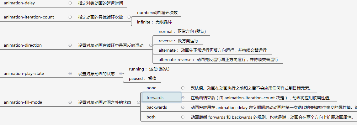
animation-delay动画延迟时间
-
animation-dirction动画方向
-
normal: 正常方向
-
reverse: 反方向运行
-
alternate: 动画先正常运行再反方向运行,并持续交替运行
-
alternate-reverse: 动画先反运行再正方向运行,并持续交替运行
-
animation-play-state:running运动/pasused暂停
-
animation-fill-mode:动画时间之外的状态
-
none: 默认值。不设置对象动画之外的状态
-
forwards: 设置对象状态为动画结束时的状态
-
backwards: 设置对象状态为动画开始时的状态
-
both: 设置对象状态为动画结束或开始的状态
![]()
关键帧
@keyframes 动画名称{
      form{
      }
	  to{
	  }
}

 浙公网安备 33010602011771号