项目十遇到的知识点
一、Dialog 对话框
1、取消点击Dialog 对话框黑色背景关闭弹窗
- close-on-click-modal 是否可以通过点击 modal 关闭 Dialog
:show-close="true"
:close-on-click-modal="false"
2、Dialog组件弹框
知识点
- 改变Dialog样式--->custom-class
index.vue
<div class="home>
<div @click="onOpen">这里是首页信息
<add-dialog
:visible.sync="showDialog"
@success="InitLoad"
>
子组件
<el-dialog
title="门店信息"
:visible.sync="visible"
@close="onClose(false)"
@open="changeDetail"
custom-class="AddDialog"
>
二、上传附件

- 即可上传图片又可上传world等文件
html
上传附件:
<span
class="de-box fr"
@click="handleDetele(index)"
>
<span
v-if="item.name"
@click="jumpUrl(item)"
style="display: inline-block;color: #1b4c80;"
class="f12 fl add-name"
>{{item.name}}
<img
v-else
@click="jumpUrl(item)"
class="add-img-item"
:src="item.url"
style="width:45px;height:45px;"
>
js
fileList = []; // 附件列表
// 删除
handleDetele(index) {
this.fileList.splice(index, 1);
}
// 下载
jumpUrl(item) {
window.open(item.url, "_blank");
}
selectFile(event) {
const files = event.target.files;
const fileLength = files.length;
const reader = new FileReader();
for (let i = 0; i < fileLength; i++) {
const addImg = {
url: "",
fileData: {},
name: ""
};
// 判断是否是图片
if (
files[i].type === "image/gif" ||
files[i].type === "image/jpeg" ||
files[i].type === "image/jpg" ||
files[i].type === "image/png" ||
files[i].type === "image/svg"
) {
addImg.url = URL.createObjectURL(files[i]);
addImg.fileData = files[i];
} else {
addImg.name = files[i].name;
addImg.url = URL.createObjectURL(files[i]);
addImg.fileData = files[i];
}
this.fileList.push(addImg);
}
}
less
.add-img {
display: inline-block;
vertical-align: top;
.add-img-box {
display: inline-block;
vertical-align: top;
.box-item {
vertical-align: top;
position: relative;
margin-bottom: 5px;
.add-name {
width: auto;
color: #1b4c80;
cursor: pointer;
}
.add-img-item {
object-fit: cover;
object-position: center;
cursor: pointer;
width: 45px;
height: 45px;
}
.de-box {
cursor: pointer;
width: 10px;
height: 11px;
background: url("../assets/image/close.png") no-repeat top 0 right 0;
background-size: 100% 100%;
}
}
}
}
三、DatePicker 日期选择器
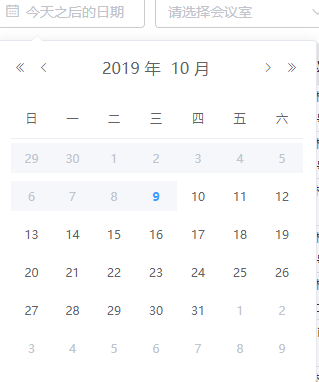
1、只能选取明天开始的时间
// 选今天之后的日期(从明天开始)
pickerOptions = {
disabledDate(time) {
return time.getTime() < Date.now() - 8.64e6;
}
};
value1 = "";
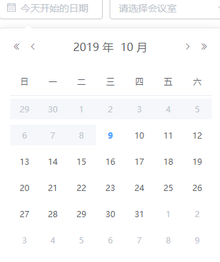
2、只能选取今天开始的时间
// 选今天开始的日期
pickerOptions = {
disabledDate(time) {
return time.getTime() < Date.now() - 8.64e7;
}
};
value1 = "";
四、flex.css:移动端flex布局
1、npm
npm install flex.css --save
2、use
3、flex属性大全
dir
dir:主轴方向
top:从上到下
right:从右到左
bottom:从下到上
left:从左到右(默认)
main
main:主轴对齐方式
right:从右到左
left:从左到右(默认)
justify:两端对齐
center:居中对齐
cross
cross:交叉轴对齐方式
top:从上到下(默认)
bottom:从上到下
baseline:基线对齐
center:居中对齐
stretch:高度并排铺满
box
box:子元素设置
mean:子元素平分空间
first:第一个子元素不要多余空间,其他子元素平分多余空间
last:最后一个子元素不要多余空间,其他子元素平分多余空间
justify:两端第一个元素不要多余空间,其他子元素平分多余空间
4、flex-box属性说明
- 取值范围(0-10),单独设置子元素多余空间的如何分配,设置为0,则子元素不占用多余的多余空间
多余空间分配 = 当前flex-box值/子元素的flex-box值相加之和
其他知识
千分位金额的正则表达式
NumberRenderer(params) {
if (params === null || params === undefined) {
return null;
} else if (isNaN(params)) {
return "NaN";
} else {
let num = params.toString(); // 将输入的数字转换为字符串
if (/^-?\d+.?\d+$/.test(num)) {
// 判断输入内容是否为整数或小数
if (/^-?\d+$/.test(num)) {
// 判断输入内容是否为整数
num = num.replace(/(\d)(?=(\d{3})+(?!\d))/g, "$1,"); // 对其进行分割
} else {
const num_array = num.split("."); // 如果是小数就根据"."拆分成两个数组,整数部分和小数部分,对整数部分进行千分位处理,再合并小数部分
const num_before = num_array[0].replace(
/(\d)(?=(\d{3})+(?!\d))/g,
"$1,"
);
num = num_before + "." + num_array[1];
}
}
return num;
}
}
- console.log(this.NumberRenderer(185962.5632241)) // 185,962.5632241
改变elementUI表格的文字大小
ts
export default class Page extends Vue {
styleObj = {
"font-size": "14px"
};
}
- 头部字体14px.表格内容字体12px
- header-cell-style 表头单元格的style的回调方法,也可以使用一个固定的Object为所有表头单元格设置一样的Style
element table 的index显示
-
PageIndex 当前页
-
PageSize 每页的数量
{{scope.$index+(PageIndex - 1) * PageSize + 1}}
html禁止缓存
Cache-Control
-
客户端可以在HTTP请求中使用的标准 Cache-Control 指令
Cache-Control: max-age=
Cache-Control: max-stale[=]
Cache-Control: min-fresh=
Cache-control: no-cache
Cache-control: no-store
Cache-control: no-transform
Cache-control: only-if-cached -
no-cache
-
在发布缓存副本之前,强制要求缓存把请求提交给原始服务器进行验证。

 浙公网安备 33010602011771号