css flex布局
学习地址
http://www.ruanyifeng.com/blog/2015/07/flex-examples.html

https://github.com/ccforward/cc/issues/57
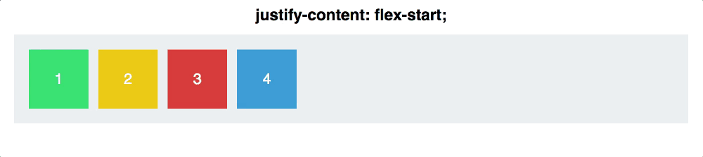
# 左右横向水平X轴 justify-content
- flex-start
- center
- flex-end
- space-around
- space-between
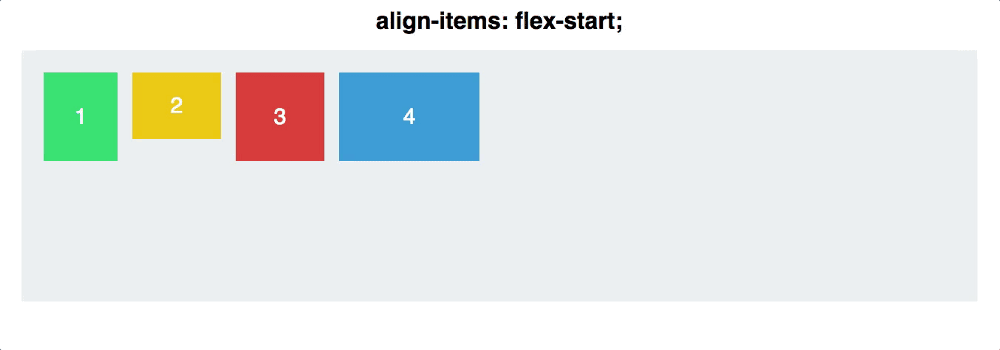
# 上下垂直竖向Y轴 : align-items
- flex-start
- flex-end
- center
- stretch
- baseline
flex-direction 排列的方向 :row(默认):从左到右
column(常用):从上到下 #注意开启此属性时,justify-content 和align-items 的身份会互换
align-self #允许在大局样式的基础上,对单一元素进行y轴更替,并且目前为止也仅仅知道可以换y轴而已
flex-wrap: wrap; #当宽度不够时换行 (ps:默认哪怕变形会挤在一起)
flex : n ; #对flex布局下的元素进行分配大小,比如(注意,使用了这个之后,元素的width属性就会无效)
.demo:nth-child(1){flex:1;}   #占了1/3
.demo:nth-child(2){flex:2}   #占了2/3
也可以只设定某个元素,让其他元素自动补全(推荐使用这种写法)
(注意,flex-direction: column;模式下好像百分比没有效果,需要使用px之类代替)
.item:nth-child(1){flex:0 0 20%;}  #占了20%
.item:nth-child(2){flex:0 0 20%;}  #占了20%
.item:nth-child(3){flex: auto;}    #将剩余的宽度补全,也可以写成真实数据
嵌套flex : 容器中的元素不受外部flex干扰,仅遵循父flex容器属性
demo大全:

https://github.com/dragon8github/flex

 浙公网安备 33010602011771号