web 点九切图 九宫格切图 border-image 的几个示例
说明:
原理是利用 border-image 对图片的切割四刀(上右下左),形成九宫格。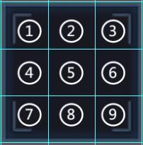
做这种功能的技巧,首先需要找出特殊的、不变的部位,然后再找出重复的部位。
不变的地方通常是头尾(要么是左右,要么是上下),重复的地方必定是中间内容区域(fill)。
所以,绝大部分时候是不需要切四刀的。只需要切两刀,要么切上下,要么切左右。
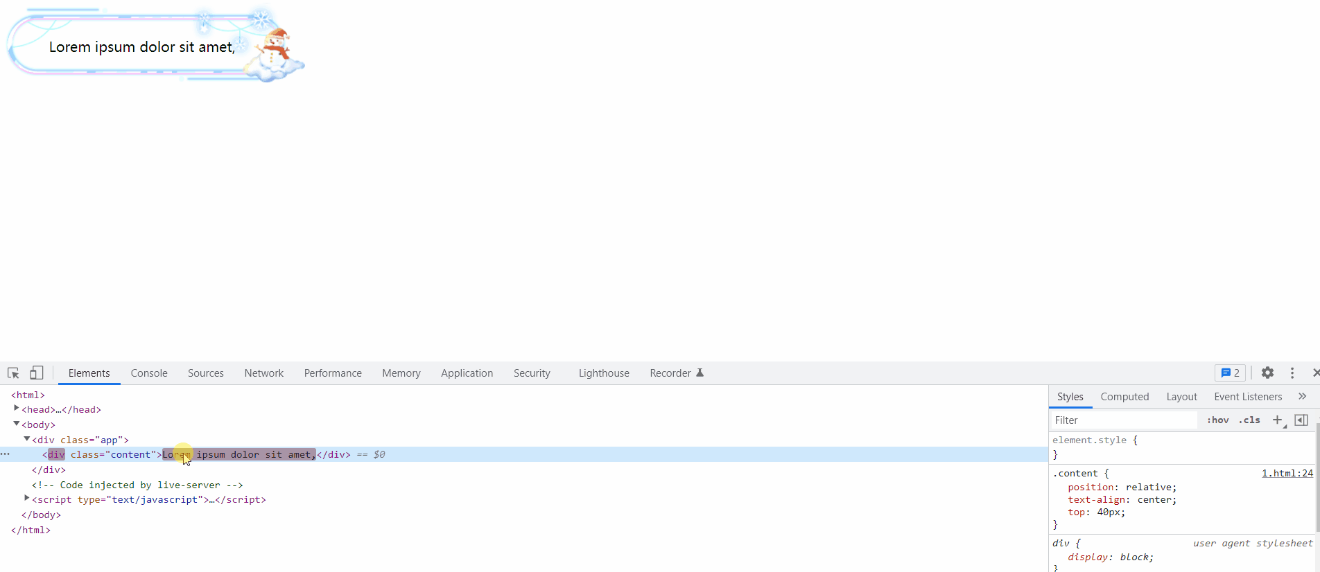
示例1:上下头尾切割
譬如一般的弹窗图片:
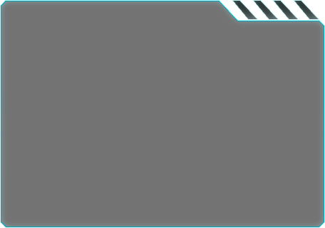
我只需要切出头尾即可:
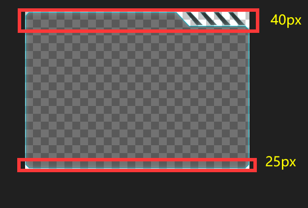
代码如下,可以通过打开 p 的注释查看效果。
<style>
    .app {
        width: 456px;
        min-height: 320px;
        box-sizing: border-box;

        border-image-source: url('https://lee-1255983702.cos.ap-guangzhou.myqcloud.com/1649347819653bcard.png');

        /* 只切上下两个区域 */
        border-image-slice: 40 0 25 0 fill;
        border-image-width: 40px 0 25px 0px;
        border-image-repeat: stretch;
    }
</style>

<body>
    <div class="app">
        <!-- <p>1</p><p>1</p><p>1</p><p>1</p><p>1</p><p>1</p><p>1</p><p>1</p><p>1</p><p>1</p><p>1</p><p>1</p><p>1</p><p>1</p><p>1</p><p>1</p><p>1</p><p>1</p><p>1</p><p>1</p><p>1</p><p>1</p> -->
    </div>
</body>
示例 2:左右头尾切割 + 动态宽度
当然也支持宽度动态拉伸。切割图片的位置就变成「左右」了。
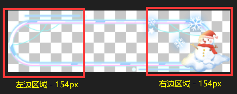
演示效果如图所示:
代码如下,宽度采用 max-content 能更好的搭配动态宽度。
<style>
    .app {
        width: max-content; /* fit-content */
        min-width: 331px;
        height: 92px;
        padding: 0 80px 0 50px;
        box-sizing: border-box;

        border-image-source: url('https://lee-1255983702.cos.ap-guangzhou.myqcloud.com/16493477783361.png');
        border-image-slice: 0 154 0 154 fill;
        border-image-width: 0 154px 0 154px;
        border-image-repeat: repeat;
    }

    .content {
        /* 为了使用 max-content/fix-content 内容区域最好不要使用绝对定位失去块特征、失去宽度 */
        position: relative;
        text-align: center;
        top: 40px;
    }
</style>

<body>
    <div class="app">
        <div class="content">Lorem ipsum dolor sit amet</div>
    </div>
</body>
示例3:上右下左全部切割
<style>
    .card {
        min-width: 466px;
        min-height: 349px;
        position: relative;
        box-sizing: border-box;


        /* 同时切上右下左四个区域 */
        border-image-source: url('https://lee-1255983702.cos.ap-guangzhou.myqcloud.com/1652062319356弹框.png');
        border-image-slice: 33 80 70 80 fill;
        border-image-width: 33px 80px 70px 80px;
        border-image-repeat: stretch;
    }

    .card__title { color: #fff; font-size: 18px; font-weight: bold; position: absolute; left: 62px; top: 2px; letter-spacing: 1px; }
    .card__body { padding: 48px 60px; color: #fff; font-size: 16px; }
</style>

<body>
    <div class="card">
        <div class="card__title">新增社保人员分析</div>
        <div class="card__body">
            Hello World
        </div>
    </div>
</body>
示例 4:基础案例
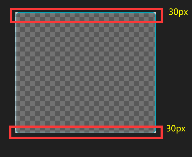
代码示例:
<style>
    .app {
        width: 456px;
        min-height: 393px;
        box-sizing: border-box;

        border-image-source: url('https://lee-1255983702.cos.ap-guangzhou.myqcloud.com/1649347861622rcard.png');

        /* 只切上下两个区域 */
        border-image-slice: 30 0 30 0 fill;
        border-image-width: 30px 0 30px 0;
        border-image-repeat: stretch;
    }
</style>

<body>
    <div class="app">
    </div>
</body>
参考资料:
- https://www.zhangxinxu.com/wordpress/2010/01/css3-border-image/
- https://blog.csdn.net/huhaha24/article/details/81059484
- https://zhuanlan.zhihu.com/p/29472601
- https://www.jianshu.com/p/fee55621cd3b

 浙公网安备 33010602011771号