Python第十五章 pyecharts
第十五章 pyecharts
15.1 pyecharts概述
15.1.1 什么是pyecharts
Echarts 是个由百度开源的数据可视化,凭借着良好的交互性,精巧的图表设计,得到了众多开发者的认可. 而 Python 是门富有表达力的语言,很适合用于数据处理. 当数据分析遇上数据可视化时pyecharts 诞生了.
pyecharts相关网址
- pyecharts中文官方文档https://05x-docs.pyecharts.org/#/zh-cn/
- pyecharts样式文档https://gallery.pyecharts.org/#/README
【说明】本章仅仅是举几个例子来展示pyecharts的使用,具体的应用还是到官网中去查询每种图表怎么使用
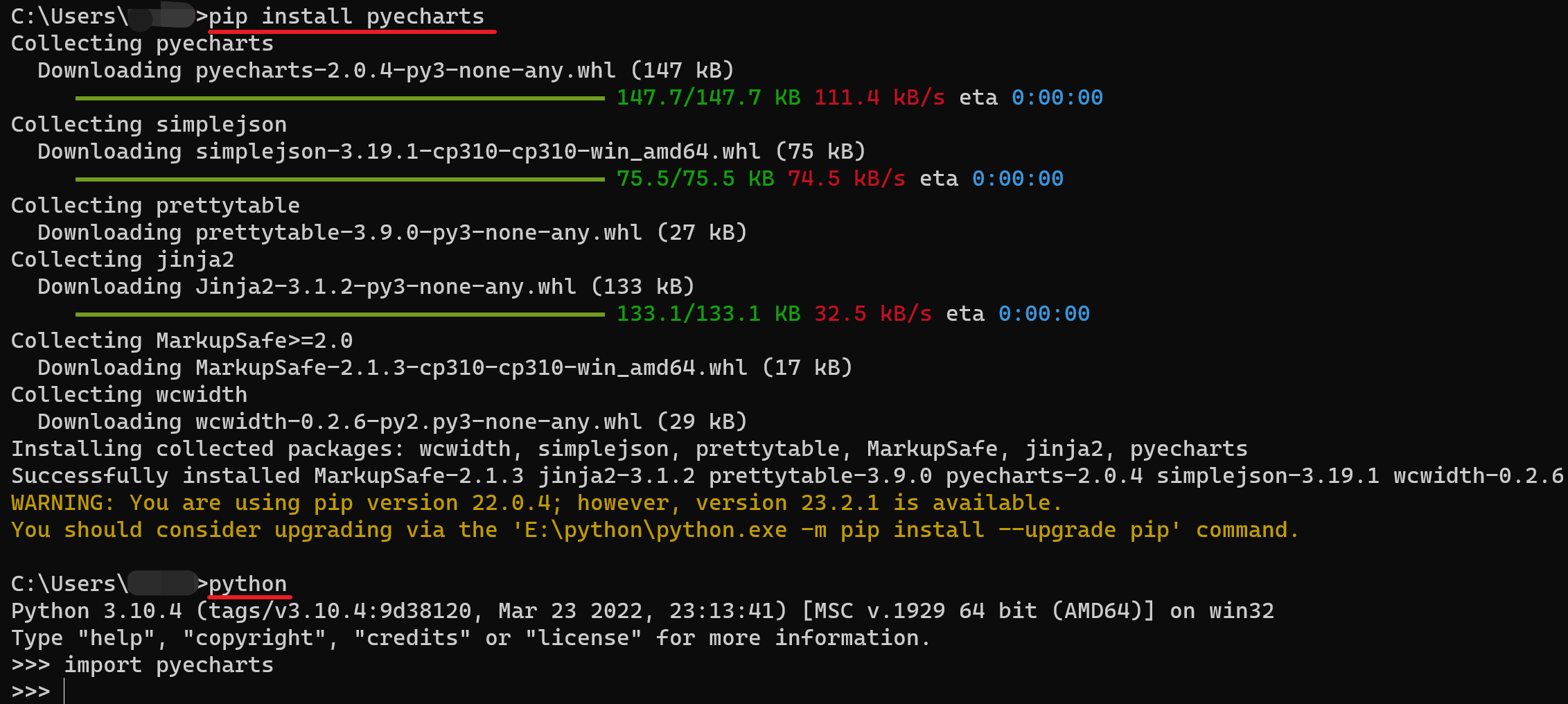
15.1.2 安装pyecharts
15.2 pyecharts配置项
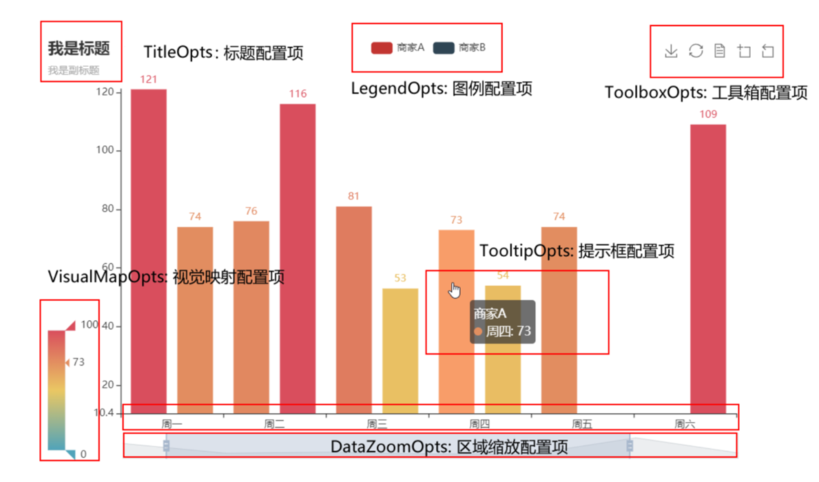
pyecharts模块中有很多的配置选项, 常用到2个类别的选项:
- 全局配置选项
- 系列配置选项
1、全局配置选项
全局配置选项可以通过set_global_opts方法来进行配置, 相应的选项和选项的功能如下(实际上不仅仅是这些)
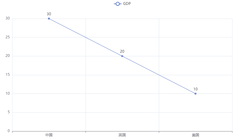
如下是一个折线图的配置
普通折线图
from pyecharts.charts import Line

# 得到折线图对象
line = Line()
# 添加x轴数据
line.add_xaxis(["中国", "英国", "美国"])
# 添加y轴数据
line.add_yaxis("GDP", [30, 20, 10])
# 生成图表
line.render("三国GDP.html")  # 参数是生成的html文件的名称
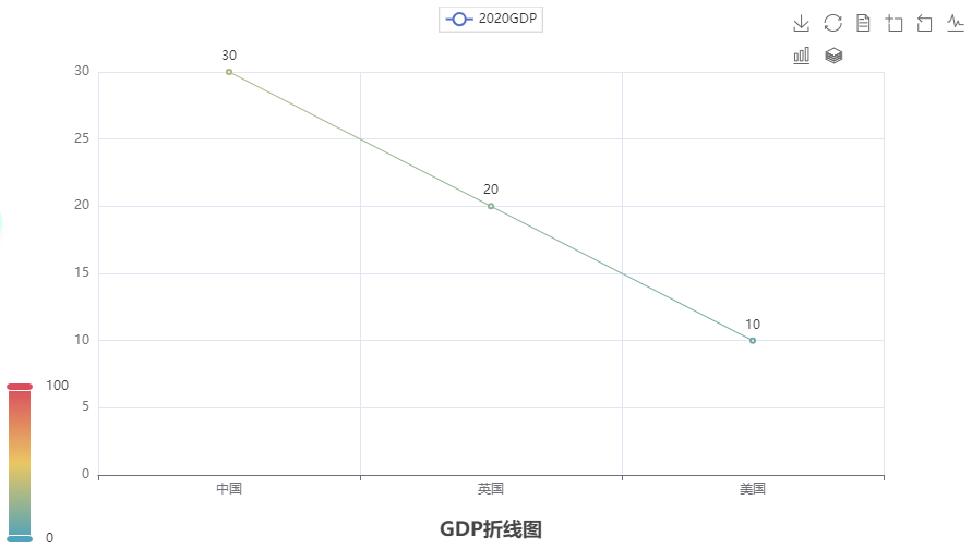
配置后的折线图
from pyecharts.charts import Line
from pyecharts.options import TitleOpts, LegendOpts, ToolboxOpts, VisualMapOpts, TooltipOpts

line = Line()
line.add_xaxis(["中国", "英国", "美国"])
line.add_yaxis("2020GDP", [30, 20, 10])

# 全局配置
line.set_global_opts(
    # 配置标题和位置
    title_opts=TitleOpts(title="GDP折线图", pos_left="center", pos_bottom="1%"),
    # 配置是否展示数据,默认是展示
    legend_opts=LegendOpts(is_show=True),
    # 工具箱
    toolbox_opts=ToolboxOpts(is_show=True),
    # 淹死额
    visualmap_opts=VisualMapOpts(is_show=True),
    tooltip_opts=TooltipOpts(is_show=True)
)

# 生成图表
line.render("三国GDP.html")  # 参数是生成的html文件的名称
2、系列配置项(后面构建案例时详解)
15.3 折线图
15.3.1 基本使用
1、基础单线折线图
from pyecharts.charts import Line

# 得到折线图对象
line = Line()
# 添加x轴数据
line.add_xaxis(["中国", "英国", "美国"])
# 添加y轴数据
line.add_yaxis("GDP", [30, 20, 10])
# 生成图表
line.render("三国GDP.html")  # 参数是生成的html文件的名称
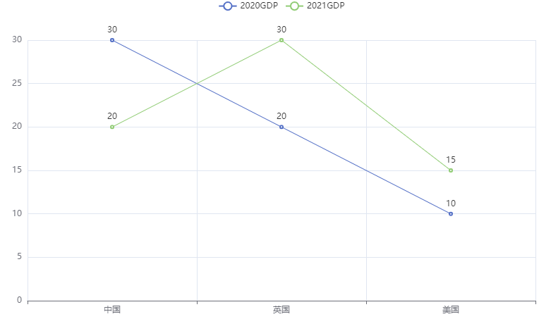
2、多线折线图
from pyecharts.charts import Line

# 得到折线图对象
line = Line()
# 添加x轴数据
line.add_xaxis(["中国", "英国", "美国"])
# 添加y轴数据
line.add_yaxis("2020GDP", [30, 20, 10])
line.add_yaxis("2021GDP", [20, 30, 15]) # 多加一条
# 生成图表
line.render("三国GDP.html")  # 参数是生成的html文件的名称
3、配置全局变量
【说明】在配置的时候,几乎每一个配置项都要导入一个模块
from pyecharts.charts import Line
# 导入配置项模块
from pyecharts.options import TitleOpts, LegendOpts, ToolboxOpts, VisualMapOpts, TooltipOpts

# 得到折线图对象
line = Line()
# 添加x轴数据
line.add_xaxis(["中国", "英国", "美国"])
# 添加y轴数据
line.add_yaxis("2020GDP", [30, 20, 10])

# 全局配置
line.set_global_opts(
    # 配置标题和位置
    title_opts=TitleOpts(title="GDP折线图", pos_left="center", pos_bottom="1%"),
    # 配置是否展示数据,默认是展示
    legend_opts=LegendOpts(is_show=True),
    # 工具箱
    toolbox_opts=ToolboxOpts(is_show=True),
    # 淹死额
    visualmap_opts=VisualMapOpts(is_show=True),
    tooltip_opts=TooltipOpts(is_show=True)
)

# 生成图表
line.render("三国GDP.html")  # 参数是生成的html文件的名称
15.3.2 详细案例
一般分为两步:数据处理、创建折线图
【数据处理】
这里要获得三国的数据
us_file = open("D:/美国.txt", "r", encoding="UTF-8")
# 读取全部的数据
us_data = us_file.read()
# 掐头去尾得到标准的JSON格式,replace是去除前面的部分,切片是去除后面的部分
us_json = us_data.replace("jsonp_1629344292311_69436(", "")[0:-2]
print(us_json)
然后将打印出的数据放到JSON网站中格式化看是否正确
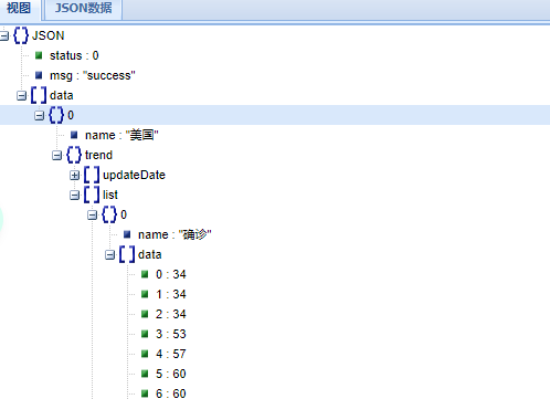
然后根据这个进行操作,这里要获取折线图的横纵坐标
import json

us_file = open("D:/美国.txt", "r", encoding="UTF-8")
# 读取全部的数据
us_data = us_file.read()
# 掐头去尾得到标准的JSON格式
us_json = us_data.replace("jsonp_1629344292311_69436(", "")[0:-2]
# print(us_json)
# 转换成py对象
us_dict = json.loads(us_json)

# 获取时间,只要一年的,也就是前314个日子
us_date = us_dict["data"][0]["trend"]["updateDate"][:314]
us_data = us_dict["data"][0]["trend"]["list"][0]["data"][:314]
【制作折线图】
这下横纵坐标就都有了,可以制作折线图了
import json
from pyecharts.charts import Line

us_file = open("D:/美国.txt", "r", encoding="UTF-8")
# 读取全部的数据
us_data = us_file.read()
# 掐头去尾得到标准的JSON格式
us_json = us_data.replace("jsonp_1629344292311_69436(", "")[0:-2]
# print(us_json)
# 转换成py对象
us_dict = json.loads(us_json)

# 获取时间,只要一年的,也就是前314个日子
us_date = us_dict["data"][0]["trend"]["updateDate"][:314]
us_data = us_dict["data"][0]["trend"]["list"][0]["data"][:314]

line = Line()
line.add_xaxis(us_date)
line.add_yaxis("美国确诊人数", us_data)  # 在添加y轴的时候输入名称

line.render("确诊人数.html")
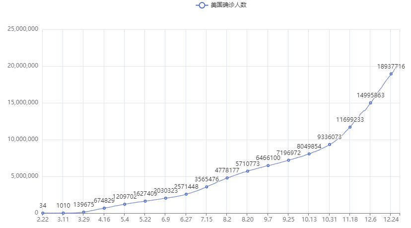
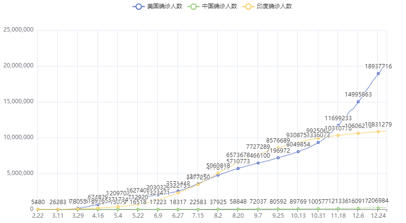
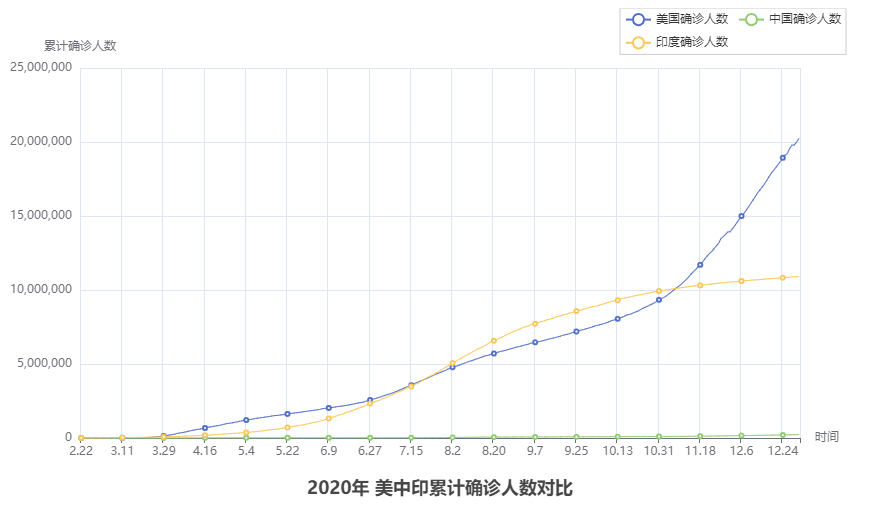
然后将其他两个国家也一起展示,代码逻辑完全相同
import json
from pyecharts.charts import Line

us_file = open("D:/美国.txt", "r", encoding="UTF-8")
ch_file = open("D:/中国.txt", "r", encoding="UTF-8")
in_file = open("D:/印度.txt", "r", encoding="UTF-8")
# 读取全部的数据
us_data = us_file.read()
ch_data = ch_file.read()
in_data = in_file.read()
# 关闭全部文件
us_file.close()
ch_file.close()
in_file.close()
# 掐头去尾得到标准的JSON格式
us_json = us_data.replace("jsonp_1629344292311_69436(", "")[0:-2]
ch_json = ch_data.replace("jsonp_1629350871167_29498(", "")[0:-2]
in_json = in_data.replace("jsonp_1629350745930_63180(", "")[0:-2]
# print(us_json)
# 转换成py对象
us_dict = json.loads(us_json)
ch_dict = json.loads(ch_json)
in_dict = json.loads(in_json)
# 获取时间,只要一年的,也就是前314个日子
us_date = us_dict["data"][0]["trend"]["updateDate"][:314]
us_data = us_dict["data"][0]["trend"]["list"][0]["data"][:314]
ch_date = ch_dict["data"][0]["trend"]["updateDate"][:314]
ch_data = ch_dict["data"][0]["trend"]["list"][0]["data"][:314]
in_date = in_dict["data"][0]["trend"]["updateDate"][:314]
in_data = in_dict["data"][0]["trend"]["list"][0]["data"][:314]


line = Line()
line.add_xaxis(us_date)
line.add_yaxis("美国确诊人数", us_data)
line.add_yaxis("中国确诊人数", ch_data)
line.add_yaxis("印度确诊人数", in_data)

line.render("确诊人数.html")
然后进行配置,首先去除折线上的数字,太乱了
from pyecharts.options import LabelOpts
# 在添加y轴的时候设置
line.add_yaxis("美国确诊人数", us_data, label_opts=LabelOpts(is_show=False))
line.add_yaxis("中国确诊人数", ch_data, label_opts=LabelOpts(is_show=False))
line.add_yaxis("印度确诊人数", in_data, label_opts=LabelOpts(is_show=False))
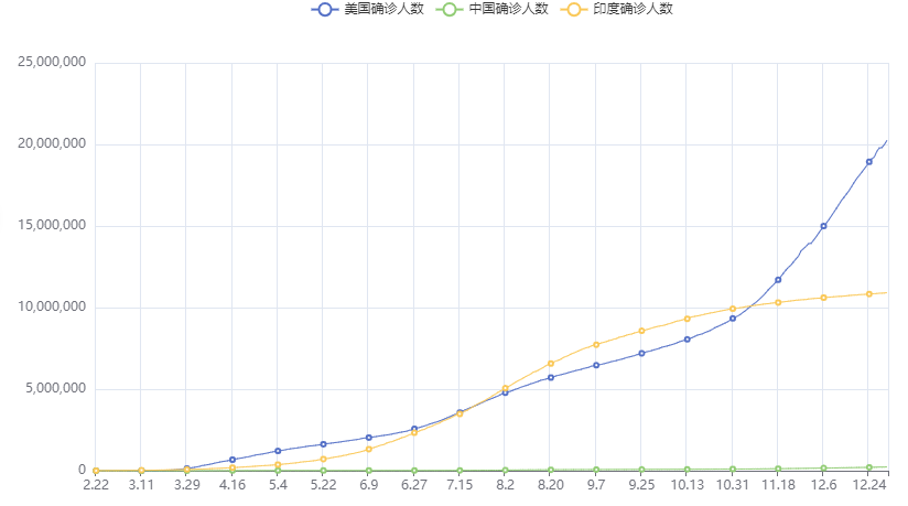
然后进行全局配置
from pyecharts.options import LabelOpts, TitleOpts, AxisOpts, LegendOpts

line.set_global_opts(
    title_opts=TitleOpts(title="2020年 美中印累计确诊人数对比", pos_left="center", pos_bottom="1%"),
    xaxis_opts=AxisOpts(name="时间"),
    yaxis_opts=AxisOpts(name="累计确诊人数"),
    legend_opts=LegendOpts(pos_left="70%")  # 图例的位置
)
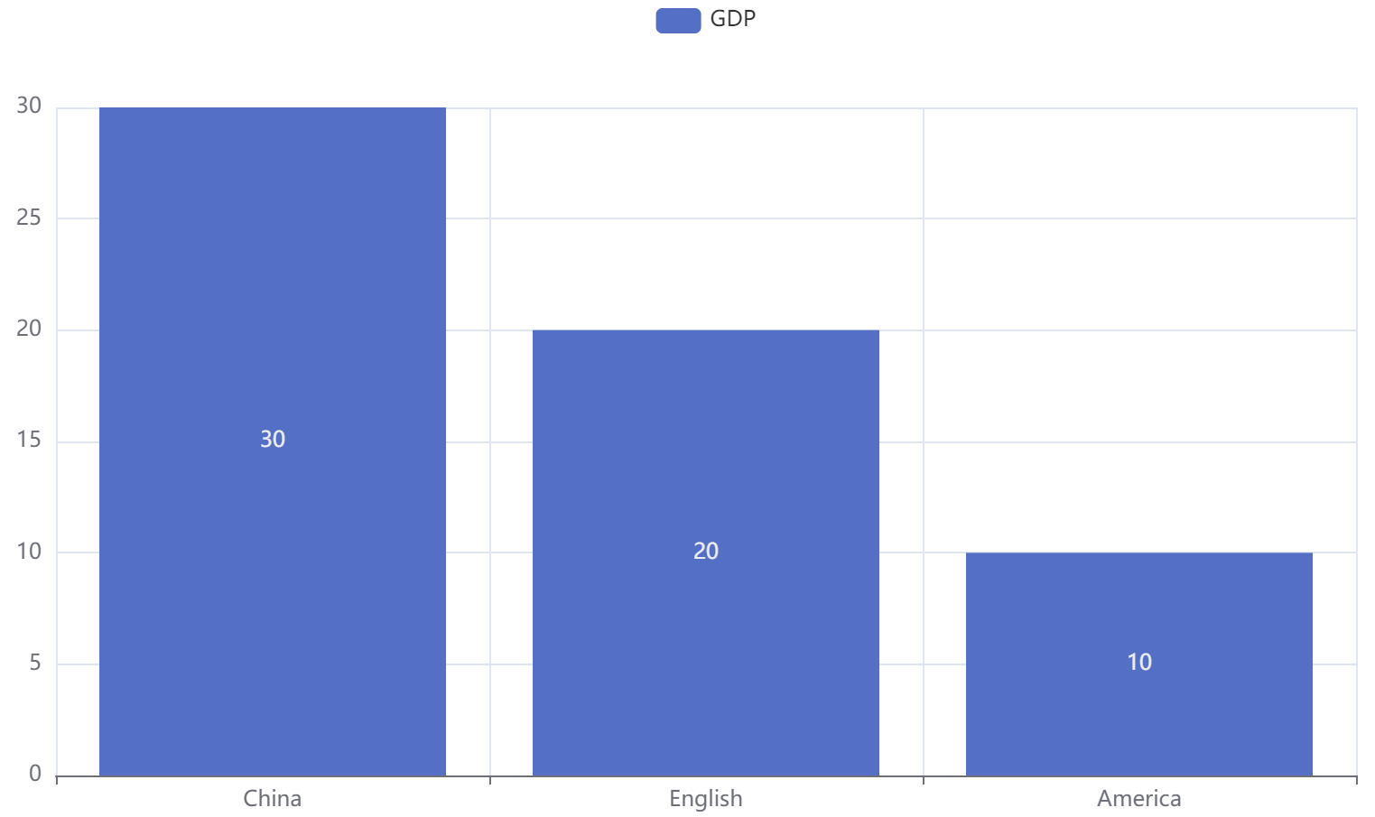
15.4 柱状图
15.4.1 基本使用
1、基础柱状图
from pyecharts.charts import Bar

# 构建柱状图对象
bar = Bar()

# 添加x轴数据
bar.add_xaxis(["China", "English", "America"])
# 添加y轴数据
bar.add_yaxis("GDP", [30, 20, 10])

# 绘图
bar.render("基础柱状图.html")
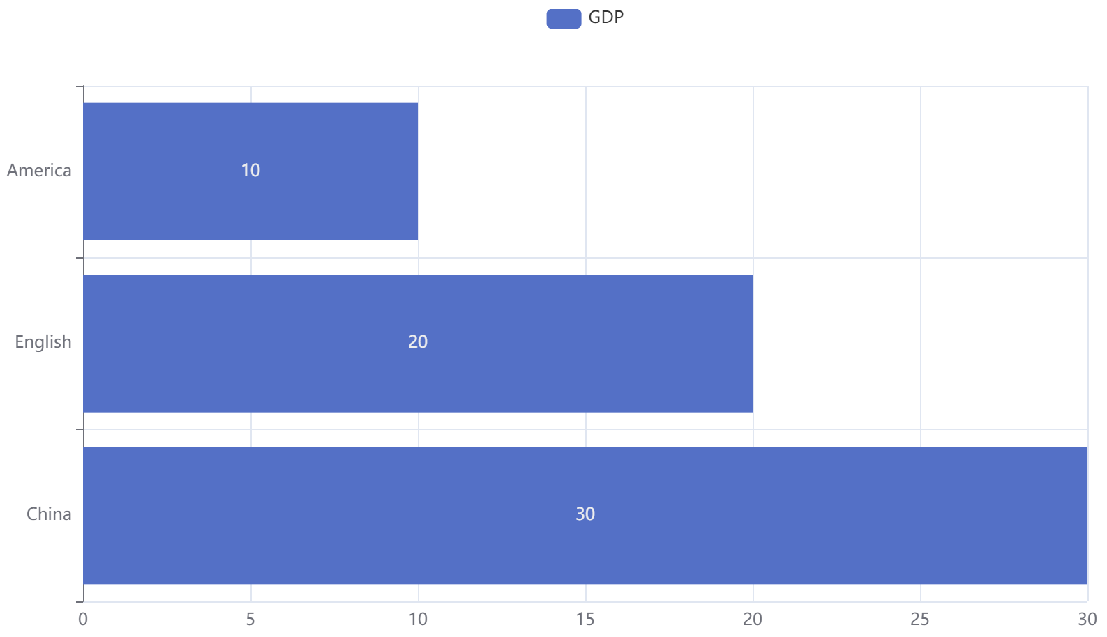
2、反转x轴和y轴
from pyecharts.charts import Bar

# 构建柱状图对象
bar = Bar()

# 添加x轴数据
bar.add_xaxis(["China", "English", "America"])
# 添加y轴数据
bar.add_yaxis("GDP", [30, 20, 10])
# 反转x轴和y轴
bar.reversal_axis()

# 绘图
bar.render("基础柱状图.html")
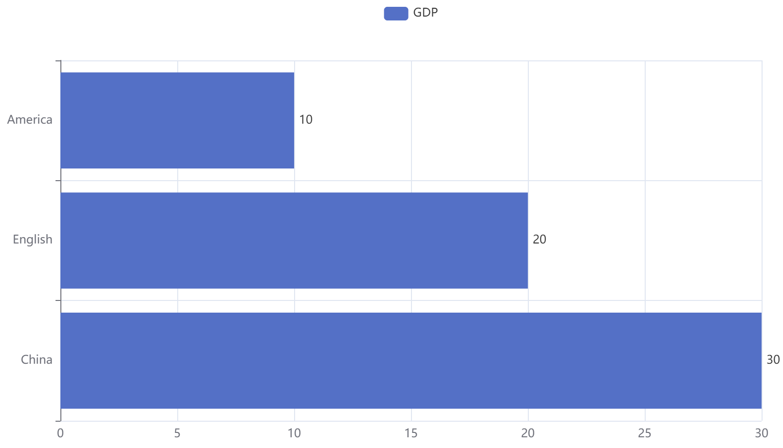
3、将标签(数值)设置在右侧
from pyecharts.charts import Bar
from pyecharts.options import LabelOpts

# 构建柱状图对象
bar = Bar()

# 添加x轴数据
bar.add_xaxis(["China", "English", "America"])
# 添加y轴数据
bar.add_yaxis("GDP", [30, 20, 10], label_opts=LabelOpts(position="right"))
# 反转x轴和y轴
bar.reversal_axis()

# 绘图
bar.render("基础柱状图.html")
15.5 时间线
柱状图描述的是分类数据,回答的是每一个分类中『有多少?』这个问题. 这是柱状图的主要特点,同时柱状图很难动态的描述一个趋势性的数据. 这里pyecharts为我们提供了一种解决方案-时间线
如果说一个Bar、Line对象是一张图表的话,时间线就是创建一个一维的x轴,轴上每一个点就是一个图表对象
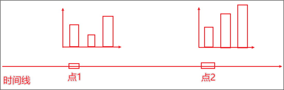
【理解】一个坐标图,横坐标是点,纵坐标是图
15.5.1 基本时间线
下面创建三个柱状图,用时间线连起来
1、基本时间线
from pyecharts.charts import Bar, Timeline
from pyecharts.options import *
# 2020年GDP的柱状图
bar1 = Bar()
bar1.add_xaxis(["China", "English", "America"])
bar1.add_yaxis("GDP", [30, 20, 10], label_opts=LabelOpts(position="right"))
bar1.reversal_axis()
# 2021年GDP的柱状图
bar2 = Bar()
bar2.add_xaxis(["China", "English", "America"])
bar2.add_yaxis("GDP", [50, 30, 20], label_opts=LabelOpts(position="right"))
bar2.reversal_axis()
# 2022年GDP的柱状图
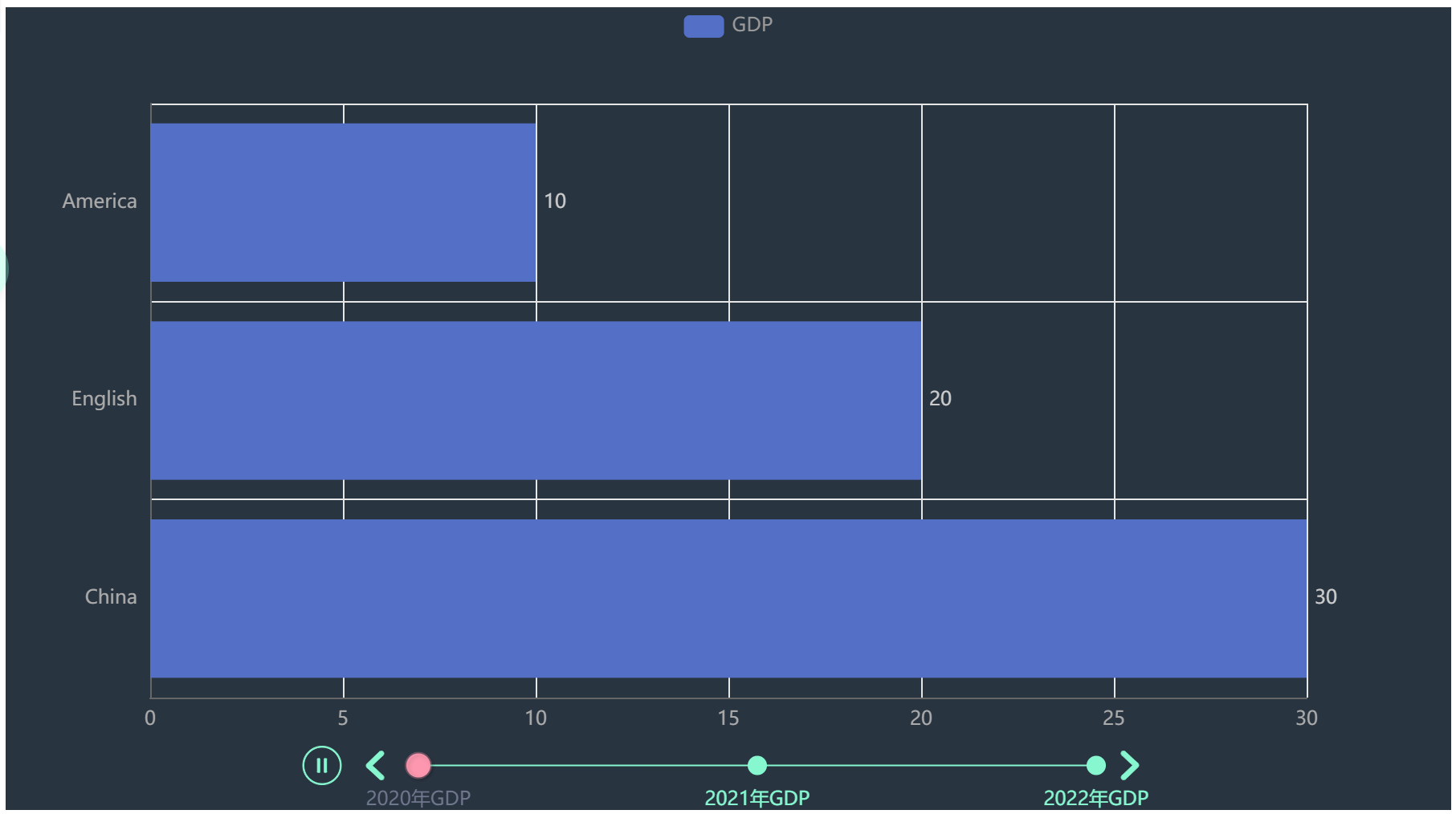
bar3 = Bar()
bar3.add_xaxis(["China", "English", "America"])
bar3.add_yaxis("GDP", [40, 60, 20], label_opts=LabelOpts(position="right"))
bar3.reversal_axis()
# 创建时间线
timeline = Timeline()
timeline.add(bar1, "2020年GDP")
timeline.add(bar2, "2021年GDP")
timeline.add(bar3, "2022年GDP")
# 通过时间线绘图
timeline.render("基础柱状图-时间线.html")
| 2020 | 2021 | 2022 |
|---|---|---|
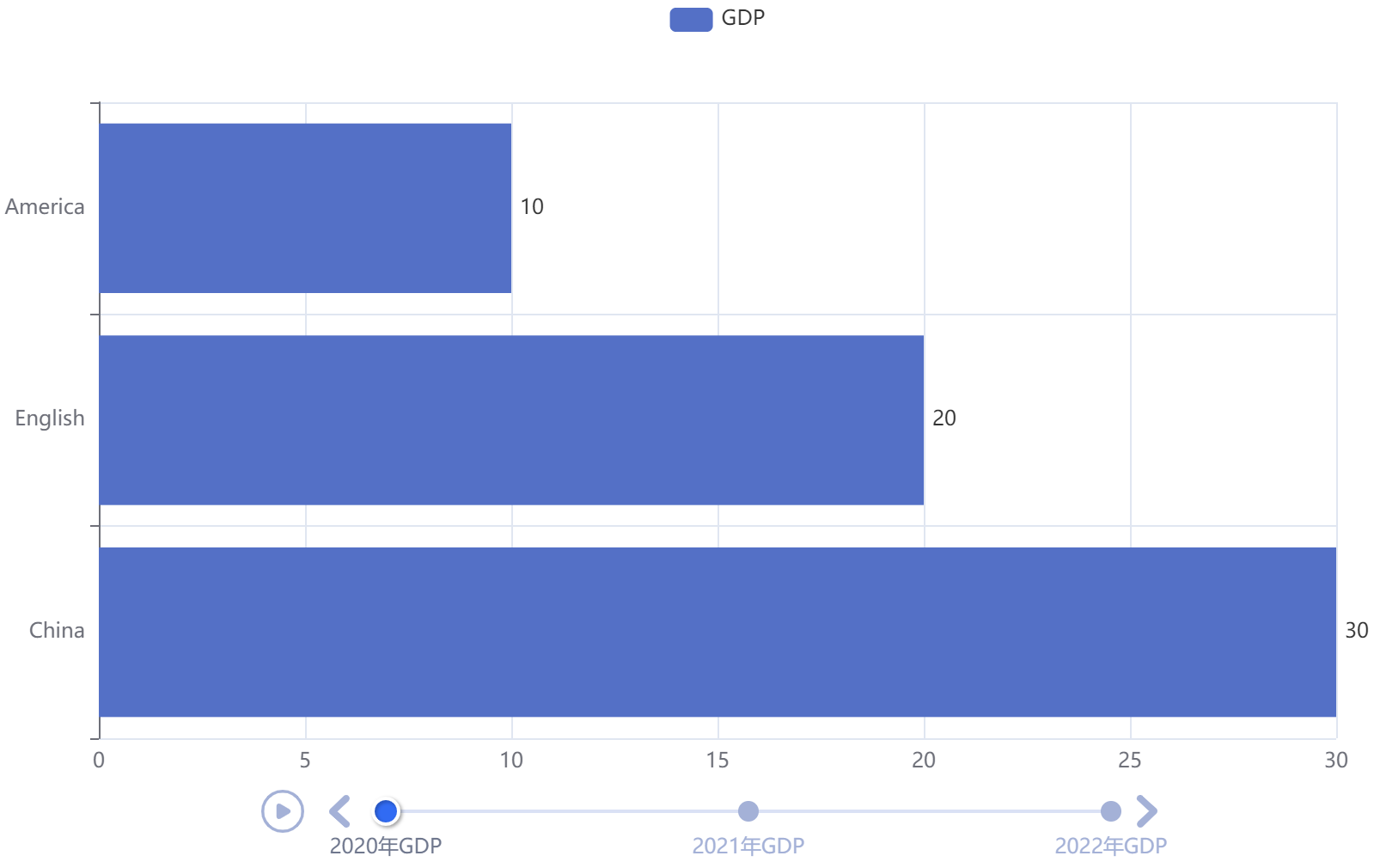 |
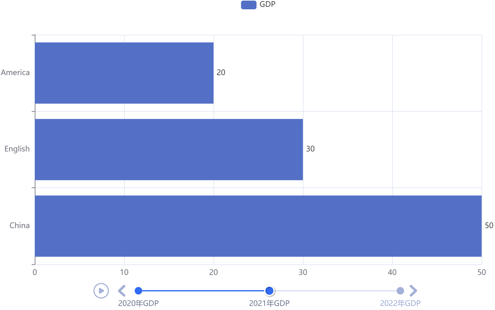 |
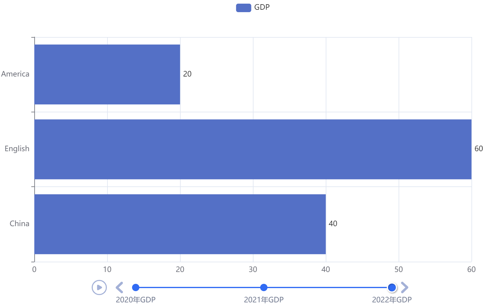 |
2、配置为自动播放
from pyecharts.charts import Bar, Timeline
from pyecharts.options import *

# 2020年GDP的柱状图
bar1 = Bar()
bar1.add_xaxis(["China", "English", "America"])
bar1.add_yaxis("GDP", [30, 20, 10], label_opts=LabelOpts(position="right"))
bar1.reversal_axis()

# 2021年GDP的柱状图
bar2 = Bar()
bar2.add_xaxis(["China", "English", "America"])
bar2.add_yaxis("GDP", [50, 30, 20], label_opts=LabelOpts(position="right"))
bar2.reversal_axis()

# 2022年GDP的柱状图
bar3 = Bar()
bar3.add_xaxis(["China", "English", "America"])
bar3.add_yaxis("GDP", [40, 60, 20], label_opts=LabelOpts(position="right"))
bar3.reversal_axis()

# 创建时间线
timeline = Timeline()
timeline.add(bar1, "2020年GDP")
timeline.add(bar2, "2021年GDP")
timeline.add(bar3, "2022年GDP")

# 配置自动播放
timeline.add_schema(
    play_interval=1000,  # 自动播放的时间间隔,单位毫秒
    is_timeline_show=True,  # 是否在自动播放的时候显示时间线
    is_auto_play=True,  # 是否自动播放
    is_loop_play=True  # 是否循环自动播放
)

# 通过时间线绘图
timeline.render("基础柱状图-时间线.html")
3、设置时间线主题
# 导入
from pyecharts.globals import ThemeType

# 创建时间线
timeline = Timeline(
    {"theme": ThemeType.CHALK}
)
15.5.2 案例
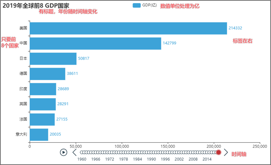
这里举一些数据类型
year,GDP,rate
1960,美国,5.433E+11
1960,英国,73233967692
1960,法国,62225478000
1960,中国,59716467625
...
1961,伊朗,4426949094
1961,巴基斯坦,4118647627
1961,葡萄牙,3417516639
1961,以色列,3138500000
1961,刚果(金),3086746857
1961,泰国,3034043574
...
1962,刚果(金),3779841428
1962,葡萄牙,3668222357
1962,泰国,3308912796
1962,秘鲁,3286773187
1962,韩国,2814318516
1962,以色列,251000000
就是这样分析
【数据处理】
from pyecharts.charts import Bar, Timeline
from pyecharts.options import *
from pyecharts.globals import ThemeType

# 数据处理
file = open("D:/GDP.csv", "r", encoding="GB2312")
lines = file.readlines()
file.close()
# 去掉第一行
lines = lines[1:]

# 然后按照时间分类,以字典保存,key为时间,value为(国家, GDP)
data_dict = {}
for line in lines:
    line_split = line.split(",")
    year = int(line_split[0])
    country = line_split[1]
    GDP = float(line_split[2])  # float会将科学计数法转换成小数
    try:
        data_dict[year].append((country, GDP))
    except KeyError:
        data_dict[year] = []
        data_dict[year].append((country, GDP))

# dict的内容为 dict[year, tuple(country, GDP)],然后对每年进行排序,因为每年都需要8个最高的

# 将年份全部拿出来,然后排序
sorted_year_list = sorted(data_dict.keys())
timeline = Timeline({"theme": ThemeType.CHALK})
【创建时间线】
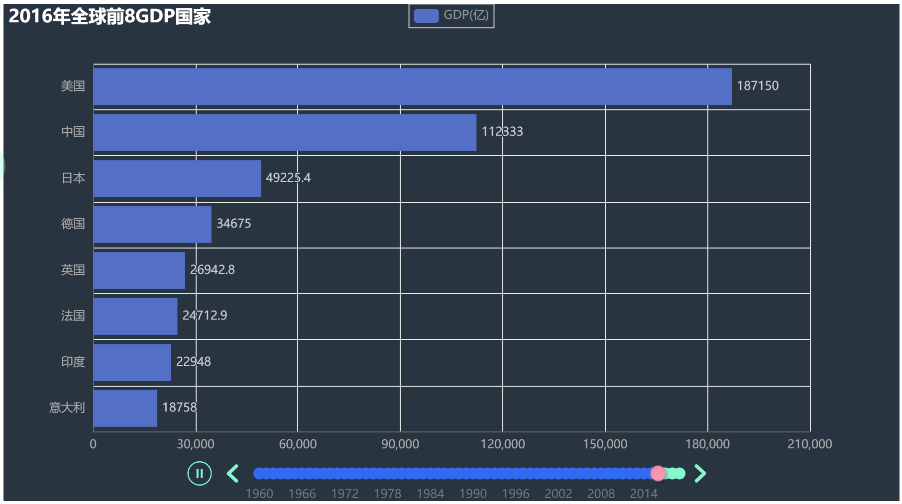
# 然后遍历每一年的内容,每一年也就是一个横坐标的节点,一个柱状图
for year in sorted_year_list:
    data_dict[year].sort(key=lambda elem: elem[1], reverse=True)
    year_data = data_dict[year][0:8]
    countries = []
    GDPs = []
    for country_GDP in year_data:
        countries.append(country_GDP[0])
        GDPs.append(country_GDP[1] / 100000000)

    # 然后创建新柱状图
    bar = Bar()
    countries.reverse()
    GDPs.reverse()
    # 设置标题
    bar.set_global_opts(title_opts=TitleOpts(title=f"{year}年全球前8GDP国家"))
    bar.add_xaxis(countries)
    bar.add_yaxis("GDP(亿)", GDPs, label_opts=LabelOpts(position="right")) # y轴数据,标签在右
    bar.reversal_axis()  # 柱状图横过来
    timeline.add(bar, str(year))

timeline.add_schema(
    play_interval=500,
    is_timeline_show=True,
    is_auto_play=True,
    is_loop_play=False
)

timeline.render("1960-2020全球GDB前8国家.html")
15.6 地图
15.6.1 基本地图
1、基本地图
from pyecharts.charts import Map
from pyecharts.options import VisualMapOpts

map = Map()
# pyecharts组件会自动识别文字并对应到地图上
data = [
    ("北京", 99),
    ("上海", 199),
    ("湖南", 299),
    ("台湾", 399),
    ("安徽", 499),
    ("广州", 599),
    ("湖北", 699),
]
# pyecharts会识别China显示中国
map.add("地图", data, "china")

map.render("china.html")

2、配置颜色
from pyecharts.charts import Map
from pyecharts.options import VisualMapOpts

map = Map()
# pyecharts组件会自动识别文字并对应到地图上,但是名字得严格,北京市不能写成北京
data = [
    ("北京市", 99),
    ("上海市", 199),
    ("湖南省", 299),
    ("台湾省", 399),
    ("安徽省", 499),
    ("广东省", 599),
    ("湖北省", 699),
]
# pyecharts会识别China显示中国
map.add("地图", data, "china")

map.set_global_opts(
    visualmap_opts=VisualMapOpts(
        is_show=True,
        is_piecewise=True,
        pieces=[
            {"min": 1, "max": 9, "label": "1-9", "color": "#CCFFFF"},
            {"min": 10, "max": 99, "label": "10-99", "color": "#FFFF99"},
            {"min": 100, "max": 499, "label": "100-499", "color": "#FF9966"},
            {"min": 500, "max": 999, "label": "500-999", "color": "#FF6666"},
            {"min": 1000, "max": 9999, "label": "1000-9999", "color": "#CC3333"},
            {"min": 10000, "label": "10000+", "color": "#990033"}
        ]
    )
)

map.render("china.html")
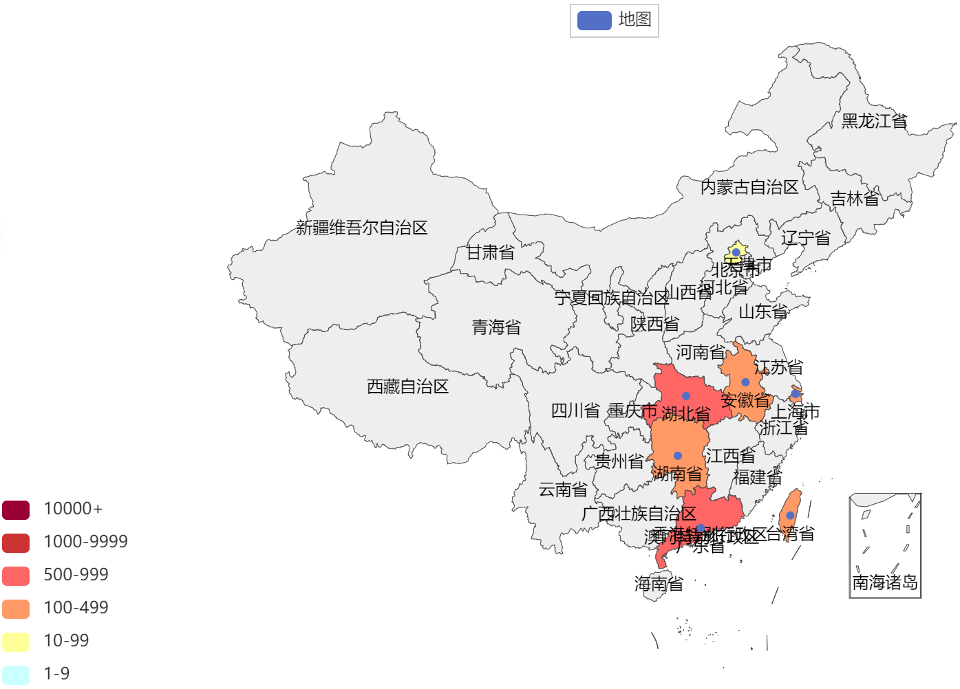
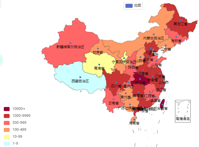
15.6.2 案例
【准备数据】
import json

from pyecharts.charts import Map
from pyecharts.options import VisualMapOpts

# 数据处理
file = open("D:/疫情.txt", "r", encoding="UTF-8")
data = file.read()
file.close()
# 转换成JSON
data_json = json.loads(data)

provinces_data = data_json["areaTree"][0]["children"]

provinces_name_comfirm = []
# 获取每个省的数据
for province_data in provinces_data:
    province_name = province_data["name"]
    if province_name == "北京" or province_name == "上海" or province_name == "天津" or province_name == "重庆":
        province_name += "市"
    elif province_name == "西藏" or province_name == "内蒙古":
        province_name += "自治区"
    elif province_name == "新疆":
        province_name += "维吾尔自治区"
    elif province_name == "广西":
        province_name += "壮族自治区"
    elif province_name == "宁夏":
        province_name += "回族自治区"
    else:
        province_name += "省"
    province_comfirm = province_data["total"]["confirm"]
    provinces_name_comfirm.append((province_name, province_comfirm))
数据如下
('台湾省', 15880)
('江苏省', 1576)
('云南省', 982)
('河南省', 1518)
('上海市', 2408)
...
然后放到地图中
map = Map()
map.add("地图", provinces_name_comfirm, "china")

map.set_global_opts(
    visualmap_opts=VisualMapOpts(
        is_show=True,
        is_piecewise=True,
        pieces=[
            {"min": 1, "max": 9, "label": "1-9", "color": "#CCFFFF"},
            {"min": 10, "max": 99, "label": "10-99", "color": "#FFFF99"},
            {"min": 100, "max": 499, "label": "100-499", "color": "#FF9966"},
            {"min": 500, "max": 999, "label": "500-999", "color": "#FF6666"},
            {"min": 1000, "max": 9999, "label": "1000-9999", "color": "#CC3333"},
            {"min": 10000, "label": "10000+", "color": "#990033"}
        ]
    )
)

map.render("中国地图.html")
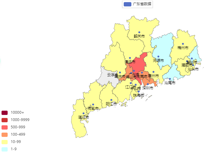
还可以看省份的
# 数据处理
# 读取文件
import json

from pyecharts.charts import Map
from pyecharts.options import VisualMapOpts

file = open("D:/疫情.txt", "r", encoding="UTF-8")
src_data = file.read()
file.close()
# 转换成JSON
data_json = json.loads(src_data)

# 获取广东的数据
cities_json = data_json["areaTree"][0]["children"][7]["children"]
# print(provinces_data)

# 将数据存到里面
cities_data: list[tuple[str, int]] = []
for city_json in cities_json:
    city_name = city_json["name"] + "市"
    city_comfirm = city_json["total"]["confirm"]
    cities_data.append((city_name, city_comfirm))

print(cities_data)

map = Map()
map.add("广东省数据", cities_data, "广东") # 这里写的是广东了,不是广东省
map.set_global_opts(
    visualmap_opts=VisualMapOpts(
        is_show=True,
        is_piecewise=True,
        pieces=[
            {"min": 1, "max": 9, "label": "1-9", "color": "#CCFFFF"},
            {"min": 10, "max": 99, "label": "10-99", "color": "#FFFF99"},
            {"min": 100, "max": 499, "label": "100-499", "color": "#FF9966"},
            {"min": 500, "max": 999, "label": "500-999", "color": "#FF6666"},
            {"min": 1000, "max": 9999, "label": "1000-9999", "color": "#CC3333"},
            {"min": 10000, "label": "10000+", "color": "#990033"}
        ]
    )
)

map.render("广东省.html")

 浙公网安备 33010602011771号