CSS display:flex的示例
0.前言
在编写下图类似的HTML时,我最初使用的float,发现浮动的写法很不方便,后面经百度改用display:flex进行布局,并对这一CSS属性产生了浓厚的兴趣。

通过几行代码轻松解决了左右对齐显示,并且意外发现通过 align-items: center 还可以实现上下对齐居中
我正在使用 styled-components 去实现前端效果,所以代码分为样式部分style.js和页面部分index.js
style.js:
 1 export const Legend = styled.div`
 2   width: 100%;
 3   display: flex;
 4   display: -webkit-flex;
 5   margin:10px 0px;
 6
 7   .left {
 8     text-align: left;
 9     font-size: 16px;
10
11     img{
12       margin-right: 5px;
13     }
14   }
15
16   .right {
17     flex: 1;
18     display: flex;
19     display: -webkit-flex;
20     align-items: center;
21     justify-content: flex-end;
22   }
23 `;
index.js:
 1           <Divider>图例</Divider>
 2           {
 3             this.state.thematicLayers.length>0?(
 4               this.state.thematicLayers.map(item => {
 5                 return (
 6                   <Legend>
 7                     <div className='left'>
 8                       <img src={item.tPic} />{item.tName}
 9                     </div>
10                     <div className='right'>
11                       <Switch />
12                     </div>
13                   </Legend>
14                 )
15               })
16             ):(
17               <div>暂无图层数据</div>
18             )
19           }
下面进入正题,Flex是弹性布局的意思,可以为任意元素指定为Flex布局
1 .box{
2     display: flex;
3     display: -webkit-flex;     /*兼容Safari(ios)*/
4 }
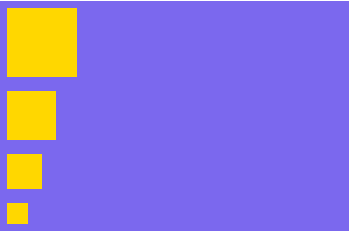
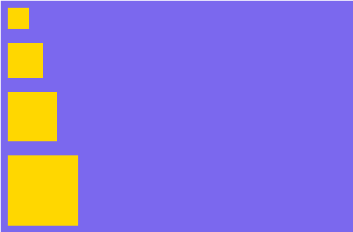
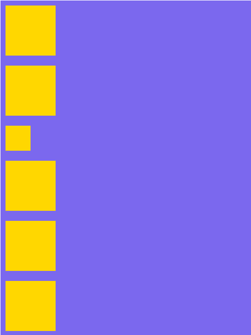
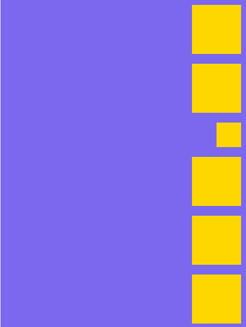
1.flex-direction 属性
主要参数: row | row-reverse | column | column-reverse
主要代码:
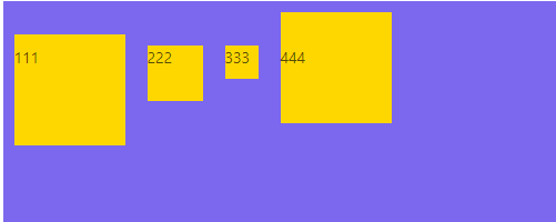
 1 export const FlexBox = styled.div`
 2   width: 1000px;
 3   margin: 0 auto;
 4   background: #7B68EE
 5   display: flex;
 6   display: -webkit-flex;
 7   flex-direction: row | row-reverse | column | column-reverse;
 8 `;
 9
10 export const FlexBoxItem = styled.div`
11   background: #FFD700;
12   width: ${props => props.width?props.width:'100px'};
13   height: ${props => props.width?props.width:'100px'};
14   margin: 10px;
15 `;
row
(默认)水平方向,起点在左端
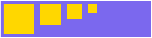
row-reverse
水平方向,起点在右端

column
垂直方向,起点在上边沿
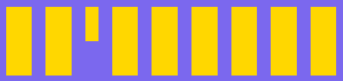
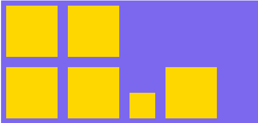
2.flex-warp 属性
主要参数:nowrap | wrap | wrap-reverse
主要代码:
 1 export const FlexBox = styled.div`
 2   width: 500px;
 3   margin: 0 auto;
 4   margin-top: 100px;
 5   background: #7B68EE
 6   display: flex;
 7   display: -webkit-flex;
 8   flex-warp: nowrap | wrap | wrap-reverse;
 9 `;
10
11 export const FlexBoxItem = styled.div`
12   background: #FFD700;
13   width: ${props => props.width?props.width:'100px'};
14   height: ${props => props.width?props.width:'100px'};
15   margin: 10px;
16 `;
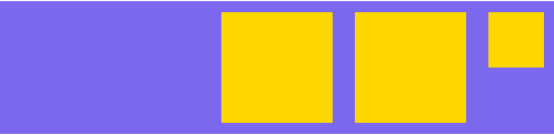
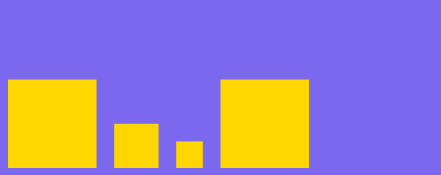
nowrap
不换行,会挤在一行,之前设定的宽度会失效,margin仍有效,图一为三个,图二为多个

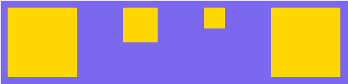
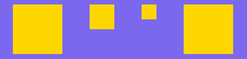
wrap
换行,且第一行在上方
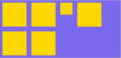
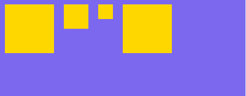
换行,且第一行在下方
3.flex-flow属性
4.justify-content属性
主要参数: flex-start | flex-end | center | left | right | space-between | space-around | space-evenly | stretch | safe | unsafe | baseline | first baseline | last baseline

flex-end
终点对齐,注意这边和上面的flex-direction:row-reverse不同,他并没有调整子元素的顺序
center
居中

space-around

5.align-items 属性
主要参数: flex-start | flex-end | center | baseline | stretch
flex-end
靠下对齐
center
垂直居中(贼好用,我不管我要标红)

baseline
第一行文字对齐,这个可以用来做效果
大致就是以上这些,连代码带查资料写了2个多小时,脑壳疼

 浙公网安备 33010602011771号