1.transitions
示例代码:


 1 <!DOCTYPE html>
 2 <html>
 3 <head>
 4 <style>
 5     div{
 6         width:200px;
 7         height: 200px;
 8         background: red;
 9         -webkit-transition:width 4s;
10         -o-transition:width 4s;
11     }
12         div:hover{
13             width: 400px;
14     }
15     </style>
16
17 </head>
18 <body>
19
20 <div></div>
21 <p>将鼠标放在div元素位置,来查看过度效果</p>
22 </body>
23 </html>
旋转:
示例代码:
 1 <!DOCTYPE html>
 2 <html>
 3 <head>
 4 <style>
 5     div{
 6         width:100px;
 7         height: 100px;
 8         background: red;
 9         -webkit-transition:width 2s,height 2s,
10         -webkit-transform 2s;
11         -o-transition:width 4s;
12     }
13         div:hover{
14             width: 400px;
15             height:400px;
16             transform: rotate(180deg);
17             -webkit-transform:rotate(360deg);
18     }
19     </style>
20
21 </head>
22 <body>
23
24 <div></div>
25 <p>将鼠标放在div元素位置,来查看过度效果</p>
26 </body>
27 </html>
测试结果:
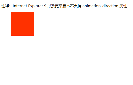
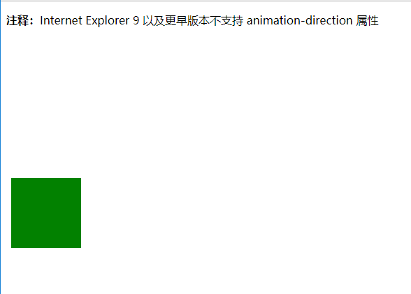
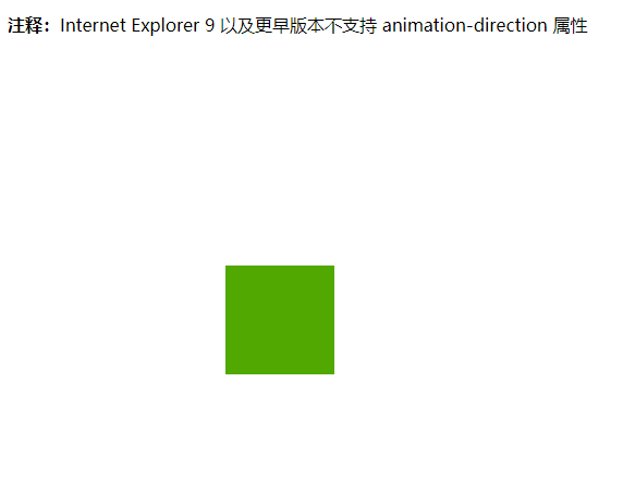
2.Animations:
示例代码:
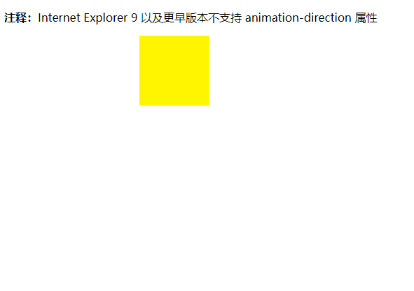
 1 <!DOCTYPE html>
 2 <html>
 3 <head>
 4 <style>
 5     div{
 6         width:100px;
 7         height: 100px;
 8         background: red;
 9         position: relative;
10         -webkit-animation:myfirst 5s infinite;
11         -webkit-animation-direction:alternate;
12     }
13     @-webkit-keyframes myfirst{
14         0% {background:red;left :0px;top:0px;}
15         25% {background:yellow;left:200px;top:0px;}
16         50% {backgroung:blue ;left:200px;top:200px;}
17         75% {background:green;left:0px;top:200px;}
18         100% {backgroung:red;left:0px;top:0px;}
19     }
20     </style>
21
22 </head>
23 <body>
24 <p>
25     <strong>注释:</strong>Internet Explorer 9 以及更早版本不支持 animation-direction 属性
26 </p>
27 <div></div>
28
29 </body>
30 </html>
测试结果:
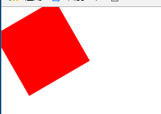
3.Transformations
示例代码:
 1 <!DOCTYPE html>
 2 <html>
 3 <head>
 4 <style>
 5     div{
 6         width:100px;
 7         height: 100px;
 8         background-color: red;
 9         transform: rotate(60deg);
10         -webkit-transform:rotate(60deg);
11         /*
12         -webkit-animation:myfirst 5s infinite;
13         -webkit-animation-direction:alternate;*/
14     }
15     </style>
16
17 </head>
18 <body>
19 <div></div>
20
21 </body>
22 </html>
测试结果: