
CSS-动画模块
过渡和动画之间的异同
不同点
- 过渡必须人为的触发才会执行动画
- 动画不需要人为的触发就可以执行动画
相同点
- 过渡和动画都是用来给元素添加动画的
- 过渡和动画都是系统新增的一些属性
- 过渡和动画都需要满足三要素才会有动画效果
<!DOCTYPE html>
<html lang="en">
<head>
    <meta charset="UTF-8">
    <title>动画模块</title>
    <style>
        * {
            margin: 0;
            padding: 0;
        }

        div {
            width: 100px;
            height: 50px;
            background-color: red;
            /*
            transition-property: margin-left;
            transition-duration: 3s;
            */

            /* 1.告诉系统需要执行哪个动画 */
            animation-name: BNTang;
            /* 3.告诉系统动画持续的时长 */
            animation-duration: 3s;
        }

        /* 2.告诉系统我们需要自己创建一个名称叫做 BNTang 的动画 */
        @keyframes BNTang {
            from {
                margin-left: 0;
            }
            to {
                margin-left: 500px;
            }
        }

        /*
        div:hover {
            margin-left: 500px;
        }
        */
    </style>
</head>
<body>
<div></div>
</body>
</html>
如上的示例代码中的动画属性分别代码的意思其实我已经标记出来了,我还是在下方列举一下吧,方便查看
| 属性名 | 作用 |
|---|---|
| animation-name | 告诉系统需要执行哪个动画 |
| @keyframes xxx | 告诉系统我们需要自己创建一个名称叫做 xxx 的动画 |
| animation-duration | 告诉系统动画持续的时长 |
动画的其它属性
老规矩先来查看示例代码在来列举示例代码中动画属性的作用
<!DOCTYPE html>
<html lang="en">
<head>
    <meta charset="UTF-8">
    <title>动画模块-其它属性</title>
    <style>
        * {
            margin: 0;
            padding: 0;
        }

        div {
            width: 100px;
            height: 50px;
            background-color: red;
            animation-name: sport;
            animation-duration: 2s;
            /*
            告诉系统多少秒之后开始执行动画
            animation-delay: 2s;
            */
            /* 告诉系统动画执行的速度 */
            animation-timing-function: linear;
            /* 告诉系统动画需要执行几次 */
            animation-iteration-count: 3;
            /*
            告诉系统是否需要执行往返动画
            取值:
            - normal, 默认的取值, 执行完一次之后回到起点继续执行下一次
            - alternate, 往返动画, 执行完一次之后往回执行下一次
            */
            animation-direction: alternate;
        }

        @keyframes sport {
            from {
                margin-left: 0;
            }
            to {
                margin-left: 500px;
            }
        }

        div:hover {
            /*
            告诉系统当前动画是否需要暂停
            取值:
            - running: 执行动画
            - paused: 暂停动画
            */
            animation-play-state: paused;
        }
    </style>
</head>
<body>
<div class="box1"></div>
</body>
</html>
| 属性名 | 作用 |
|---|---|
| animation-delay | 告诉系统多少秒之后开始执行动画 |
| animation-timing-function | 告诉系统动画执行的速度 |
| animation-iteration-count | 告诉系统动画需要执行几次 |
| animation-direction | 告诉系统是否需要执行往返动画 |
| animation-play-state | 告诉系统当前动画是否需要暂停 |
通过我们的观察, 动画是有一定的状态的
- 等待状态
- 执行状态
- 结束状态
<!DOCTYPE html>
<html lang="en">
<head>
    <meta charset="UTF-8">
    <title>动画模块-其它属性</title>
    <style>
        * {
            margin: 0;
            padding: 0;
        }

        .box1 {
            width: 100px;
            height: 50px;
            background-color: red;
            position: absolute;
            left: 0;
            top: 0;
            animation-name: sport;
            animation-duration: 5s;
        }

        @keyframes sport {
            0% {
                left: 0;
                top: 0;
            }
            25% {
                left: 300px;
                top: 0;
            }
            50% {
                left: 300px;
                top: 300px;
            }
            75% {
                left: 0;
                top: 300px;
            }
            100% {
                left: 0;
                top: 0;
            }
        }

        .box2 {
            width: 200px;
            height: 200px;
            background-color: blue;
            margin: 100px auto;
            animation-name: myRotate;
            animation-duration: 5s;
            animation-delay: 2s;
            /*
            指定动画等待状态和结束状态的样式
            取值:
            - none: 不做任何改变
            - forwards: 让元素结束状态保持动画最后一帧的样式
            - backwards: 让元素等待状态的时候显示动画第一帧的样式
            - both: 让元素等待状态显示动画第一帧的样式, 让元素结束状态保持动画最后一帧的样式
            */
            /*
            animation-fill-mode: backwards;
            animation-fill-mode: forwards;
            */
            animation-fill-mode: both;
        }

        @keyframes myRotate {
            0% {
                transform: rotate(10deg);
            }
            50% {
                transform: rotate(50deg);
            }
            100% {
                transform: rotate(70deg);
            }
        }
    </style>
</head>
<body>
<div class="box1"></div>
<div class="box2"></div>
</body>
</html>
| 属性名 | 作用 |
|---|---|
| animation-fill-mode | 指定动画等待状态和结束状态的样式 |
动画模块的连写格式
animation: 动画名称 动画时长 动画运动速度 延迟时间 执行次数 往返动画;
动画模块连写格式的简写
animation: 动画名称 动画时长;
示例代码如下所示
<!DOCTYPE html>
<html lang="en">
<head>
    <meta charset="UTF-8">
    <title>动画模块-连写</title>
    <style>
        * {
            margin: 0;
            padding: 0;
        }

        div {
            width: 100px;
            height: 50px;
            background-color: red;
            /*
            animation: move 3s linear 2s 1 normal;
            */
            animation: move 3s;
        }

        @keyframes move {
            from {
                margin-left: 0;
            }
            to {
                margin-left: 500px;
            }
        }
    </style>
</head>
<body>
<div></div>
</body>
</html>
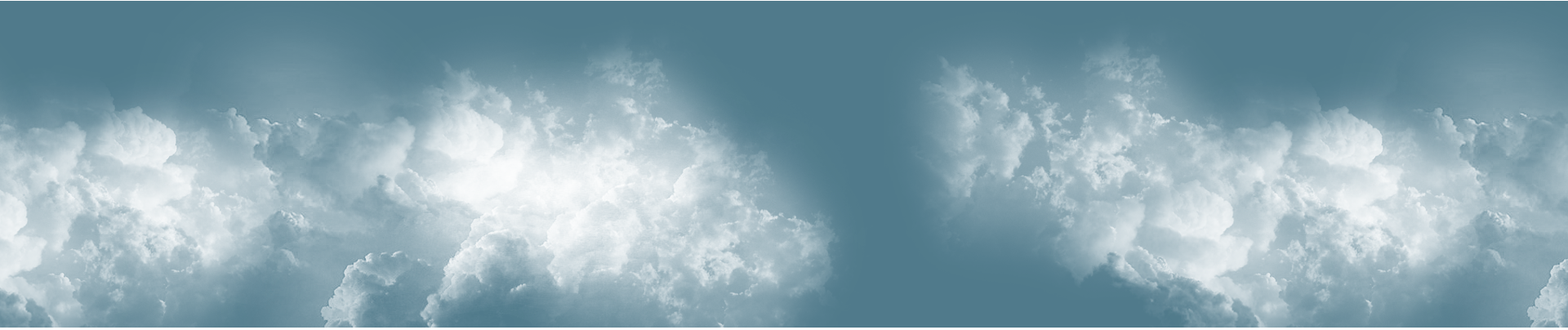
云层效果
素材下载: https://files.cnblogs.com/files/BNTang/CloudImages.zip
<!DOCTYPE html>
<html lang="en">
<head>
    <meta charset="UTF-8">
    <title>动画模块-云层效果</title>
    <style>
        * {
            margin: 0;
            padding: 0;
        }

        ul {
            height: 400px;
            background-color: skyblue;
            margin-top: 100px;
            animation: change 5s linear 0s infinite alternate;
            position: relative;
            overflow: hidden;
        }

        ul li {
            list-style: none;
            width: 400%;
            height: 100%;
            position: absolute;
            left: 0;
            top: 0;
        }

        ul li:nth-child(1) {
            background-image: url("images/cloud_one.png");
            animation: one 30s linear 0s infinite alternate;
        }

        ul li:nth-child(2) {
            background-image: url("images/cloud_two.png");
            animation: two 30s linear 0s infinite alternate;
        }

        ul li:nth-child(3) {
            background-image: url("images/cloud_three.png");
            animation: three 30s linear 0s infinite alternate;
        }

        @keyframes change {
            from {
                background-color: skyblue;
            }
            to {
                background-color: black;
            }
        }

        @keyframes one {
            from {
                margin-left: 0;
            }
            to {
                margin-left: -100%;
            }
        }

        @keyframes two {
            from {
                margin-left: 0;
            }
            to {
                margin-left: -200%;
            }
        }

        @keyframes three {
            from {
                margin-left: 0;
            }
            to {
                margin-left: -300%;
            }
        }
    </style>
</head>
<body>
<ul>
    <li></li>
    <li></li>
    <li></li>
</ul>
</body>
</html>
无限滚动
<!DOCTYPE html>
<html lang="en">
<head>
    <meta charset="UTF-8">
    <title>动画模块-无限滚动</title>
    <style>
        * {
            margin: 0;
            padding: 0;
        }

        div {
            width: 600px;
            height: 188px;
            border: 1px solid #000;
            margin: 100px auto;
            overflow: hidden;
        }

        ul {
            width: 2000px;
            height: 188px;
            background-color: black;
            animation: move 10s linear 0s infinite normal;
        }

        ul li {
            float: left;
            list-style: none;
            width: 300px;
            height: 188px;
            background-color: red;
            border: 1px solid #000;
            box-sizing: border-box;
        }

        ul:hover {
            /* 动画添加给谁, 就让谁停止 */
            animation-play-state: paused;
        }

        ul:hover li {
            opacity: 0.5;
        }

        ul li:hover {
            opacity: 1;
        }

        @keyframes move {
            from {
                margin-left: 0;
            }
            to {
                margin-left: -1200px;
            }
        }
    </style>
</head>
<body>
<div>
    <ul>
        <li><img src="images/banner1.jpg" alt=""></li>
        <li><img src="images/banner2.jpg" alt=""></li>
        <li><img src="images/banner3.jpg" alt=""></li>
        <li><img src="images/banner4.jpg" alt=""></li>
        <li><img src="images/banner1.jpg" alt=""></li>
        <li><img src="images/banner2.jpg" alt=""></li>
    </ul>
</div>
</body>
</html>

 浙公网安备 33010602011771号