WPF 自定义控件样式
今天学习一下自定义控件,与UserControl的区别在于可控性更强,缺点是要写更多的样式代码
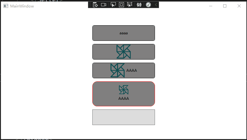
先展示一下
控件代码 继承至ButtonBase 这样Button所有的属性都能获取,比如Command之类
  1 using System;
  2 using System.Collections.Generic;
  3 using System.Linq;
  4 using System.Text;
  5 using System.Threading.Tasks;
  6 using System.Windows;
  7 using System.Windows.Controls;
  8 using System.Windows.Controls.Primitives;
  9 using System.Windows.Data;
 10 using System.Windows.Documents;
 11 using System.Windows.Input;
 12 using System.Windows.Media;
 13 using System.Windows.Media.Imaging;
 14 using System.Windows.Navigation;
 15 using System.Windows.Shapes;
 16
 17 namespace 自定义控件
 18 {
 19     public enum ButtonType
 20     {
 21         Icon,
 22
 23         Text,
 24
 25         IconWithText,
 26     }
 27
 28     /// <summary>
 29     /// 按照步骤 1a 或 1b 操作,然后执行步骤 2 以在 XAML 文件中使用此自定义控件。
 30     ///
 31     /// 步骤 1a) 在当前项目中存在的 XAML 文件中使用该自定义控件。
 32     /// 将此 XmlNamespace 特性添加到要使用该特性的标记文件的根
 33     /// 元素中:
 34     ///
 35     ///     xmlns:MyNamespace="clr-namespace:自定义控件"
 36     ///
 37     ///
 38     /// 步骤 1b) 在其他项目中存在的 XAML 文件中使用该自定义控件。
 39     /// 将此 XmlNamespace 特性添加到要使用该特性的标记文件的根
 40     /// 元素中:
 41     ///
 42     ///     xmlns:MyNamespace="clr-namespace:自定义控件;assembly=自定义控件"
 43     ///
 44     /// 您还需要添加一个从 XAML 文件所在的项目到此项目的项目引用,
 45     /// 并重新生成以避免编译错误:
 46     ///
 47     ///     在解决方案资源管理器中右击目标项目,然后依次单击
 48     ///     “添加引用”->“项目”->[浏览查找并选择此项目]
 49     ///
 50     ///
 51     /// 步骤 2)
 52     /// 继续操作并在 XAML 文件中使用控件。
 53     ///
 54     ///     <MyNamespace:DisplayButton/>
 55     ///
 56     /// </summary>
 57     public class DisplayButton : ButtonBase
 58     {
 59         // Using a DependencyProperty as the backing store for CornerRadius.  This enables animation, styling, binding, etc...
 60         public static readonly DependencyProperty CornerRadiusProperty =
 61             DependencyProperty.Register("CornerRadius", typeof(CornerRadius), typeof(DisplayButton), new PropertyMetadata(default));
 62
 63         // Using a DependencyProperty as the backing store for Type.  This enables animation, styling, binding, etc...
 64         public static readonly DependencyProperty DisplayStyleProperty =
 65             DependencyProperty.Register("DisplayStyle", typeof(ButtonType), typeof(DisplayButton), new PropertyMetadata(default));
 66
 67         // Using a DependencyProperty as the backing store for text.  This enables animation, styling, binding, etc...
 68         public static readonly DependencyProperty TextProperty =
 69             DependencyProperty.Register("Text", typeof(string), typeof(DisplayButton), new PropertyMetadata(default));
 70
 71         // Using a DependencyProperty as the backing store for Image.  This enables animation, styling, binding, etc...
 72         public static readonly DependencyProperty IconProperty =
 73             DependencyProperty.Register("Icon", typeof(ImageSource), typeof(DisplayButton), new PropertyMetadata(default));
 74
 75         public CornerRadius CornerRadius
 76         {
 77             get { return (CornerRadius)GetValue(CornerRadiusProperty); }
 78             set { SetValue(CornerRadiusProperty, value); }
 79         }
 80
 81         //切换按钮样式
 82         public ButtonType DisplayStyle
 83         {
 84             get { return (ButtonType)GetValue(DisplayStyleProperty); }
 85             set { SetValue(DisplayStyleProperty, value); }
 86         }
 87
 88         public string Text
 89         {
 90             get { return (string)GetValue(TextProperty); }
 91             set { SetValue(TextProperty, value); }
 92         }
 93
 94         /// <summary>
 95         /// 使用ImageSource可以直接把路径转换为图片
 96         /// </summary>
 97         public ImageSource Icon
 98         {
 99             get { return (ImageSource)GetValue(IconProperty); }
100             set { SetValue(IconProperty, value); }
101         }
102
103         static DisplayButton()
104         {
105             DefaultStyleKeyProperty.OverrideMetadata(typeof(DisplayButton), new FrameworkPropertyMetadata(typeof(DisplayButton)));
106         }
107     }
108 }
样式代码 注意必须定义在Themes文件夹下的Generic.xaml中,在创建自定义控件的时候,VS就会帮你生成这个东西
<ResourceDictionary
    xmlns="http://schemas.microsoft.com/winfx/2006/xaml/presentation"
    xmlns:x="http://schemas.microsoft.com/winfx/2006/xaml"
    xmlns:local="clr-namespace:自定义控件">

    <Style TargetType="{x:Type local:DisplayButton}">
        <Setter Property="BorderBrush" Value="Black" />
        <Setter Property="Background" Value="Gray" />
        <Setter Property="BorderThickness" Value="1" />
        <!--  基础样式  -->
        <Setter Property="Template">
            <Setter.Value>
                <ControlTemplate TargetType="{x:Type local:DisplayButton}">
                    <Border
                        Padding="1"
                        Background="{TemplateBinding Background}"
                        BorderBrush="{TemplateBinding BorderBrush}"
                        BorderThickness="{TemplateBinding BorderThickness}"
                        CornerRadius="{TemplateBinding CornerRadius}"
                        SnapsToDevicePixels="True">
                        <ContentPresenter Margin="5" />
                    </Border>
                </ControlTemplate>
            </Setter.Value>
        </Setter>
        <!--  文本和图标切换效果  -->
        <Style.Triggers>
            <Trigger Property="DisplayStyle" Value="Text">
                <Setter Property="Template">
                    <Setter.Value>
                        <ControlTemplate TargetType="local:DisplayButton">
                            <Border
                                Padding="1"
                                Background="{TemplateBinding Background}"
                                BorderBrush="{TemplateBinding BorderBrush}"
                                BorderThickness="{TemplateBinding BorderThickness}"
                                CornerRadius="{TemplateBinding CornerRadius}"
                                SnapsToDevicePixels="True">
                                <Grid>
                                    <TextBlock
                                        x:Name="textBlock"
                                        HorizontalAlignment="Center"
                                        VerticalAlignment="Center"
                                        Text="{TemplateBinding Text}" />
                                    <ContentPresenter Margin="5" />
                                </Grid>
                            </Border>
                            <!--  触发单独的效果  -->
                            <ControlTemplate.Triggers>
                                <Trigger Property="IsPressed" Value="True">
                                    <Setter TargetName="textBlock" Property="Foreground" Value="Red" />
                                </Trigger>
                            </ControlTemplate.Triggers>
                        </ControlTemplate>
                    </Setter.Value>
                </Setter>
            </Trigger>

            <!--  只显示图标  -->
            <Trigger Property="DisplayStyle" Value="Icon">
                <Setter Property="Template">
                    <Setter.Value>
                        <ControlTemplate TargetType="local:DisplayButton">
                            <Border
                                Padding="1"
                                Background="{TemplateBinding Background}"
                                BorderBrush="{TemplateBinding BorderBrush}"
                                BorderThickness="{TemplateBinding BorderThickness}"
                                CornerRadius="{TemplateBinding CornerRadius}"
                                SnapsToDevicePixels="True">
                                <Grid>
                                    <Image
                                        x:Name="image"
                                        VerticalAlignment="Center"
                                        RenderTransformOrigin="0.5 0.5"
                                        Source="{TemplateBinding Icon}">
                                        <Image.RenderTransform>
                                            <RotateTransform x:Name="rotate" />
                                        </Image.RenderTransform>
                                    </Image>
                                    <ContentPresenter />
                                </Grid>
                            </Border>
                            <ControlTemplate.Triggers>
                                <!--点击动画-->
                                <EventTrigger RoutedEvent="Click">
                                    <BeginStoryboard>
                                        <Storyboard
                                            RepeatBehavior="Forever"
                                            Storyboard.TargetName="rotate"
                                            Storyboard.TargetProperty="Angle">
                                            <DoubleAnimation
                                                From="0"
                                                To="360"
                                                Duration="0:0:1" />
                                        </Storyboard>
                                    </BeginStoryboard>
                                </EventTrigger>
                            </ControlTemplate.Triggers>
                        </ControlTemplate>
                    </Setter.Value>
                </Setter>
            </Trigger>

            <!--  同时显示图标和文字  -->
            <Trigger Property="DisplayStyle" Value="IconWithText">
                <Setter Property="Template">
                    <Setter.Value>
                        <ControlTemplate TargetType="local:DisplayButton">
                            <Border
                                Padding="1"
                                Background="{TemplateBinding Background}"
                                BorderBrush="{TemplateBinding BorderBrush}"
                                BorderThickness="{TemplateBinding BorderThickness}"
                                CornerRadius="{TemplateBinding CornerRadius}"
                                SnapsToDevicePixels="True">
                                <Grid>
                                    <StackPanel
                                        HorizontalAlignment="Center"
                                        Orientation="Horizontal">
                                        <Image
                                            VerticalAlignment="Center"
                                            Source="{TemplateBinding Icon}" />
                                        <TextBlock
                                            Margin="5,0,0,0"
                                            VerticalAlignment="Center"
                                            Text="{TemplateBinding Text}" />
                                    </StackPanel>
                                    <ContentPresenter />
                                </Grid>
                            </Border>
                        </ControlTemplate>
                    </Setter.Value>
                </Setter>
            </Trigger>

            <!--  全局触发效果  -->
            <Trigger Property="IsMouseOver" Value="True">
                <Setter Property="Opacity" Value="0.8" />
            </Trigger>
            <Trigger Property="IsMouseOver" Value="False">
                <Setter Property="Opacity" Value="1" />
            </Trigger>
            <Trigger Property="IsPressed" Value="True">
                <Setter Property="BorderThickness" Value="2" />

                <!--<Setter Property="Effect">
                                <Setter.Value>
                                    <DropShadowEffect ShadowDepth="1"  Direction="45" />
                                </Setter.Value>
                            </Setter>-->
            </Trigger>
            <Trigger Property="IsPressed" Value="False">
                <Setter Property="BorderThickness" Value="1" />
                <!--<Setter Property="Effect">
                                <Setter.Value>
                                    <DropShadowEffect ShadowDepth="3"  Direction="45" />
                                </Setter.Value>
                            </Setter>-->
            </Trigger>
        </Style.Triggers>
    </Style>
</ResourceDictionary>
界面代码 重写了一次控件样式 把图标放到了上面
 1 <Window
 2     x:Class="自定义控件.MainWindow"
 3     xmlns="http://schemas.microsoft.com/winfx/2006/xaml/presentation"
 4     xmlns:x="http://schemas.microsoft.com/winfx/2006/xaml"
 5     xmlns:d="http://schemas.microsoft.com/expression/blend/2008"
 6     xmlns:local="clr-namespace:自定义控件"
 7     xmlns:mc="http://schemas.openxmlformats.org/markup-compatibility/2006"
 8     Title="MainWindow"
 9     Width="800"
10     Height="450"
11     mc:Ignorable="d">
12     <Window.Resources>
13         <!--  重写控件样式  -->
14         <Style
15             x:Key="DisplayStyle"
16             TargetType="local:DisplayButton">
17             <Setter Property="Template">
18                 <Setter.Value>
19                     <ControlTemplate TargetType="local:DisplayButton">
20                         <Border
21                             Padding="2"
22                             Background="{TemplateBinding Background}"
23                             BorderBrush="{TemplateBinding BorderBrush}"
24                             BorderThickness="{TemplateBinding BorderThickness}"
25                             CornerRadius="{TemplateBinding CornerRadius}"
26                             SnapsToDevicePixels="True">
27                             <Grid>
28                                 <StackPanel
29                                     VerticalAlignment="Center"
30                                     Orientation="Vertical">
31                                     <Image
32                                         MaxWidth="30"
33                                         MaxHeight="30"
34                                         Source="{TemplateBinding Icon}" />
35                                     <TextBlock
36                                         Margin="0,5"
37                                         HorizontalAlignment="Center"
38                                         Text="{TemplateBinding Text}" />
39                                 </StackPanel>
40                                 <ContentPresenter />
41                             </Grid>
42                         </Border>
43                     </ControlTemplate>
44                 </Setter.Value>
45             </Setter>
46         </Style>
47     </Window.Resources>
48     <Grid>
49         <StackPanel
50             VerticalAlignment="Center"
51             Orientation="Vertical">
52             <local:DisplayButton
53                 Width="200"
54                 Height="50"
55                 Margin="0,5"
56                 CornerRadius="5"
57                 DisplayStyle="Text"
58                 Text="aaaa" />
59             <local:DisplayButton
60                 Width="200"
61                 Height="50"
62                 Margin="0,5"
63                 CornerRadius="5"
64                 DisplayStyle="Icon"
65                 Icon="/风车.png" />
66             <local:DisplayButton
67                 Width="200"
68                 Height="50"
69                 Margin="0,5"
70                 CornerRadius="5"
71                 DisplayStyle="IconWithText"
72                 Icon="/风车.png"
73                 Text="AAAA" />
74             <local:DisplayButton
75                 Width="200"
76                 Height="80"
77                 Margin="0,5"
78                 BorderBrush="Red"
79                 CornerRadius="15"
80                 Icon="/风车.png"
81                 Style="{StaticResource DisplayStyle}"
82                 Text="AAAA" />
83             <Button
84                 Width="200"
85                 Height="50"
86                 Margin="0,5" />
87         </StackPanel>
88     </Grid>
89 </Window>

 浙公网安备 33010602011771号