
[Python] Histograms for analysis Daily return
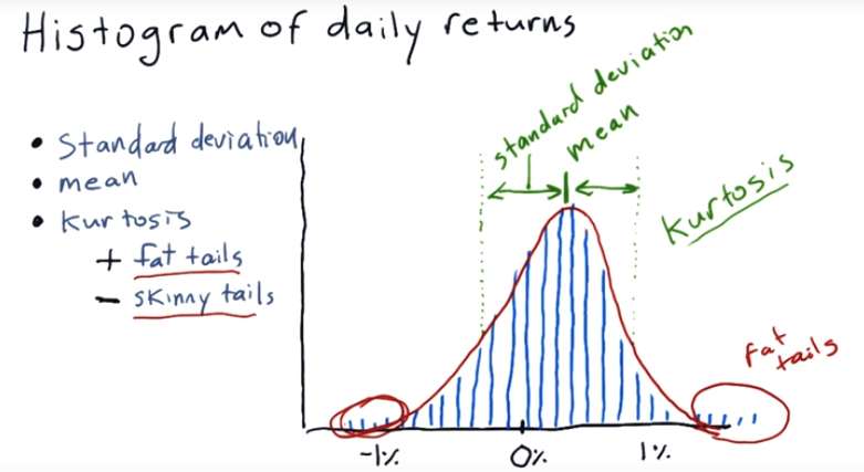
A histogram is an accurate representation of the distribution of numerical data.

Y axis is the occurances, X axis is the % of daily return.
There are three things can meature histogram
1. Standard deviation
2. Mean
3. Kurtosis : In probability theory and statistics, kurtosis is a measure of the "tailedness" of the probability distribution of a real-valued random variable.
Plot a histogram:
import os
import pandas as pd
import matplotlib.pyplot as plt

def compute_daily_return(df):
    dr = df.copy()
    dr = (df / df.shift(-1)) -1
    return dr

def histogram(df):
    dr = compute_daily_return(df)
    plot_data(dr, title="Daily returns", yLabel="Daily returns")
    dr.hist(bins=20)
    plt.show()


if __name__ == '__main__':
    df=test_run()
    #rolling_mean(df)
    histogram(df['SPY'])


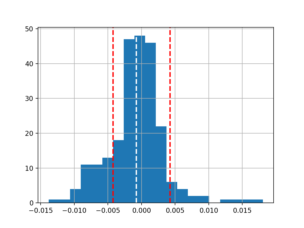
Plot 'mean' and 'std', Get 'kurtosis' value as well:
def histogram(df):
    dr = compute_daily_return(df)
    plot_data(dr, title="Daily returns", yLabel="Daily returns")
    dr.hist(bins=20)


    # Get mean and standard deviation
    mean = dr.mean()
    print("mean=", mean)
    std = dr.std()
    print("std=", std)

    plt.axvline(mean, color='w', linestyle='dashed', linewidth=2)
    plt.axvline(std, color='r', linestyle='dashed', linewidth=2)
    plt.axvline(-std, color='r', linestyle='dashed', linewidth=2)
    plt.show()

    # Get kurtosis
    print("kurtosis=", dr.kurtosis())


if __name__ == '__main__':
    df=test_run()
    histogram(df['SPY'])
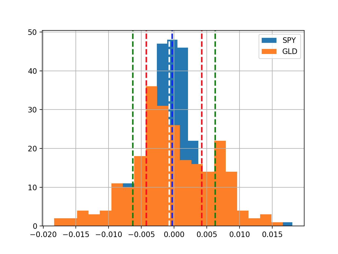
Now, let see how to plot tow histgram in the same plot:
def histogram(df):

    dr = compute_daily_return(df)
    plot_data(dr, title="Daily returns", yLabel="Daily returns")

    dr['SPY'].hist(bins=20, label="SPY")
    dr['GLD'].hist(bins=20, label="GLD")
    plt.legend(loc='upper right')

    # Get mean and standard deviation
    mean_spy = dr['SPY'].mean()
    mean_gld = dr['GLD'].mean()

    std_spy = dr['SPY'].std()
    std_gld = dr['GLD'].std()

    plt.axvline(mean_spy, color='w', linestyle='dashed', linewidth=2)
    plt.axvline(std_spy, color='r', linestyle='dashed', linewidth=2)
    plt.axvline(-std_spy, color='r', linestyle='dashed', linewidth=2)

    plt.axvline(mean_gld, color='b', linestyle='dashed', linewidth=2)
    plt.axvline(std_gld, color='g', linestyle='dashed', linewidth=2)
    plt.axvline(-std_gld, color='g', linestyle='dashed', linewidth=2)
    plt.show()

if __name__ == '__main__':
    df=test_run()
    histogram(df[['SPY', 'GLD']])

 浙公网安备 33010602011771号