
[Mobile Web] LEVEL 5 RESPONSIVE MEDIA
Responsive Images:
Responsive image means images which display on our website will adjust its width and height automaticlly according to different screen size.
For achieve this,
1. we save the image larger than we need. Because save larger we can size it differently without affect the resolution.
2. Use Max-width: use max-width in general
img{
   max-width: 100%;
}
Size image in different case:
about img{
    width: 29.6875%;
}
Responsive Media:
Level 5
img,
embed,
object,
video {
  max-width: 100%;
}
embed: The <embed> tag defines a container for an external application or interactive content (a plug-in).
<embed src="helloworld.swf">
object:
The <object> tag defines an embedded object within an HTML document. Use this element to embed multimedia (like audio, video, Java applets, ActiveX, PDF, and Flash) in your web pages.
You can also use the <object> tag to embed another webpage into your HTML document.
<object width="400" height="400" data="helloworld.swf"></object>
FitText to make font-sizing flexible: [http://fittextjs.com/]
Lettering.js for more robust control over your typography:[http://letteringjs.com/]
FitVids.js for flexible, responsive videos: [http://fitvidsjs.com/]
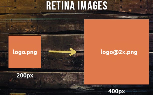
Retina Images:
Retina Images = 1.5x - 2x the pixel density
@media
only screen and (-webkit-min-device-pixel-ratio: 1.5),
only screen and (-moz-min-device-pixel-ratio: 1.5),
only screen and (-o-min-device-pixel-ratio: 1.5),
only screen and (min-device-pixel-ratio: 1.5){
  /*Style*/
}
Usually, ratina image is double size:
@media
only screen and (-webkit-min-device-pixel-ratio: 1.5),
only screen and (min-device-pixel-ratio: 1.5) {
.logo {
  background-image: url(logo@2x.png);
  -webkit-background-size: 12px 16px;
     background-size: 12px 16px;
  }
}
Background-size
Here the background-size is the origln size, not double size.
Image size
We can use PictureFill lib. http://scottjehl.com/picturefill/
<picture alt="Our Alternate Text">
   <!-- Smallest size first - no @media qualifier -->
   <source src="content-image.jpeg" />
       <!-- Large size - send to viewports 800px wide and up -->
   <source src="content-image-lrg.jpeg" media="(min-width: 800px)" />
   <!-- Fallback content for non-JS or non-media-querysupporting- browsers -->
   <noscript>
      <img src="content-image.jpeg" alt="Our Alternate Text" />
    </noscript>
</picture>
noscript to handle if the broswer doesn't support picture tag, we set oringal img.

 浙公网安备 33010602011771号