
[Mobile Web] LEVEL 4: RESPONSIVE ADVENTURES -- EX
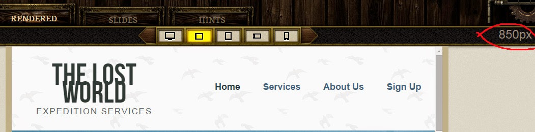
FIND THE BREAKPOINT
Using the border handles on either side, keep resizing the site below to see where the logo breaks. Once you find it, write a media query to target that breakpoint, adding20px to the breakpoint you find. Use the max-width property.
Answer:
The break point is 850px.
@media screen and (max-width: 870px){

  }
MEDIA SPECIFIC HEADER
Using the media query that you just wrote, adjust the <h1> font-size, using ems, with a target font-size of 50px, with our context being 16px. Also, set the line-heightto the em equivalent of 30px.
Calculate the `font-size` by dividing the target font-size of 50px by the context size of 16px. The result is the `font-size` in `em`. Also specify a `line-height` em equivalent of `30px` using its context.
Your `font-size` calculation should come out to `3.125em`. Now specify the `line-height` as the em equivalent of `30px`.
  h1 {
    font-size: 3.125em; /* 50px/16px */
  }
}
The context for the line-height will be the font-size of the h1, 50px. 30px/50px = .6em.
@media screen and (max-width: 850px) {
  h1 {
    font-size: 3.125em; /* 50px/16px */
    line-height: 0.6em;
  }
}
REPOSITION NAV
It looks like the <nav> is pushed a little far down, so let's reduce the margin-top to20px. We should also reduce the font-size on the <nav> <li>'s, in ems, to the equivalent of 14px with our context being 16px.
@media screen and (max-width: 850px) {
  nav {
    margin-top: 20px;
  }
  nav ul li {
    font-size: 0.875em;
  }
}
REPOSITION BANNER
We should start preparing the .banner-caption for the lower viewports by adjusting the position and size of it. Let's set the bottom value to 0 so it sticks to the bottom, and extend the width 100%. You can use the CSS Source to view original styles.
.banner-caption {
  bottom: 30px;
  position: absolute;
  right: 0;
  width: 42.5531915%;
}
Answer:
@media screen and (max-width: 850px) {
  .banner-caption {
    bottom: 0;
    width: 100%;
  }
}
FIND NEXT BREAKPOINT
Using the border handles on either side, keep resizing the site below to see where the logo and nav stack. Write the media query to the next breakpoint. Use the max-widthproperty.
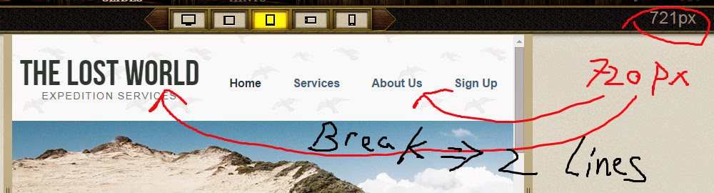
@media screen and (max-width: 720px){

  }
RESIZE H1
Use the media query you just wrote to make the <h1> font-size 70px, in ems, with a context of 16px. Also, set the line-height to the em equivalent of 40px.
@media screen and (max-width: 720px) {
  h1 {
    font-size: 4.375em;
    line-height: 0.571429em;
  }
}
FIX HEADER
Now, increase the <nav> <li>'s font-size to a target of 18px, with the context being 16px, Also, our .banner is getting rather large height-wise at this lower viewport. Let's set the height of the .banner to 250px.
@media screen and (max-width: 720px) {
  nav ul li {
    font-size: 1.125em;
  }
  .banner {
    height: 250px;
  }
}

 浙公网安备 33010602011771号