
[Vue] Basic a11y for our components
Appropriate types
In HTML we have a wide variety of input elements to craft our forms, but one element in particular rules them all. The catch-all input allows us the flexibility of creating text inputs, but we can also transform it into checkboxes and radio buttons with the type property.
A common mistake is to ignore this type property when creating text inputs. Most of us know and commonly use two regularly: type email and password.
When using a specific type in an input element, not only do we get better autocompletion for our form, but it also allows screen readers to better understand what type of data we want to retrieve from the user. A type of tel for example, will provide the user on a mobile phone with a handy numeric keyboard with phone symbols like + * #.
Your users with mobility problems will definitely be grateful for this one!
Bottom line: Don’t forget to set your type, even when the input is not of type password or email.
Here is a list of the available types for an input element:
- button
- checkbox
- color
- date
- datetime-local
- file
- hidden
- image
- month
- number
- password
- radio
- range
- reset
- search
- submit
- tel
- text
- time
- url
- week
Use Fieldset and Legend
Two often overlooked or under-taught elements in HTML are fieldset and legend.
In forms, usually we group our inputs logically. For example, you would usually code your form to first ask the user for their personal data like Name, Last Name, and Phone. Later on, another section may ask them for a shipping address.
For accessible users, this information may not be as immediately available without having to tab through the whole form, this is where <fieldset> and <legend> come to play.
You should always try to wrap up sections of your form inside a fieldset element. This will logically group the inputs inside of it. Then, the first element of the fieldset will be a legend element which will provide a Title for that particular fieldset.
If for some reason you don’t want the legend to show on your form (usually because of design reasons), you can always position it absolutely, outside of the visible screen.
For our current form in SimpleForm.vue, we can wrap up our logical sections inside fieldset like in the following example:
📃 SimpleForm.vue
<template>
  <div>
    <h1>Create an event</h1>
    <form @submit.prevent="sendForm">
      <BaseSelect
        :options="categories"
        v-model="event.category"
        label="Select a category"
      />

      <fieldset>
        <legend>Name & describe your event</legend>

        <BaseInput
          v-model="event.title"
          label="Title"
          type="text"
        />

        <BaseInput
          v-model="event.description"
          label="Description"
          type="text"
        />
      </fieldset>

      <fieldset>
        <legend>Where is your event?</legend>

        <BaseInput
          v-model="event.location"
          label="Location"
          type="text"
        />
      </fieldset>

      <fieldset>
        <legend>Pets</legend>

        <p>Are pets allowed?</p>
        <div>
          <BaseRadioGroup
            v-model="event.pets"
            name="pets"
            :options="petOptions"
          />
        </div>
      </fieldset>

      <fieldset>
        <legend>Extras</legend>
        <div>
          <BaseCheckbox
            v-model="event.extras.catering"
            label="Catering"
          />
        </div>

        <div>
          <BaseCheckbox
            v-model="event.extras.music"
            label="Live music"
          />
        </div>
      </fieldset>

      <button type="submit">Submit</button>
    </form>

    <pre>{{ event }}</pre>
  </div>
</template>
We can add a style tag to remove the default borders and margins, and to style the legend tags as we had the headers before.
📃 SimpleForm.vue
<style>
fieldset {
  border: 0;
  margin: 0;
  padding: 0;
}

legend {
  font-size: 28px;
  font-weight: 700;
  margin-top: 20px;
}
</style>
I’m going to use FireFox this time because it has a very nice accessibility inspector tool.
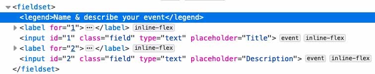
Checking the accessibility tab, you can see how now the logical grouping of our form will be understood by screen readers.
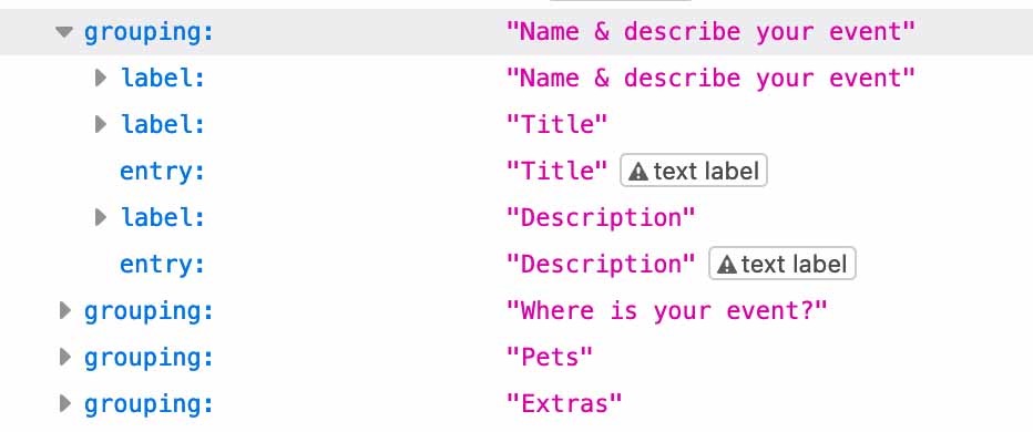
Do NOT rely on placeholders
A popular design pattern that emerged a few years ago used the placeholder attribute of inputs to describe the type of content that the element was expecting. Sadly this is still sometimes used now-a-days instead of a proper label.
Placeholders should only be used to describe the intended value, but not as a replacement for a descriptive label. Placeholders disappear whenever a user starts typing into the field, forcing the user to keep in mind what that field was expecting. Additionally, some users can have problems differentiating between a field with a placeholder and a field that has pre-populated or filled content.
As far as screen readers go, each screen reader may treat the placeholder attribute differently, but as long as a correctly set label is in place, it shouldn’t be much of a concern to leave it in.
Labels
Speaking about labels, let’s talk about a really powerful accessibility feature that is sadly very commonly underused, or misused, in forms.
If we navigate to FireFox again in the accessibility tab and inspect our Title input, we can see a ⚠️ icon right next to it. This means we have a problem.
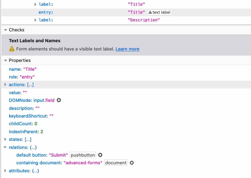
Let’s take a look at the information panel. The Checks section is already telling us the issue: “Form elements should have a visible text label”
This may come as a surprise, since our Title field clearly has a label on top of it describing what we intend for this input.
For our sighted users, however, this is not evident. We have not yet linked these two HTML elements together, and that is an assumption that a screen reader cannot afford to make. Thankfully this is a very easy fix!
There are a few ways to link an input element with its label, the first one is to actually nest the input inside of the label element.
<label>
  Title
  <input />
</label>
This is one of the easiest ways to make sure that your input is always correctly linked to the related label, but I want to go into depth into the second and usually more “common” way to relate HTML elements because it’s going to come in handy later when we look at error messages. This method involves using IDs.
Let’s jump directly into our BaseInput component and figure out how to create a relationship between our <label> and <input> by using an ID.
You may be thinking that perhaps the most obvious option would be to add a property, so that the parent can determine the id of the element, and then we don’t have to worry about it inside our component. And you would be right… But what if there were a way we could dynamically generate unique number identifiers for every component in our form without having to resort to manual props?
We are going to create a Vue 3 composable that allows us to create these dynamic unique identifiers, or UUIDs for short. I know this is a bit of a jump from the pace of the course, but if you need a refresher on Vue 3 composition API or composables we have a course titled Build a Gmail Clone with Vue 3 here on Vue Mastery to get you up to speed. At any rate, don’t worry too much, it’s going to be a really simple one.
If you’re following along with the repository files, I’ve gone ahead and created a UniqueID.js file inside the features folder. Let’s take a look.
📃 UniqueID.js
let UUID = 0

export default function UniqueID () {
  const getID = () => {
    UUID++
    return UUID
  }

  return {
    getID
  }
}
First we declare a let variable with a default value of 0. This will increase as we create more and more components - the first component will have an id of 1, the second of 2, and so on.
We are going to export a function UniqueID. When executed, this function will return an object, which contains a function under the property getID. This function will increase by 1 the global UUID counter and return it.
Know also that there are plenty of UUID libraries out there that you can use in place of this custom solution, but I wanted to show you just how easy it can be.
Let’s look at this in action to better understand it, by looking at BaseInput.vue.
First, we are going to import our new composable.
📃 BaseInput.vue
<script>
import UniqueID from '../features/UniqueID'
export default { ... }
</script>
Now that we have it ready, we can generate a new unique ID inside our component’s setup method. Let’s go ahead and do that.
📃 BaseInput.vue
<script>
import UniqueID from '../features/UniqueID'
export default {
  props: { ... },
  setup () {
    const uuid = UniqueID().getID()
    return {
      uuid
    }
  }
}
</script>
Notice that we are executing both the UniqueIDcomposable, and then the getID method inside. This will give us a completely unique ID number every time a component is instantiated.
Finally, we return an object with the uuid so that we can use it in our template.
Speaking of which, let’s go back into the template and tie the label and input together.
To accomplish this, we need to give the input element an id attribute value. We will bind the id to our uuid. After we have the input setup with its own unique ID, we can now tell the label that its describing the input by setting the for attribute of the label.
Note: All of these are vanilla HTML attributes, no crazy Vue magic here other than the ease of binding all of them.
📃 BaseInput.vue
<template>
<label :for="uuid" v-if="label">{{ label }}</label>
<input
v-bind="$attrs"
:value="modelValue"
:placeholder="label"
@input="$emit('update:modelValue', $event.target.value)"
class="field"
:id="uuid"
>
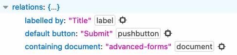
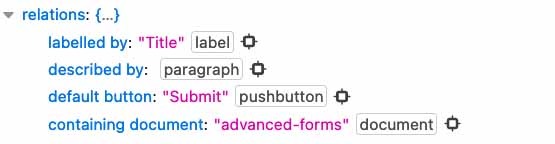
</template>Let’s head back to the browser. The first thing I want to point out to you is that the warning sign on our field is gone. And if we check under the bit where it says relations inside the accessible properties, we can see now that it shows a new entry: labelledby: "Title". If you hover over this element you can now see in the browser which element exactly its referring to. Neat, right?
Now, if we take a look at the inspector tab, and we look at our input elements, we can see that they have automatically been assigned ids 1 and 2, respectively.
We still need to add a uuid to our Checkbox, Radio, and Select components. Are you up for a challenge? Try doing this bit yourself. It will be as straightforward as replicating exactly what we just did here with BaseInput.
Accessible errors
Have you ever filled out a form just to hit the submit button and nothing seemed to work? It was clearly not submitting, and there was no visible error anywhere, yet something was clearly wrong. This situation is not foreign to most Internet users, but imagine the exasperation when you require accessible tools and the form doesn’t easily tell you what’s wrong with your inputs.
Let’s first go into our BaseInput.vue component and add a new prop, error, that will allow us to set a String with an error message in case the component is in an error state.
📃 BaseInput.vue
props: {
  label: {
    type: String,
    default: ''
  },
  modelValue: {
    type: [String, Number],
    default: ''
  },
  error: {
    type: String,
    default: ''
  }
},
We will display this error below our input field whenever an error is present, so if the error property is set to anything other than an empty string.
📃 BaseInput.vue
<template>
<label :for="uuid" v-if="label">{{ label }}</label>
<input
v-bind="$attrs"
:value="modelValue"
:placeholder="label"
@input="$emit('update:modelValue', $event.target.value)"
class="field"
:id="uuid"
>
<p
v-if="error"
class="errorMessage"
>
{{ error }}
</p>
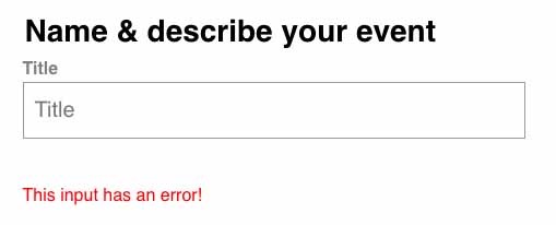
</template>We will also go back to SimpleForm.vue and add an error message to our “Title” input, so that we can see how it behaves on the browser. Note that we also added a class of errorMessage that will simply color it red.
📃 SimpleForm.vue
<BaseInput
  v-model="event.title"
  label="Title"
  type="text"
  error="This input has an error!"
/>
Now let’s look at the browser, the error is correctly displaying under the title once the error prop is set. Notice that the “Description” input which is also a BaseInput is displaying no error because the prop error is not set to anything.
If we open our Accessibility tab in Firefox once again and inspect the input element, we can see that there is nothing tying the error to the actual title input. This is where most forms fall short. Just because the error message is “near” the input doesn’t mean that a screen reader will be able to identify it as part of the error.
Luckily there is a straightforward solution to this problem: the aria-describedby attribute. This attribute allows us to declare directly on the input element which other elements describe it.
The attribute can take a string list of IDs for other HTML elements in the page, so first we’re going to add a unique ID to our label. Luckily, we already have a UUID number associated with the instance of the component to do it.
Let’s head back to BaseInput and add the id binding to the error p tag.
📃 BaseInput.vue
<p
  v-if="error"
  class="errorMessage"
  :id="`${uuid}-error`"
>
  {{ error }}
</p>
Notice that we are appending the -error string to the UUID. We need this identifier to be unique, and the UUID by itself is already in use by the input.
Now that our error message has a unique ID, we can set it as a “description” for the input element with the aria-describedby attribute.
📃 BaseInput.vue
<template>
  <label :for="uuid" v-if="label">{{ label }}</label>
  <input
    v-bind="$attrs"
    :value="modelValue"
    :placeholder="label"
    @input="$emit('update:modelValue', $event.target.value)"
    class="field"
    :id="uuid"
    :aria-describedby="error ? `${uuid}-error` : null"
  >
  <p
    v-if="error"
    class="errorMessage"
    :id="`${uuid}-error`"
  >
    {{ error }}
  </p>
</template>
Notice that we’re adding a secondary check to see if error is set. This allows us a bit of relationship hygiene between our elements — when no error is present, no error message will be displayed and the id will point to nothing.
If we check our browser again, we can see that when the error is present, a new described by entry is present in the input’s relationship object.
One more thing though… Because we are using v-if to display this information on and off, we want to make sure that screen readers announce/read it whenever it becomes displayed. To do this, we’re going to add an attribute of aria-live="assertive. Another way would be to add a role attribute of “alert”, but I’ve found that the aria-live tends to work better with a variety of screen readers.
📃 BaseInput.vue
<p
  v-if="error"
  class="errorMessage"
  :id="`${uuid}-error`"
  aria-live="assertive"
>
  {{ error }}
</p>
Explicit input state
Another thing we can quickly add to our input to make it even more accessible is the aria-invalid attribute. A mistake that I’ve seen many forms make is to try and rely on a red border around an invalid input. For obvious reasons, this is not accessible.
We’ve already taken steps into accessible errors, but let’s make sure to also notify screen readers on the invalid state of an input to provide better feedback for our users.
We are going to add the aria-invalid attribute to our input, and toggle it off and on depending on whether the error prop is set. When the input is valid, null will make it so that the attribute is not added to the input element.
📃 BaseInput.vue
<input
v-bind="$attrs"
:value="modelValue"
:placeholder="label"
@input="$emit('update:modelValue', $event.target.value)"
class="field"
:id="uuid"
:aria-describedby="error ? `${uuid}-error` : null"
:aria-invalid="error ? true : null"
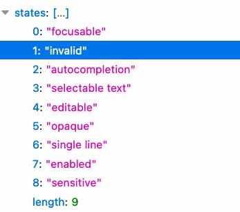
>If we go back to the browser and inspect the input using the Accessibility tool on Firefox, we can see that the state of “invalid” has now been added to the active states of the input.
Other noteworthy states that we could also add attributes for are readonly, disabled and required. These three can be set directly with HTML5 attributes of the same name, or with their aria counterparts: aria-readonly, aria-disabled, and aria-required.
Don’t disable the submit button
If a form is not valid, then it makes sense to set the disabled attribute to true on the submit button so that the user can’t submit the form, right? We can even style the button with a different color to convey that it won’t be clickable.
There’s a big problem with this though. Users that rely on screen readers will not get any feedback at all, the button will be completely ignored by the screen reader when tabbing through the form. This clearly can be very confusing and frustrating.
I suggest instead that you make any and all checks to make sure your form is valid before submitting it on the sendForm method that we created on the SimpleForm component. If everything checks out, we submit the form normally.
If something is wrong, then set the necessary errors in your form with the tools that we just learned to notify the user that something is wrong.

 浙公网安备 33010602011771号