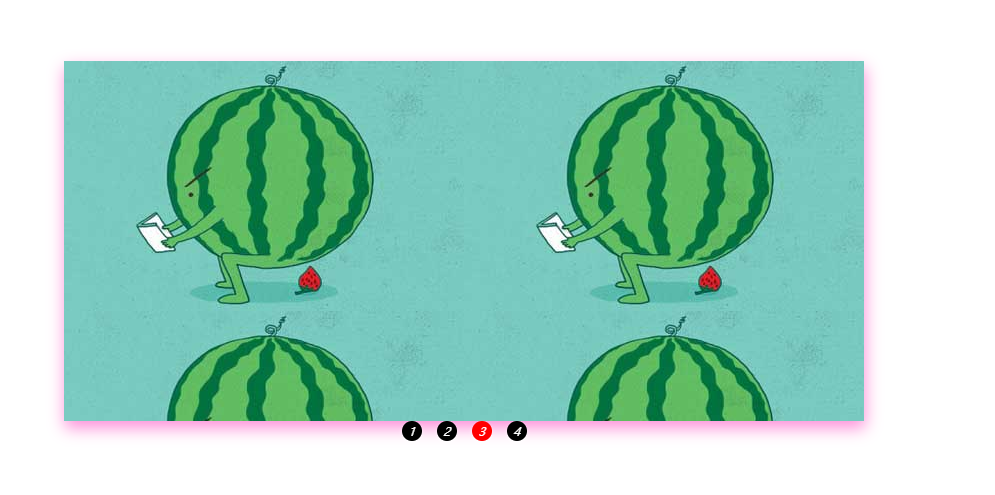
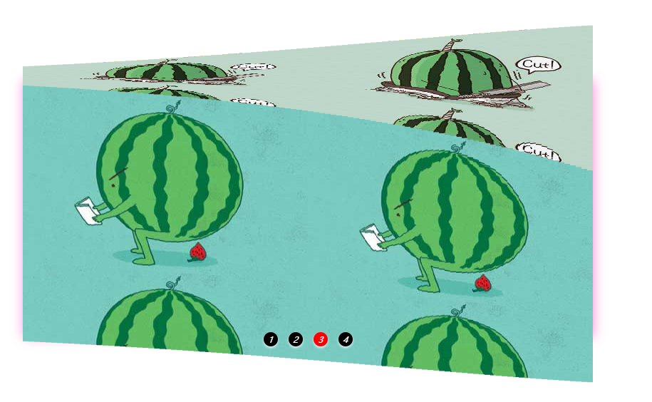
3D轮播图
demo.html
<!DOCTYPE html>
<html lang="en">
<head>
<meta charset="UTF-8">
<meta name="viewport" content="width=device-width, initial-scale=1.0">
<meta http-equiv="X-UA-Compatible" content="ie=edge">
<title>Document</title>
<style>
* {
margin: 0;
padding: 0;
}
li {
list-style: none;
}
.solid {
width: 800px;
height: 360px;
margin: 150px auto 0;
box-shadow: 1px 7px 25px #fd8fd9;
}
.solid ul {
height: 100%;
}
.solid ul li {
position: relative;
float: left;
box-sizing: border-box;
transform-style: preserve-3d;
transform: translateZ(-180px);
}
.solid ul li div {
position: absolute;
width: 100%;
height: 100%;
}
.solid ul li div:nth-child(1) {
top: -360px;
background: url('./img/02.jpg');
transform-origin: bottom;
transform: translateZ(180px) rotateX(90deg);
}
.solid ul li div:nth-child(2) {
top: 360px;
background: url('./img/01.jpg');
transform-origin: top;
transform: translateZ(180px) rotateX(-90deg);
}
.solid ul li div:nth-child(3) {
background: url('./img/03.jpg');
transform: translateZ(180px);
}
.solid ul li div:nth-child(4) {
background: url('./img/04.jpg');
transform: translateZ(-180px) rotateX(180deg);
}
.solid ol {
position: absolute;
left: 50%;
width: 140px;
height: 20px;
transform: translateX(-50%);
display: flex;
justify-content: space-around;
}
.solid ol li {
width: 20px;
height: 20px;
background: black;
box-shadow: 0 2px 5px white;
border-radius: 50%;
color: white;
text-align: center;
/*斜体 12px大小/20px行高*/
font: italic 12px/20px 'Microsoft Yahei';
cursor: pointer;
}
.solid ol li.on {
background: red;
}
</style>
</head>
<body>
<div class="solid">
<ul class="oUl"></ul>
<ol>
<li class="on">1</li>
<li>2</li>
<li>3</li>
<li>4</li>
</ol>
</div>
<script src="./demo.js"></script>
</body>
</html>
demo.js
var solid = document.getElementsByClassName('solid')[0];
var btn = document.querySelectorAll('ol li');
var oUl = document.getElementsByClassName('oUl')[0];
var css = document.getElementsByTagName('style')[0];
var timer, n = 0;
createDom();
function createDom() {
var num = 100, uHTML = '', pHTML = '', tHTML = '';
var allWidth = parseInt(getComputedStyle(solid, null).width);
var width = allWidth / num;
for (var i = 0; i < num; i++) {
uHTML += '<li><div></div><div></div><div></div><div></div></li>';
pHTML += '.solid ul li:nth-child(' + (i + 1) + ') div{background-position-x: ' + (-i*width) + 'px;}';
tHTML += '.solid ul li:nth-child(' + (i + 1) + '){transition: 0.8s ' + (0.3 * i / num) + 's}';
}
oUl.innerHTML = uHTML;
css.innerHTML += pHTML + tHTML + '.solid ul li, .solid ul li div{width:' + width + 'px;height:100%}';
bindEvent();
play();
}
function bindEvent() {
for (var i = 0; i < btn.length; i++) {
btn[i].index = i;
btn[i].onclick = function () {
n = this.index;
for (var i = 0; i < btn.length; i++) {
btn[i].className = '';
}
this.className = 'on';
css.innerHTML += '.solid ul li{transform: translateZ(-180px) rotateX(' + (n * 90) + 'deg);}';
}
};
solid.onmouseenter = function () {
clearInterval(timer);
};
solid.onmouseleave = function () {
play();
};
}
function play() {
clearInterval(timer);
timer = setInterval(function () {
n++;
n %= 4;
for (var i = 0; i < btn.length; i++) {
btn[i].className = '';
}
btn[n].className = 'on';
css.innerHTML += '.solid ul li{transform: translateZ(-180px) rotateX(' + (n * 90) + 'deg);}';
}, 4000);
}
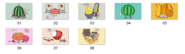
img文件夹
运行结果

 浙公网安备 33010602011771号