推荐一个优秀的 .NET MAUI 组件库
前言
.NET MAUI 的发布,项目中可以使用这个新的跨平台 UI 框架来轻松搭建的移动和桌面应用。
为了帮助大家更快地构建美观且功能丰富的应用,本文将推荐一款优秀的 .NET MAUI 组件库MDC-MAUI,它不仅提供了丰富的 UI 组件,而且易于集成和使用。
通过本文的介绍,希望能够帮助大家在开发过程中节省时间并提升应用的用户体验。
组件介绍
MDC-MAUI 是一个专为 .NET MAUI 开发的组件库,为每个平台提供一致的视觉效果。
该库开箱即用,提供了丰富的 UI 组件,包括按钮、卡片、导航、开关、进度条等,可以帮助我们快速构建美观且功能丰富的应用。
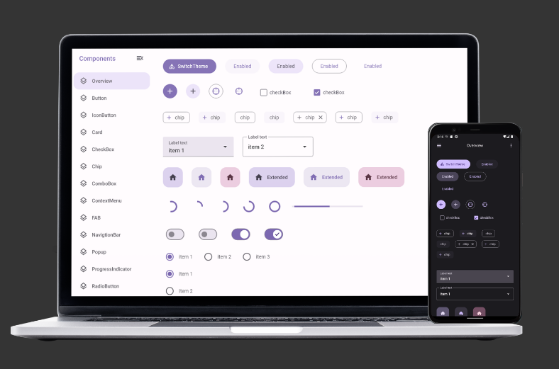
组件展示
布局
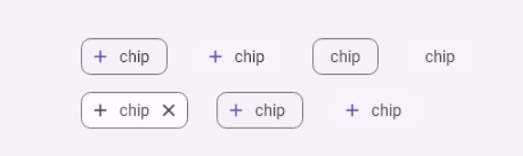
1、WrapLayout
WrapLayout 是一种布局容器,允许根据 Orientation 属性将项目排列成行或列。当空间被填满时,容器会自动将项目换行到新的一行或一列。
2、示例代码
 <md:WrapLayout Orientation="Horizontal">
     <md:Chip IconData="{Static icon:Material.Add}" Text="chip" />
     <md:Chip IconData="{Static icon:Material.Add}" Text="chip" />
     <md:Chip IconData="{Static icon:Material.Add}" Text="chip" />
     <md:Chip IconData="{Static icon:Material.Add}" Text="chip" />
     <md:Chip IconData="{Static icon:Material.Add}" Text="chip" />
     <md:Chip IconData="{Static icon:Material.Add}" Text="chip" />
     <md:Chip IconData="{Static icon:Material.Add}" Text="chip" />
 </md:WrapLayout>
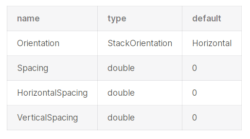
3、属性
按钮
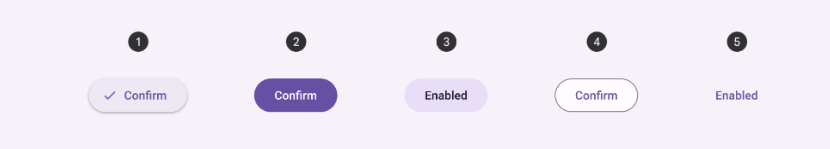
1、Button
常用按钮触发 UI 中的大多数操作。
提供五种样式:填充按钮(Filled)、凸起按钮(Elevated)、填充色调按钮(Filled Tonal)、边框按钮(Outlined)和文本按钮(Text)。
2、代码示例
<md:Button Style="{DynamicResource ElevatedButtonStyle}" Text="Elevated" />
<md:Button Style="{DynamicResource FilledButtonStyle}" Text="Filled" />
<md:Button Style="{DynamicResource FilledTonalButtonStyle}" Text="FilledTonal" />
<md:Button Style="{DynamicResource OutlinedButtonStyle}" Text="Outlined" />
<md:Button Style="{StaticResource TextButtonStyle}" Text="Text" />
复选框
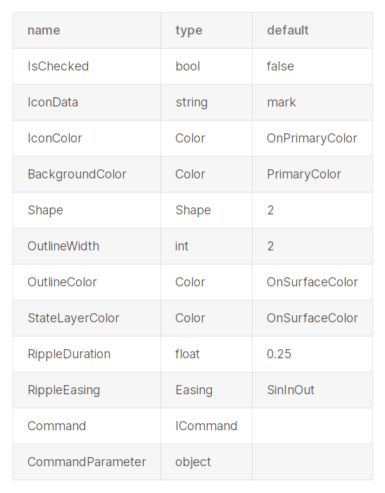
1、CheckBox
CheckBox允许用户从列表中选择一个或多个项目,或者开启或关闭某个项目。
2、代码示例
<mdc:CheckBox Text="checkbox" />
3、属性
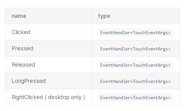
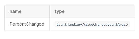
4、事件
进度条
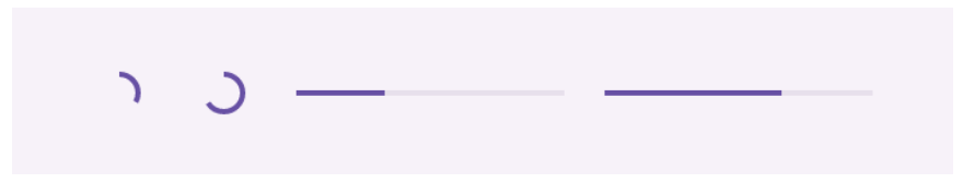
1、ProgressIndicator
进度指示器实时显示流程的状态。
2、代码示例
<md:ProgressIndicator Style="{DynamicResource CircularProgressIndicatorStyle}" />
<md:ProgressIndicator Style="{DynamicResource LinearProgressIndicatorStyle}" />
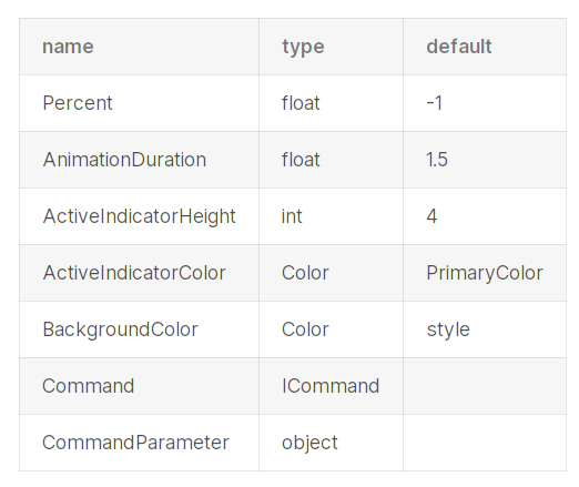
3、属性
4、事件
导航栏
1、NavigationBar
导航栏允许用户在较小的设备上切换 UI 视图。

2、代码示例
<...
 xmlns:icon="clr-namespace:IconPacks.IconKind;assembly=IconPacks.Material"
...>

<mdc:FAB IconData="{Static icon:Material.Star}" Style="{DynamicResource SecondaryFABStyle}" />

<mdc:NavigationBar>
    <mdc:NavigationBarItem IconData="{Static icon:Material.Star}" Text="label 1">
  ...
 </mdc:NavigationBarItem>
    <mdc:NavigationBarItem IconData="{Static icon:Material.Star}" Text="label 2">
  ...
 </mdc:NavigationBarItem>
</mdc:NavigationBar>
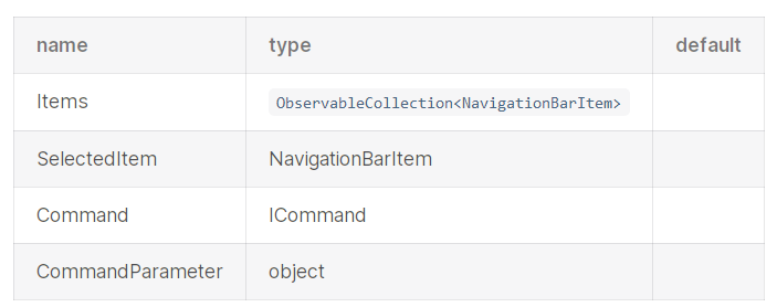
3、属性
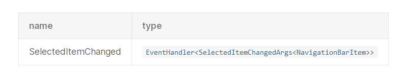
4、事件
还有很多组件,大家如果有需要可以访问在线文档(https://mdc-maui.github.io/ )学习和参考,包括组件介绍、代码示例、属性以及事件等。
组件地址
- Github
https://github.com/mdc-maui/mdc-maui
- 文档地址
https://mdc-maui.github.io/
最后
如果你觉得这篇文章对你有帮助,不妨点个赞支持一下!你的支持是我继续分享知识的动力。如果有任何疑问或需要进一步的帮助,欢迎随时留言。也可以加入微信公众号 [DotNet技术匠] 社区,与其他热爱技术的同行一起交流心得,共同成长!


 浙公网安备 33010602011771号