
CSS3简单画出3d图形
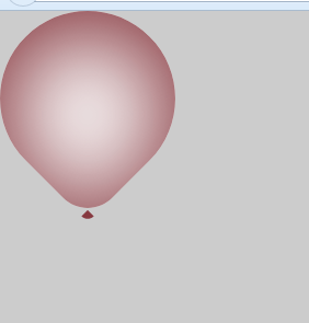
1、气球
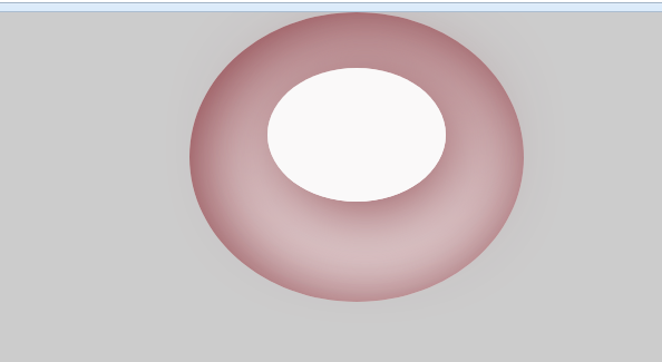
2、泳圈
1、2两图实现代码分别如下:
<html>
<head>
<meta charset="utf-8">
<meta http-equiv="X-UA-Compatible" content="IE=edge,chrome=1">
<title>气球特效</title>
<meta name="description" content="">
<meta name="keywords" content="">
<link href="" rel="stylesheet">
<style type="text/css">
    *{margin:0;padding: 0;}
    body{position: relative; overflow: hidden; background: #ccc;}
    .balloon{
        display: inline-block;
        position: absolute;
        width: 160px;
        height: 160px;
        background: #faf9f9;
        border-radius: 160px 160px 64px 160px;
        transform:rotate(45deg);
        /*        盒子阴影  纵向移动 横向移动 羽化 半径  颜色  内外切换*/
        box-shadow:8px 8px 80px 8px #873940 inset;
    }
    .balloon::after{
        position: absolute;
        bottom: 0;
        right: 0;
        content:'';
        width: 0;
        height: 0;
        border:8px solid transparent;
        border-right-color:#873940;
        transform: rotate(45deg);
        border-radius: 16px;

    }
</style>
</head>
<body>
    <div class="balloon"></div>
</body>
</html>
<!DOCTYPE html>
<html>
<head>
<meta charset="utf-8">
<meta http-equiv="X-UA-Compatible" content="IE=edge,chrome=1">
<title>游泳圈静态</title>
<meta name="description" content="">
<meta name="keywords" content="">
<link href="" rel="stylesheet">
<style type="text/css">
    *{margin:0;padding: 0;}
    body{position: relative; overflow: hidden; background: #ccc;}

    .youyongquan{
        position: relative;
        width: 200px;
        height: 160px;
        padding: 50px 50px 50px 50px;
        margin:0 auto;
        background: #faf9f9;
        border-radius: 50% 50% 50% 50%;
        box-shadow:8px 8px 80px 8px #873940 inset;
    }
    .quan2{
        width: 160px;
        height: 120px;
        margin:0 auto;
        background: #faf9f9;
        border-radius: 50% 50% 50% 50%;
        box-shadow:8px 8px 80px 8px #873940;
    }
</style>
</head>
<body>
    <div class="youyongquan">
        <div class="quan2"></div>
    </div>
</body>
</html>

 浙公网安备 33010602011771号