弹性布局 骰子
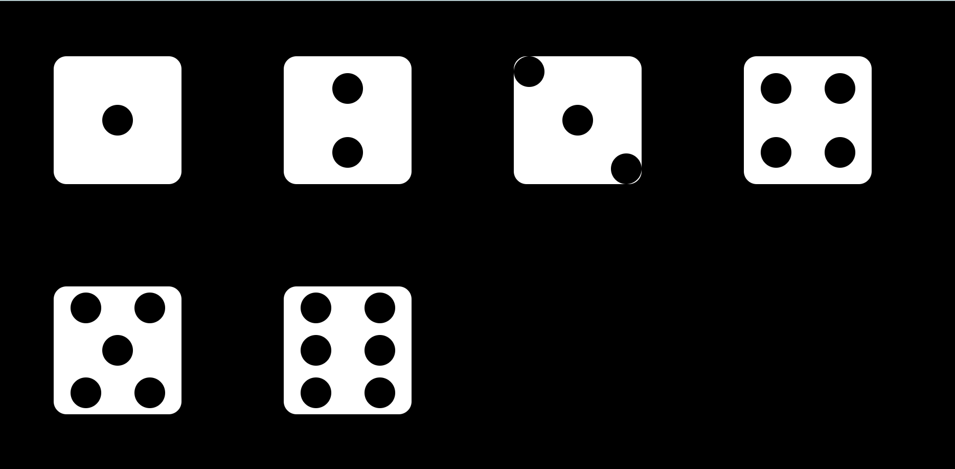
骰子一到六
| 决定主轴的排列方式 | |
| display:flex; | 给父级加让父级变为容器 |
| flex-direction:row;(默认值) | 向左对齐(默认) |
| flex-direction:row-reverse; | 向右对齐 |
| flex-direction:column; | 垂直排列 |
| flex-direction:column-reverse; | 从下往上垂直排列 |
| 决定子元素在主轴上的对齐方式 | |
| justify-content:flex-start;(默认值) | 子元素向左对齐 |
| justify-content:flex-end; | 子元素向右对齐 |
| justify-content:center; | 子元素居中 |
| justify-content:space-between; | 子元素分散开 |
| justify-content:space-around; | 子元素在在父级不那么分散 |
| justify-content:space-evenly; | 子元素在在父级不那么分散 |

  1 <!DOCTYPE html>
  2 <html lang="en">
  3 <head>
  4     <meta charset="UTF-8">
  5     <title>弹性布局</title>
  6 </head>
  7 <style>
  8     .b{
  9         width: 250px;
 10         height: 250px;
 11         background-color: white;
 12         display: flex;
 13         margin: 100px;
 14         border-radius: 25px;
 15     }
 16     body{
 17         width: 100%;
 18         height: 100%;
 19         background-color: black;
 20         display: flex;
 21         flex-wrap: wrap;
 22     }
 23     .a{
 24         border-radius: 50%;
 25         width: 60px;
 26         height: 60px;
 27         background-color: black;
 28     }
 29 </style>
 30 <body>
 31 <!--    一 -->
 32 <!--            justify-content: center:水平居中    align-items: center:垂直居中-->
 33         <div class="b" style="justify-content: center;align-items: center">
 34
 35             <div class="a"></div>
 36         </div>
 37 <!--        二-->
 38 <!--           justify-content: space-around:分散开留有空隙    flex-direction:column:竖起来     align-items: center:上下居中-->
 39         <div class="b" style="justify-content: space-around;flex-direction:column;align-items: center;">
 40             <div class="a"></div>
 41             <div class="a"></div>
 42         </div>
 43 <!--        三-->
 44 <!--            justify-content: space-between:分散开不留空隙-->
 45         <div class="b" style="justify-content: space-between">
 46             <div class="a"></div>
 47 <!--            align-self: center:子元素设置居中-->
 48             <div class="a" style="align-self: center";></div>
 49 <!--            align-self: flex-end:子元素向右对齐-->
 50             <div class="a" style="align-self: flex-end";></div>
 51         </div>
 52 <!--        四-->
 53 <!--            flex-direction:column :竖起来      justify-content:space-around :分散开留空隙-->
 54         <div class="b" style="flex-direction:column; justify-content: space-around;">
 55 <!--            justify-content:space-around :分散开留空隙-->
 56            <div style="justify-content:space-around; display: flex">
 57                <div class="a" ></div>
 58                <div class="a"></div>
 59            </div>
 60 <!--            justify-content:space-around :分散开留有空隙-->
 61            <div style="justify-content:space-around; display: flex">
 62                <div class="a"></div>
 63                <div class="a"></div>
 64            </div>
 65         </div>
 66 <!--        五-->
 67 <!--            flex-direction:column :竖起来      justify-content:space-around :分散开留有空隙-->
 68         <div class="b" style="flex-direction:column; justify-content: space-around;">
 69 <!--            justify-content:space-around :分散开留有空隙-->
 70             <div style="justify-content:space-around; display: flex">
 71                 <div class="a" ></div>
 72                 <div class="a"></div>
 73             </div>
 74 <!--            align-self:center :上下居中-->
 75             <div class="a" style="align-self: center";></div>
 76 <!--            jystify-content:space-aroumd :分散开留有空隙-->
 77             <div style="justify-content:space-around; display: flex">
 78                 <div class="a"></div>
 79                 <div class="a"></div>
 80             </div>
 81
 82         </div>
 83 <!--    六-->
 84 <!--            flex-direction:column :竖起来  justify-conent:space-around :分散开留有空隙-->
 85 <div class="b" style="flex-direction:column; justify-content: space-around;">
 86 <!--    justify-content:space-around :分散开-->
 87     <div style="justify-content:space-around; display: flex">
 88         <div class="a" ></div>
 89         <div class="a"></div>
 90     </div>
 91     <!--    justify-content:space-around :分散开-->
 92     <div style="justify-content:space-around; display: flex">
 93         <div class="a"></div>
 94         <div class="a"></div>
 95     </div>
 96     <!--    justify-content:space-around :分散开-->
 97     <div style="justify-content:space-around; display: flex">
 98         <div class="a"></div>
 99         <div class="a"></div>
100     </div>
101
102 </div>
103
104 </body>
105 </html>
效果:


【推荐】国内首个AI IDE,深度理解中文开发场景,立即下载体验Trae
【推荐】编程新体验,更懂你的AI,立即体验豆包MarsCode编程助手
【推荐】抖音旗下AI助手豆包,你的智能百科全书,全免费不限次数
【推荐】轻量又高性能的 SSH 工具 IShell:AI 加持,快人一步
· 阿里最新开源QwQ-32B,效果媲美deepseek-r1满血版,部署成本又又又降低了!
· 开源Multi-agent AI智能体框架aevatar.ai,欢迎大家贡献代码
· Manus重磅发布:全球首款通用AI代理技术深度解析与实战指南
· 被坑几百块钱后,我竟然真的恢复了删除的微信聊天记录!
· AI技术革命,工作效率10个最佳AI工具