
clip-path
chip-path
clip-path属性使用裁剪方式创建元素的可显示区域。区域内的部分显示,区域外的隐藏。可以指定一些特殊形状。
语法: clip: clip-source|basic-shape|margin-box|border-box|padding-box|content-box|fill-box|stroke-box|view-box|none|initial|inherit;
| 属性 | 描述 |
|
clip-source |
用 URL 表示剪切元素的路径 |
| basic-shape | 将元素裁剪为基本形状:圆形、椭圆形、多边形或插图 |
| margin-box | 使用外边距框作为引用框 |
| border-box | 使用边框作为引用框 |
| padding-box | 使用内边距框作为引用框 |
| content-box | 使用内容框作为引用框 |
| fill-box | 使用对象边界框作为引用框 |
| stroke-box | 使用笔触边界框(stroke bounding box)作为引用框 |
| view-box | 使用最近的 SVG 视口(viewport)作为引用框 |
| none | 这是默认设置。 没有剪辑 |
| initial | 设置属性为默认值 |
| inherit | 属性值从父元素 |
clip-source
我们可以使用clip-source,使元素按照我们想要的样子裁剪。
basic-shape
它分为好几种类型:circle 、inset、ellipse、polygon
注:特别需要注意的是,clip-path在剪切基本图形时,需要用到inset()、circle()、polygon()、ellipse()这些函数的时候,其中所有需要的坐标所在的参考系,均是被剪切元素本身。
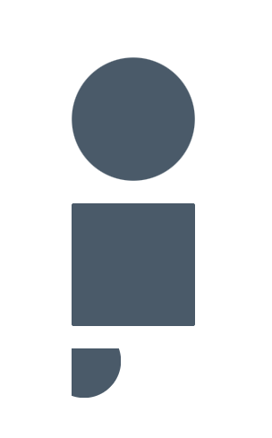
circle
- 值为一个坐标点和半径组成。
- 左上角为原点,右下角是(100%,100%)的点。
- 定义半径的时候可以用at关键字来定义坐标。

<!DOCTYPE html>
<html lang="en">
<head>
    <meta charset="UTF-8">
    <title>Title</title>
    <style>
        body {
            background-color: #fff;
        }

        .fa {
            border: 1px solid #fff;
            color: #4A5A69;
            padding: 10px;
            margin: 10px;
        }

        .fa>div {
            width: 110px;
            height: 110px;
            background-color: #4A5A69;
            margin: 20px auto;
        }

        .circle1 {
            clip-path: circle(50% at 50% 50%)
        }

        .circle2 {
            clip-path: circle(70% at 50% 50%)
        }

        .circle3 {
            clip-path: circle(30% at 10% 10%)
        }

    </style>
</head>
<body>
<div class="fa">
<div class="circle1"></div>
<div class="circle2"></div>
<div class="circle3"></div>
</div>


</body>
</html>
效果如下:
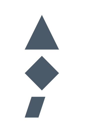
polygon
- 值为多个坐标点组成,坐标第一个值是x方向,第二个值是y方向。
- 左上角为原点,右下角是(100%,100%)的点。

<!DOCTYPE html>
<html lang="en">
<head>
    <meta charset="UTF-8">
    <title>Title</title>
    <style>
        body {
            background-color: #fff;
        }

        .fa {
            border: 1px solid #fff;
            color: #4A5A69;
            padding: 10px;
            margin: 10px;
        }

        .fa>div {
            width: 110px;
            height: 110px;
            background-color: #4A5A69;
            margin: 20px auto;
        }

        .polygon1 {
            clip-path: polygon(50% 0px, 100% 100%, 0px 100%)
        }

        .polygon2 {
            clip-path: polygon(0px 50%, 50% 0, 100% 50%, 50% 100%)
        }

        .polygon3 {
            clip-path: polygon(0% 60%, 20% 0%, 60% 0%, 40% 60%)
        }

    </style>
</head>
<body>
<div class="fa">
<div class="polygon1"></div>
<div class="polygon2"></div>
<div class="polygon3"></div>
</div>

</body>
</html>
效果如下:
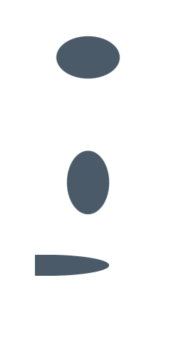
ellipse
- 值为椭圆的x轴半径,y轴半径,定位椭圆的坐标三部分组成。
- 左上角为原点,右下角是(100%,100%)的点。
- at关键字将半径和坐标分开
<!DOCTYPE html>
<html lang="en">
<head>
    <meta charset="UTF-8">
    <title>Title</title>
    <style>
        body {
            background-color: #fff;
        }

        .fa {
            border: 1px solid #fff;
            color: #4A5A69;
            padding: 10px;
            margin: 10px;
        }

        .fa>div {
            width: 110px;
            height: 110px;
            background-color: #4A5A69;
            margin: 20px auto;
        }

        .ellipse1 {
            clip-path: ellipse(30% 20% at 50% 50%)
        }

        .ellipse2 {
            clip-path: ellipse(20% 30% at 50% 50%)
        }

        .ellipse3 {
            clip-path: ellipse(60% 10% at 10% 10%)
        }

    </style>
</head>
<body>
<div class="fa">
<div class="ellipse1"></div>
<div class="ellipse2"></div>
<div class="ellipse3"></div>
</div>


</body>
</html>
效果如下:
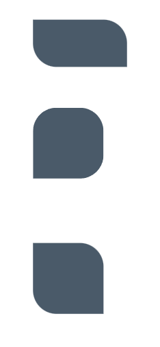
inset
- 值为(上 右 下 左 round 左上角radius 右上角radius 右下角radius 左下角radius)
- round前面的数值,表示的是距离,如果第一个值为25%,则表示图像在上面从25%开始绘制。
<!DOCTYPE html>
<html lang="en">
<head>
    <meta charset="UTF-8">
    <title>Title</title>
    <style>
        body {
            background-color: #fff;
        }

        .fa {
            border: 1px solid #fff;
            color: #4A5A69;
            padding: 10px;
            margin: 10px;
        }

        .fa>div {
            width: 110px;
            height: 110px;
            background-color: #4A5A69;
            margin: 20px auto;
        }

        .inset1 {
            clip-path: inset(25% 0% 25% 0% round 0% 25% 0% 25%)
        }

        .inset2 {
            clip-path: inset(0% 25% 25% 0% round 25% 25% 25% 0%)
        }

        .inset3 {
            clip-path: inset(25% 25% 0% 0% round 0% 25% 0% 25%)
        }

    </style>
</head>
<body>
<div class="fa">
<div class="inset1"></div>
<div class="inset2"></div>
<div class="inset3"></div>
</div>

</body>
</html>
效果如下:


【推荐】国内首个AI IDE,深度理解中文开发场景,立即下载体验Trae
【推荐】编程新体验,更懂你的AI,立即体验豆包MarsCode编程助手
【推荐】抖音旗下AI助手豆包,你的智能百科全书,全免费不限次数
【推荐】轻量又高性能的 SSH 工具 IShell:AI 加持,快人一步
· TypeScript + Deepseek 打造卜卦网站:技术与玄学的结合
· Manus的开源复刻OpenManus初探
· AI 智能体引爆开源社区「GitHub 热点速览」
· 三行代码完成国际化适配,妙~啊~
· .NET Core 中如何实现缓存的预热?