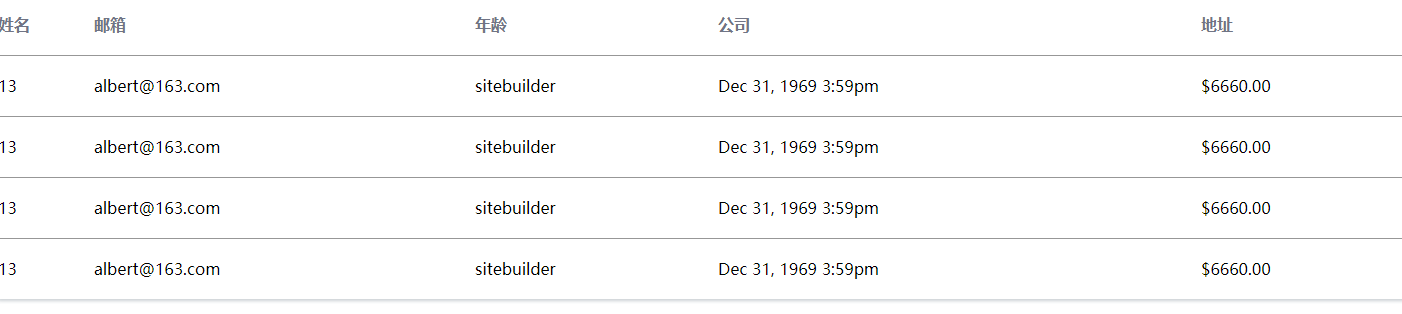
方式1:
效果:
![]()
<!DOCTYPE html>
<html>
    <head>
        <meta charset="utf-8">
         <meta name="viewport" content="width=device-width, initial-scale=1">
        <style type="text/css">
            .customer-page {
                background: #FFFFFF;
                box-shadow: 0 2px 4px 0 rgba(147, 157, 165, 0.48);
                text-align: center;
            }

            .customer-page-table {
                display: table;
                width: 100%;
            }

            .table-row {
                display: table-row;
            }

            .item-content {
                display: table-cell;
            }

            .table-row.header .item-content {
                font-weight: 600;
                color: #707485;
            }

            .table-row:not(:last-child) .item-content {
                border-bottom: 1px solid #979797;
            }

            .table-row .item-content {
                height: 60px;
                text-align: left;
                line-height: 60px;
            }

            @media screen and (max-width: 500px) {

                .customer-page-tabl {
                    display: inline;
                }

                .table-row {
                    border: 1px solid #ddd;
                    margin-bottom: 10px;
                    display: block;
                    border-bottom: 2px solid #ddd;
                }

                .table-row.header {
                    display: none;
                }

                .table-row .item-content {
                    display: block;
                    text-align: right;
                    font-size: 13px;
                    border-bottom: 1px dotted #ccc;
                    height: 50px;
                    line-height: 50px;
                    padding: 0 10px;
                }

                .table-row .item-content:last-child {
                    border-bottom: 0;
                }

                .table-row .item-content:before {
                    content: attr(data-label);
                    float: left;
                    text-transform: uppercase;
                    font-weight: bold;
                }
            }
        </style>
        <title>DIV+CSS实现自适应表格布局</title>
    </head>
    <body>
        <div class="customer-page">

            <div class="customer-page-table">
                <div class="table-row header">
                    <div class="item-content">姓名</div>
                    <div class="item-content">邮箱</div>
                    <div class="item-content">年龄</div>
                    <div class="item-content">公司</div>
                    <div class="item-content">地址</div>
                </div>
                <div class="table-row body-row" data-id="13">
                    <div data-label="年龄" class="item-content">13</div>
                    <div data-label="邮箱" class="item-content">albert@163.com</div>
                    <div data-label="姓名" class="item-content">sitebuilder</div>
                    <div data-label="公司" class="item-content">Dec 31, 1969 3:59pm</div>
                    <div data-label="地址" class="item-content">$6660.00</div>
                </div>

            </div>
        </div>

    </body>
</html>
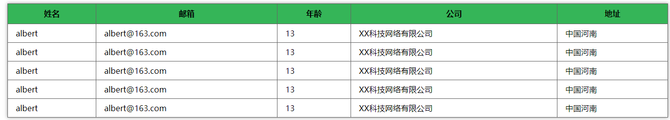
方式二:
效果:
![]()
代码:
<!DOCTYPE html>
<html>
    <head>
        <meta charset="utf-8">
        <meta name="viewport" content="width=device-width, initial-scale=1">
        <style type="text/css">
            table.responsive{
                width:98%;
                margin: 0 auto;
                color: #000;
                border-collapse: collapse;
                border: 1px solid #666666;
                box-shadow: 0 0 10px rgba(0, 0, 0, 0.4);
            }
            table.responsive td,table.responsive th{
                border: 1px solid #666666;
                padding: .5em 1em;
            }
            table.responsive th {
                background: #35B558;
                height: 24px;
                line-height: 24px;
            }
            @media (max-width:480px){
                table.responsive thead {
                    display: none;
                }
                table.responsive tr, table.responsive td {
                    display: block;
                }
                table.responsive td{
                    padding-left: 25%;
                }
                table.responsive td:nth-child(1)::before {
                    content:'姓名';
                    position: absolute;
                    left: .5em;
                    font-weight: bold;
                }
                table.responsive td:nth-child(2)::before {
                    content:'邮箱';
                    position: absolute;
                    left: .5em;
                    font-weight: bold;
                }
                table.responsive td:nth-child(3)::before {
                    content:'年龄';
                    position: absolute;
                    left: .5em;
                    font-weight: bold;
                }
                table.responsive td:nth-child(4)::before {
                    content:'公司';
                    position: absolute;
                    left: .5em;
                    font-weight: bold;
                }
                table.responsive td:nth-child(5)::before {
                    content:'地址';
                    position: absolute;
                    left: .5em;
                    font-weight: bold;
                }
                table.responsive tr {
                    position: relative;
                    margin-bottom: 1em;
                    box-shadow: 0 1px 10px rgba(0, 0, 0, 0.2);
                }

            }

        </style>
        <title>DIV+CSS实现自适应表格布局</title>
    </head>
    <body>
        <table class="responsive">
            <thead>
                <tr>
                    <th>姓名</th>
                    <th>邮箱</th>
                    <th>年龄</th>
                    <th>公司</th>
                    <th>地址</th>
                </tr>
            </thead>
            <tbody>
                <tr>
                    <td class="name">albert</td>
                    <td class="email">albert@163.com</td>
                    <td class="age">13</td>
                    <td class="company">XX科技网络有限公司</td>
                    <td class="addres">中国河南</td>
                </tr>
                <tr>
                    <td class="name">albert</td>
                    <td class="email">albert@163.com</td>
                    <td class="age">13</td>
                    <td class="company">XX科技网络有限公司</td>
                    <td class="addres">中国河南</td>
                </tr>
                <tr>
                    <td class="name">albert</td>
                    <td class="email">albert@163.com</td>
                    <td class="age">13</td>
                    <td class="company">XX科技网络有限公司</td>
                    <td class="addres">中国河南</td>
                </tr>
                <tr>
                    <td class="name">albert</td>
                    <td class="email">albert@163.com</td>
                    <td class="age">13</td>
                    <td class="company">XX科技网络有限公司</td>
                    <td class="addres">中国河南</td>
                </tr>
                <tr>
                    <td class="name">albert</td>
                    <td class="email">albert@163.com</td>
                    <td class="age">13</td>
                    <td class="company">XX科技网络有限公司</td>
                    <td class="addres">中国河南</td>
                </tr>
            </tbody>
        </table>

    </body>
</html>

 浙公网安备 33010602011771号