

弹性盒模型超详细讲解
一.弹性盒模型排列
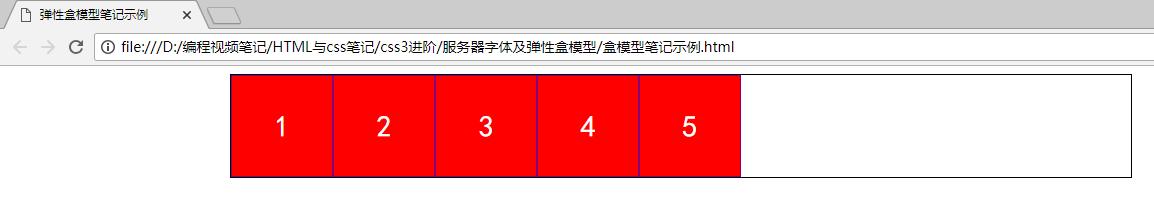
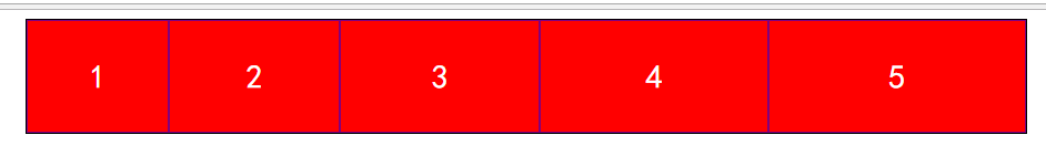
首先我们看一个普通盒子:
 1 <!DOCTYPE html>
 2 <html lang="en">
 3 <head>
 4     <meta charset="UTF-8">
 5     <title>弹性盒模型笔记示例</title>
 6     <style type="text/css">
 7         #box{
 8             width: 900px;
 9             margin:0 auto;
10             border: 1px solid #000;
11         }
12         #box div{
13             width: 100px;
14             height: 100px;
15             background:red;
16             text-align: center;
17             font: 30px/100px "simhei";
18             border:1px solid purple;
19             color: #fff;
20         }
21     </style>
22 </head>
23 <body>
24     <div id="box">
25         <div>1</div>
26         <div>2</div>
27         <div>3</div>
28         <div>4</div>
29         <div>5</div>
30     </div>
31 </body>
32 </html>
效果:
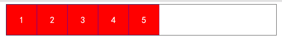
 可以看出我们是垂直的,若想水平可用浮动,加隐藏溢出清浮动,那么弹性盒模型怎么实现呢?
我们必须在父级中建立弹性盒模型
 1 <!DOCTYPE html>
 2 <html lang="en">
 3 <head>
 4     <meta charset="UTF-8">
 5     <title>弹性盒模型笔记示例</title>
 6     <style type="text/css">
 7         #box{
 8             width: 900px;
 9             margin:0 auto;
10             border: 1px solid #000;
11             display: -webkit-box;/*需要在父级中建立弹性盒模型*/
12             -webkit-box-pack:start;/*左排列*/
13             /*-webkit-box-pack:center;居中排列 */
14             /*-webkit-box-pack:right;右排列*/
15         }
16         #box div{
17             width: 100px;
18             height: 100px;
19             background:red;
20             text-align: center;
21             font: 30px/100px "simhei";
22             border:1px solid purple;
23             color: #fff;
24         }
25     </style>
26 </head>
27 <body>
28     <div id="box">
29         <div>1</div>
30         <div>2</div>
31         <div>3</div>
32         <div>4</div>
33         <div>5</div>
34     </div>
35 </body>
36 </html>
再确定排列方式
-webkit-box-pack:start;/*左排列*/
 -webkit-box-pack:center;居中排列 */
 -webkit-box-pack:right;右排列*/
依次效果如下:
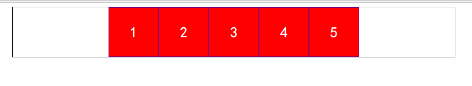

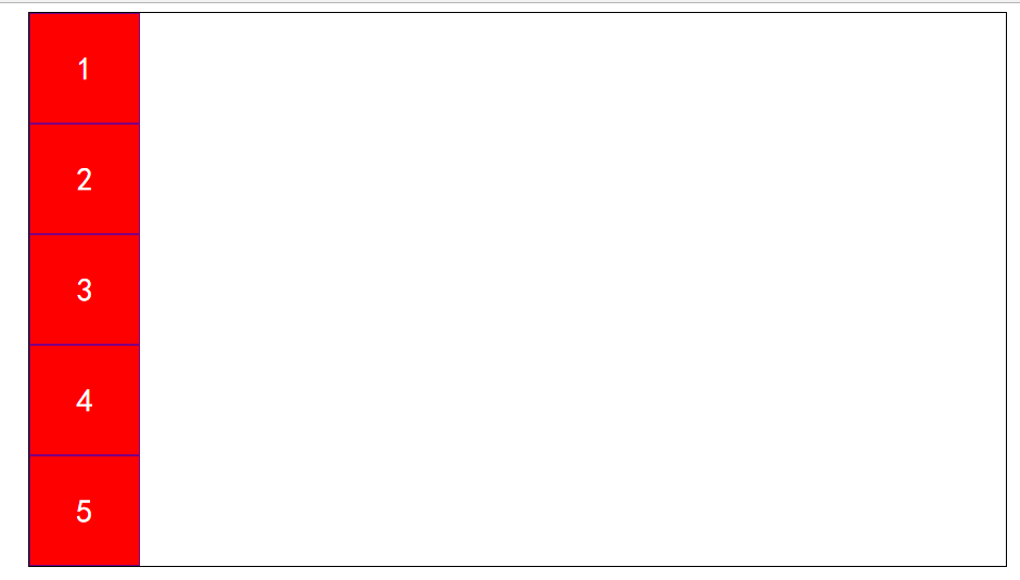
两种特殊的排列方式:水平排列和垂直排列
 1 <!DOCTYPE html>
 2 <html lang="en">
 3 <head>
 4     <meta charset="UTF-8">
 5     <title>弹性盒模型笔记示例</title>
 6     <style type="text/css">
 7         #box{
 8             width: 900px;
 9             margin:0 auto;
10             border: 1px solid #000;
11             display: -webkit-box;/*需要在父级中建立弹性盒模型*/
12             -webkit-box-orient:vertical;
13             /*-webkit-box-orient:horizontal; */
14         }
15         #box div{
16             width: 100px;
17             height: 100px;
18             background:red;
19             text-align: center;
20             font: 30px/100px "simhei";
21             border:1px solid purple;
22             color: #fff;
23         }
24     </style>
25 </head>
26 <body>
27     <div id="box">
28         <div>1</div>
29         <div>2</div>
30         <div>3</div>
31         <div>4</div>
32         <div>5</div>
33     </div>
34 </body>
35 </html>
-webkit-box-orient:vertical;-->垂直排列
-webkit-box-orient:horizontal;-->水平排列
效果依次如下:
二.弹性盒模型子级均分父级宽度
方法还是先在父级中添加弹性盒模型空间
然后均分代码-webkit-box-pack:justify;
子级需要确定均分份数,这里用到了伪类选择器
#box div:nth-of-type(1){
-webkit-box-flex:1;/*均分父级一份宽度*/
        }
注意:本例中,子级div定义了宽度
 1 <!DOCTYPE html>
 2 <html lang="en">
 3 <head>
 4     <meta charset="UTF-8">
 5     <title>弹性盒模型笔记示例</title>
 6     <style type="text/css">
 7         #box{
 8             width: 900px;
 9             margin:0 auto;
10             border: 1px solid #000;
11             display: -webkit-box;/*需要在父级添加弹性盒模型空间*/
12             -webkit-box-pack:justify;
13         }
14         #box div{
15             /*width: 100px;*/
16             height: 100px;
17             background:red;
18             text-align: center;
19             font: 30px/100px "simhei";
20             border:1px solid purple;
21             color: #fff;
22         }
23         #box div:nth-of-type(1){
24             -webkit-box-flex:1;/*均分父级一份宽度*/
25         }
26         #box div:nth-of-type(2){
27             -webkit-box-flex:2;
28         }
29         #box div:nth-of-type(3){
30             -webkit-box-flex:3;
31         }
32         #box div:nth-of-type(4){
33             -webkit-box-flex:4;
34         }
35         #box div:nth-of-type(5){
36             -webkit-box-flex:5;
37         }
38     </style>
39 </head>
40 <body>
41     <div id="box">
42         <div>1</div>
43         <div>2</div>
44         <div>3</div>
45         <div>4</div>
46         <div>5</div>
47     </div>
48 </body>
49 </html>
效果如下子级会按设置比例均分父级宽度:

我们把宽注释掉后会受宽度影响
效果如下:
补充相应的盒模型:
display:-webkit-box;--弹性盒模型
display:-moz-box;
display:-ms-box;
display:-o-box;
display:box;--正常盒模型
对应修改子级代码:
-webkit-box-pack;
-mox-box-pack;
-ms-box-pack;
-o-box-pack;
box-pack;
后续待补充:小哥哥先溜了,回去看书,惬意
