
Style
Style用于设置一种控件的属性(background,Width,template等),从而可以使这种控件调用style中设置的属性
例如为button设置一种style,页面的button都可以使用这种style
以下的例子展示一个button,当button点击时,能不断切换button的样式,首先建立一个工程Style_sample。
eg:
xmal中
代码

Code highlighting produced by Actipro CodeHighlighter (freeware)http://www.CodeHighlighter.com/--><UserControl x:Class="Style_sample.MainPage"
    xmlns="http://schemas.microsoft.com/winfx/2006/xaml/presentation"
    xmlns:x="http://schemas.microsoft.com/winfx/2006/xaml"
    xmlns:d="http://schemas.microsoft.com/expression/blend/2008"
    xmlns:mc="http://schemas.openxmlformats.org/markup-compatibility/2006"
    mc:Ignorable="d"
    d:DesignHeight="300" d:DesignWidth="400">
        <!--一般style文件都放在XXX.Resources里面-->
          <UserControl.Resources>
              <!--Style one-->
             <Style x:Key="ButtonStyleOne" TargetType="Button">
                <!--设置button的各种样式-->
                <Setter Property="FontFamily" Value="Georgia" />
                <Setter Property="FontSize" Value="50" />
                <Setter Property="Foreground" Value="Blue" />
                <Setter Property="Width" Value="800" />
                     <!--以SolidColorBrush填充button的背景,button背景显示黄色-->
                      <Setter Property="Background">
                      <Setter.Value>
                      <SolidColorBrush  Color="Yellow"/>
                      </Setter.Value>
                   </Setter>
                </Style>
              <!--Style two-->
             <Style x:Key="ButtonStyleTwo" TargetType="Button">
               <Setter Property="FontFamily" Value="Arial" />
               <Setter Property="FontSize" Value="40" />
               <Setter Property="Foreground" Value="red" />
               <Setter Property="BorderThickness" Value="10" />
               <Setter Property="Width" Value="500" />
              <!--以LinearGradientBrush填充button的背景,button背景左上蓝色,中间绿色,右下红色,其余部分颜色通过这几种颜色内插-->
                <Setter Property="Background">
                    <Setter.Value>
                    <LinearGradientBrush StartPoint="0,0" EndPoint="1,1">
                        <GradientBrush.GradientStops>
                            <GradientStopCollection>
                                <GradientStop Color="Blue" Offset="0.0"/>
                                <GradientStop Color="Green" Offset="0.5"/>
                                <GradientStop Color="Red" Offset="1.0"/>
                            </GradientStopCollection>
                        </GradientBrush.GradientStops>
                    </LinearGradientBrush>

                       </Setter.Value>
                     </Setter>
                   </Style>
              </UserControl.Resources>
             <!--初始状态Button的样式为StyleOne-->
             <Button x:Name="TestButton" Content="A Customized Button"
                Style="{StaticResource ButtonStyleOne}" Click="Button_Click" Height="64" >
             </Button>

</UserControl>
xmal.cs中
代码

Code highlighting produced by Actipro CodeHighlighter (freeware)http://www.CodeHighlighter.com/-->using System;
using System.Collections.Generic;
using System.Linq;
using System.Net;
using System.Windows;
using System.Windows.Controls;
using System.Windows.Documents;
using System.Windows.Input;
using System.Windows.Media;
using System.Windows.Media.Animation;
using System.Windows.Shapes;

namespace Style_sample
{
    public partial class MainPage : UserControl
    {
        public MainPage()
        {
            InitializeComponent();
        }

        private void Button_Click(object sender, RoutedEventArgs e)
        {
            if (TestButton.Style == (Style)this.Resources["ButtonStyleOne"]) //如果当前是样式1,点击切换样式2
            {
                TestButton.Style = (Style)this.Resources["ButtonStyleTwo"];
            }
            else
            {
                TestButton.Style = (Style)this.Resources["ButtonStyleOne"];
            }
        }
    }
}
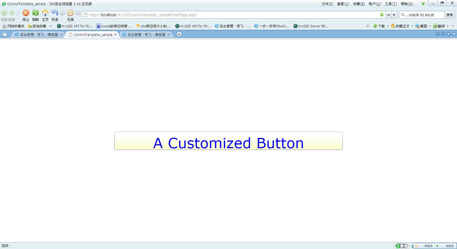
界面如下:
页面初始化时
单击button后:
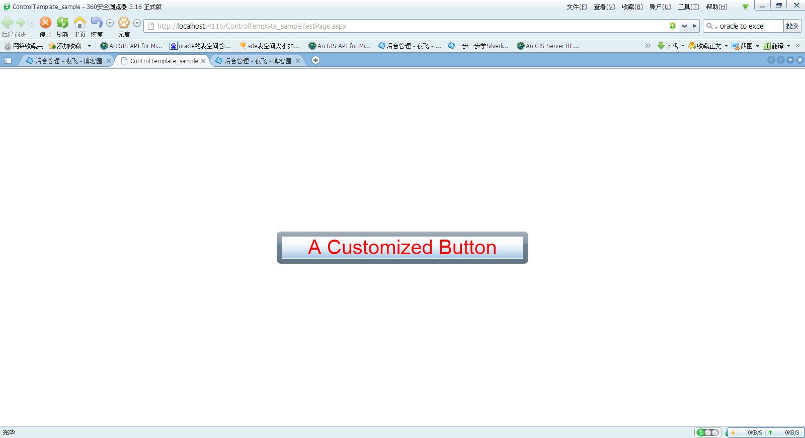
以上的例子就展示了button采用不同的style时,显示不同的效果,一般情况下,style会放在容器(grid,stackpanel等)XXX的XXX.resources中,这样容器XXX中的其他控件就可以直接调用这个style
此外也可以将style嵌入到button中,一般不怎么常用
xmal中:
代码

Code highlighting produced by Actipro CodeHighlighter (freeware)http://www.CodeHighlighter.com/--> <Button Content="Button">
        <Button.Style>
            <Style TargetType="Button">
                  <Setter Property="FontFamily" Value="Georgia" />
                  <Setter Property="FontSize" Value="50" />
                  <Setter Property="Foreground" Value="Blue" />
                  <Setter Property="Width" Value="800" />

                      <Setter Property="Background">
                           <Setter.Value>
                             <SolidColorBrush  Color="Yellow"/>
                           </Setter.Value>
                      </Setter>
                 </Style>
          </Button.Style>
  </Button>
