html5——动画案例(太阳系)
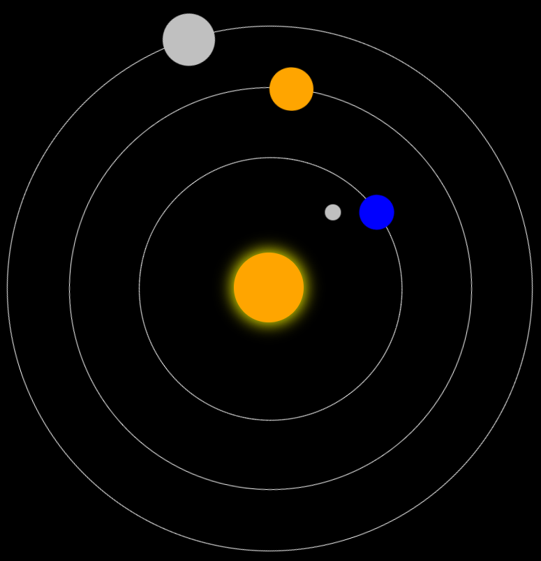
太阳系主要利用定位,伪元素
<!DOCTYPE html>
<html lang="en">
<head>
    <meta charset="UTF-8">
    <title>Title</title>
    <style>
        * {
            padding: 0;
            margin: 0;
        }

        html, body {
            width: 100%;
            height: 100%;
            overflow: hidden;
        }

        body {
            background-color: #000;
        }

        .sun {
            width: 80px;
            height: 80px;
            border-radius: 50%;
            position: absolute;
            top: 50%;
            left: 50%;
            margin-left: -40px;
            margin-top: -40px;
            background-color: orange;
            box-shadow: 0px 0px 30px 2px yellow;
        }

        .earth {
            width: 300px;
            height: 300px;
            border-radius: 50%;
            position: absolute;
            top: 50%;
            left: 50%;
            margin-left: -150px;
            margin-top: -150px;
            border: 1px solid #fff;
            animation: gun 10s infinite linear;
        }

        .earth::before {
            content: "";
            position: absolute;
            width: 40px;
            height: 40px;
            top: 50%;
            margin-top: -20px;
            left: -20px;
            border-radius: 50%;
            background-color: blue;
        }

        .moon {
            position: absolute;
            width: 100px;
            height: 100px;
            top: 50%;
            margin-top: -50px;
            left: -50px;
            border-radius: 50%;
            /*border: 1px solid #fff;*/
            animation: gun 2.5s infinite linear;
        }

        .moon:before {
            content: "";
            position: absolute;
            width: 18px;
            height: 18px;
            top: 50%;
            margin-top: -9px;
            left: -9px;
            border-radius: 50%;
            background-color: silver;
        }

        .mars {
            width: 460px;
            height: 460px;
            border-radius: 50%;
            position: absolute;
            top: 50%;
            left: 50%;
            margin-left: -230px;
            margin-top: -230px;
            border: 1px solid #fff;
            animation: gun 15s infinite linear;
        }

        .mars::before {
            content: "";
            position: absolute;
            width: 50px;
            height: 50px;
            top: 50%;
            margin-top: -25px;
            left: -25px;
            border-radius: 50%;
            background-color: orange;
        }

        .venus {
            width: 600px;
            height: 600px;
            border-radius: 50%;
            position: absolute;
            top: 50%;
            left: 50%;
            margin-left: -300px;
            margin-top: -300px;
            border: 1px solid #fff;
            animation: gun 20s infinite linear;
        }

        .venus::before {
            content: "";
            position: absolute;
            width: 60px;
            height: 60px;
            top: 50%;
            margin-top: -30px;
            left: -30px;
            border-radius: 50%;
            background-color: silver;
        }

        @keyframes gun {
            0% {
                transform: rotate(0deg);
            }
            100% {
                transform: rotate(360deg);
            }
        }
    </style>
</head>
<body>
<div class="sun"></div>
<div class="earth">
    <div class="moon"></div>
</div>
<div class="mars"></div>
<div class="venus"></div>
</body>
</html>
参考资料:cssRules js操作cssRules
