

React Native知识2-Text组件
Text用于显示文本的React组件,并且它也支持嵌套、样式,以及触摸处理。在下面的例子里,嵌套的标题和正文文字会继承来自styles.baseText的fontFamily字体样式,不过标题上还附加了它自己额外的样式。标题和文本会在顶部依次堆叠,并且被代码中内嵌的换行符分隔开。
一:属性
1:allowFontScaling bool(iOS特有):控制字体是否要根据iOS的“文本大小”辅助选项来进行缩放。
2:numberOfLines number :用来当文本过长的时候裁剪文本。包括折叠产生的换行在内,总的行数不会超过这个属性的限制;
3:onLayout function:当挂载或者布局变化以后调用,参数为如下的内容:{nativeEvent: {layout: {x, y, width, height}}}
4:onPress function:当文本被点击以后调用此回调函数
5:testID string:用来在端到端测试中标记这个视图。
6:suppressHighlighting bool(iOS特有):当为true时,如果文本被按下,则没有任何视觉效果。默认情况下,文本被按下时会有一个灰色的、椭圆形的高光
二:样式style
1:color string
2:fontFamily string
3:fontSize number
4:fontStyle enum('normal', 'italic')
5:fontWeight enum("normal", 'bold', '100', '200', '300', '400', '500', '600', '700', '800', '900')
指定字体的粗细。大多数字体都支持'normal'和'bold'值。并非所有字体都支持所有的数字值。如果某个值不支持,则会自动选择最接近的值。
6:letterSpacing number 字符间距
7:lineHeight number 行高
8:textAlign enum("auto", 'left', 'right', 'center', 'justify')
指定文本的对齐方式。其中'justify'值仅iOS支持。
9:(android) textAlignVertical enum('auto', 'top', 'bottom', 'center')
10:(ios)textDecorationColor string 线的颜色
11:textDecorationLine enum("none", 'underline', 'line-through', 'underline line-through') 横线位置
12:(ios)textDecorationStyle enum("solid", 'double', 'dotted', 'dashed') 线的样式
13:(ios)writingDirection enum("auto", 'ltr', 'rtl') 文字方向
三:实例代码:
1:Text属性的运用

import React, { Component } from 'react';
import {
  AppRegistry,
  StyleSheet,
  AlertIOS,
  Text,
  View
} from 'react-native';

class ReactNativeProject extends Component {

  render() {
    return (
      <View style={styles.container}>
        <Text style={styles.textTopStyle}>
            我开始学习react native内容,此实例是关于如何运用Text的运用,包含相关属性跟事件;
        </Text>

         <Text style={styles.textCenterStyle} numberOfLines={2}>
            numberOfLines:该属性的值是一个数字,用于规定最多显示多少行,如果超过该数值,则以省略号(...)表示,跟原生类似效果
         </Text>

         <Text style={styles.textBottomStyle} onPress={() => AlertIOS.prompt('Secure Text', null, null, 'secure-text')}>
            点击事件的运用
         </Text>

         <Text style={{fontWeight: 'bold',marginTop:40}}>
              我是关于
              <Text style={{color: 'red'}}>
              嵌套文本
              </Text>
              的运用;
        </Text>

      </View>
    );
  }
}

const styles = StyleSheet.create({
  container: {
    flex: 1,
    height:300,
    justifyContent:'center'
  },
  textTopStyle:
  {
    fontSize:20,
    fontWeight:'bold',
    textAlign:'center',
    color:'red'
  },
  textCenterStyle:
  {
    fontSize:14,
    textAlign:'center',
    color:'blue'
  },
  textBottomStyle:
  {
    fontSize:17,
    textAlign:'right',
    color:'red',
    marginTop:50,
    marginRight:20,
    borderWidth:1,
    borderColor:'red'
  }
});

AppRegistry.registerComponent('ReactNativeProject', () => ReactNativeProject);
效果图:

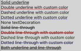
2:常见文本样式
<Text style={{textDecorationLine: 'underline', textDecorationStyle: 'solid'}}>
Solid underline
</Text>
<Text style={{textDecorationLine: 'underline', textDecorationStyle: 'double', textDecorationColor: '#ff0000'}}>
Double underline with custom color
</Text>
<Text style={{textDecorationLine: 'underline', textDecorationStyle: 'dashed', textDecorationColor: '#9CDC40'}}>
Dashed underline with custom color
</Text>
<Text style={{textDecorationLine: 'underline', textDecorationStyle: 'dotted', textDecorationColor: 'blue'}}>
Dotted underline with custom color
</Text>
<Text style={{textDecorationLine: 'none'}}>
None textDecoration
</Text>
<Text style={{textDecorationLine: 'line-through', textDecorationStyle: 'solid'}}>
Solid line-through
</Text>
<Text style={{textDecorationLine: 'line-through', textDecorationStyle: 'double', textDecorationColor: '#ff0000'}}>
Double line-through with custom color
</Text>
<Text style={{textDecorationLine: 'line-through', textDecorationStyle: 'dashed', textDecorationColor: '#9CDC40'}}>
Dashed line-through with custom color
</Text>
<Text style={{textDecorationLine: 'line-through', textDecorationStyle: 'dotted', textDecorationColor: 'blue'}}>
Dotted line-through with custom color
</Text>
<Text style={{textDecorationLine: 'underline line-through'}}>
Both underline and line-through
</Text>
效果图:
四:知识点
1:Text可以当容器,<Text>元素在布局上不同于其它组件:在Text内部的元素不再使用flexbox布局,而是采用文本布局。这意味着<Text>内部的元素不再是一个个矩形,而可能会在行末进行折叠。
2:<View>下不能直接放一段文本,而是要在<View></View>里面包含一个<Text></Text>,然后把文字内容放在Textj里面;
最近有个妹子弄的一个关于扩大眼界跟内含的订阅号,每天都会更新一些深度内容,在这里如果你感兴趣也可以关注一下(嘿对美女跟知识感兴趣),当然可以关注后输入:github 会有我的微信号,如果有问题你也可以在那找到我;当然不感兴趣无视此信息;


【推荐】国内首个AI IDE,深度理解中文开发场景,立即下载体验Trae
【推荐】编程新体验,更懂你的AI,立即体验豆包MarsCode编程助手
【推荐】抖音旗下AI助手豆包,你的智能百科全书,全免费不限次数
【推荐】轻量又高性能的 SSH 工具 IShell:AI 加持,快人一步
· 开发者必知的日志记录最佳实践
· SQL Server 2025 AI相关能力初探
· Linux系列:如何用 C#调用 C方法造成内存泄露
· AI与.NET技术实操系列(二):开始使用ML.NET
· 记一次.NET内存居高不下排查解决与启示
· 被坑几百块钱后,我竟然真的恢复了删除的微信聊天记录!
· 没有Manus邀请码?试试免邀请码的MGX或者开源的OpenManus吧
· 【自荐】一款简洁、开源的在线白板工具 Drawnix
· 园子的第一款AI主题卫衣上架——"HELLO! HOW CAN I ASSIST YOU TODAY
· Docker 太简单,K8s 太复杂?w7panel 让容器管理更轻松!
2012-09-05 安装并配置SQL Server 2005群集
2011-09-05 表值函数结合合并列值并带参
2011-09-05 Mssql合并列值(三个关系表合并)