布局方法
1、左栏高度随右栏高度自适应相等
<style type="text/css">
  #test{overflow:hidden; zoom:1;}
  .left{width:200px; margin-bottom:-3000px; padding-bottom:3000px; background:#cad5eb; float:left;}
  .center{height:300px; margin:0 0 0 210px; background:#ffe6b8;}
</style>

<div id="test">
    <div class="left">左边,无高度属性,自适应于最高一栏的高度</div>
    <div class="center">中间,高度300像素,左右两栏的高度与之自适应    </div>
</div>
2、CSS实现宽度自适应100%,宽高1:1的比例的正方形
#square{
    width:30%;
    height:30vw;  //vw是相对于视口宽度百分比的单位,1vw = 1% viewport width
    background:gray;
}
#square{
    width:30%;
    height:0;
    padding-bottom: 30%;
    background:gray;
}
3、footer置于页面最底部
<style type="text/css">
    .fixed-bottom {position: fixed;bottom: 0;width:100%;}
</style>

<div class="header">header</div>
<div class="main">main content</div>
<div class="footer">footer</div>

<script type="text/javascript">
$(function(){
      function footerPosition(){
            $(".footer").removeClass("fixed-bottom");
            var contentHeight = document.body.scrollHeight,//网页正文全文高度
                winHeight = window.innerHeight;//可视窗口高度,不包括浏览器顶部工具栏
            if(!(contentHeight > winHeight)){
                //当网页正文高度小于可视窗口高度时,为footer添加类fixed-bottom
                $(".footer").addClass("fixed-bottom");
            } else {
                $(".footer").removeClass("fixed-bottom");
            }
        }
        footerPosition();
        $(window).resize(footerPosition);
});
</script>
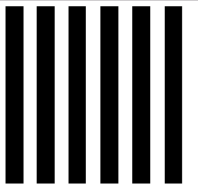
4、内容自适应分布
<style type="text/css">
.box {
  width: 256px;
  height: 256px;
  /* 两端对齐关键 */
  text-align: justify;
}
/*:before 伪元素用于辅助实现底对齐*/
.box:before {
  content: "";
  display: inline-block;
  height: 100%;
}
/*:after伪元素用于辅助实现两端对齐*/
.box:after {
  content: "";
  display: inline-block;
  width: 100%;
}
.bar {
  display: inline-block;
  width: 10%;
  height: 256px;
  background: #000;
}
</style>
<div class="box"><i class="bar"></i> <!-- 不可以换行 -->
  <i class="bar"></i>
  <i class="bar"></i>
  <i class="bar"></i>
  <i class="bar"></i>
  <i class="bar"></i>
</div>
注意: HTML 代码有些地方不能换行或者空格
效果如下:自适应平局分布