

flex布局中flex-shrink的计算规则
下面代码来自MDN
html部分:
<p>the width of content is 500px, flex-basic of flex item is 120px.</p>
<p>A, B, C are flex-shrink:1. D and E are flex-shrink:2</p>
<p>the width of D is not the same as A's</p>
<div id="content">
  <div class="box" style="background-color:red;">A</div>
  <div class="box" style="background-color:lightblue;">B</div>
  <div class="box" style="background-color:yellow;">C</div>
  <div class="box1" style="background-color:brown;">D</div>
  <div class="box1" style="background-color:lightgreen;">E</div>
</div>
css部分:
#content {
  display: flex;
  width: 500px;
}

#content div {
  flex-basis: 120px;
  border: 3px solid rgba(0,0,0,.2);
}

.box {
  flex-shrink: 1;
}

.box1 {
  flex-shrink: 2;
}
效果部分:
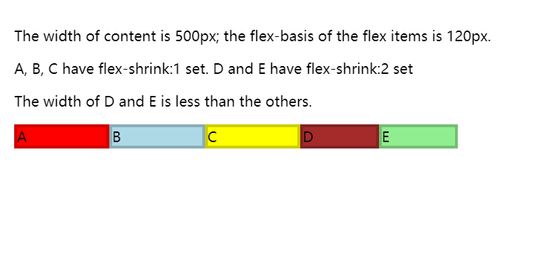
以上代码描述,id为content容器中有5个小盒,content容器定宽500px,
每个小盒的初始内容宽度是120px + 边框3px * 2 = 126px,
现在前三个小盒flex-shrink数值为1,后两个数值为2,下面计算:
小盒初始宽度总和与content容器宽度差值
Δ = 126 * 5 - 500 = 130
收缩指数
Δt = 130 ÷ (1*3 + 2*2)
前三个盒子宽度
box = 126 - Δt
后两个盒子宽度
box1= 126 - 2Δt
*总结:
1、flex-shrink仅在内容默认宽度之和大于容器的时候才会有效
2、容器内子容器的content、border、padding都要参与计算才能得到正确的收缩指数值
3、border和padding即使参与了计算,但宽度始终不会改变,假如收缩后的总宽度仍然超过容器宽度,则会超出盒子,即使设置box-sizing为border-box也不能使border和padding收缩
