

css中的float
我是一个前端初学者,学到float这属性,作为笔记整理,写了这篇文章。有需要的同道中人可以参考,如有不足和错误的地方,请指出,我定虚心接受,认真修改。
首先, 这个css属性是基于块元素,发挥其作用的,有关块元素和行内元素的知识请大家自行查询,这边就不加以叙述了。
什么是 float?
在标准流中,块元素按照水平方向自动伸展,直到遇到包含它的元素的边界,也就是其父元素;在竖直方向与其兄弟元素垂直依次排列,不能并排在一行中。可用display属性改变其为行内元素。float,也有相同的作用,当我们对一个块元素使用float时,块元素就会脱离标准流,按照float所设置的属性值向其父元素的左边或者右边靠拢,其他元素会自动忽略该元素,趁机占领它的位置,同时,默认情况下盒子的宽度不在独占一行,而是由具体宽度或者盒子内的内容决定。
float 一共有三个属性, none(默认值),也就是标准流,left,向父元素左边靠拢,right,向父元素右边靠拢,接下来我们就依次看一下这三个状态的效果。
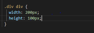
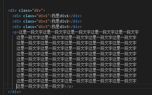
下面的关于float的部分,都基于以下代码,后面不在叙述
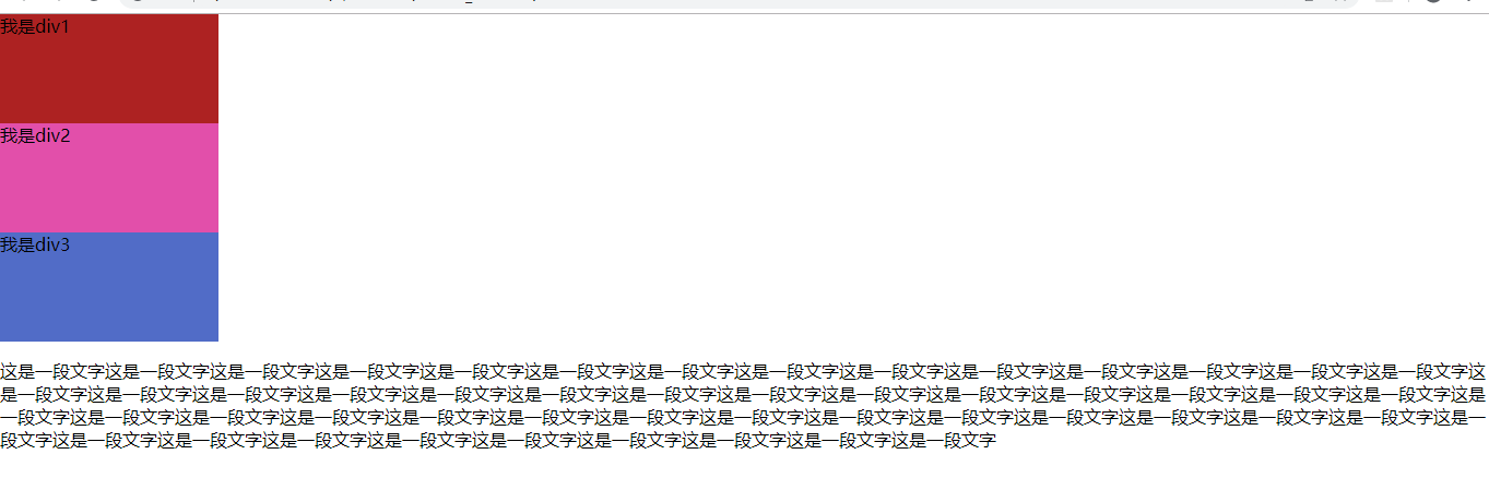
当使用 float:none; 或者不使用时的效果如下,此时,元素处在标准流中:
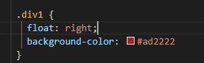
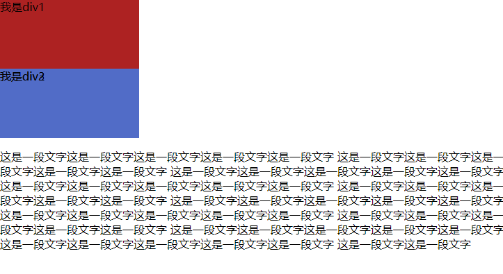
当时div1设置 float:right; 时,效果如下,此时,div1,脱离标准流, 不在占有原来的位置,后续元素依次顶替其原来的位置:
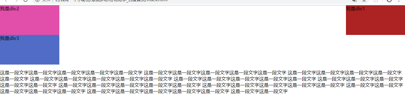
当div1设置float:left;此时,div1依旧脱离文档流,后续元素会占领它原有的位置依次排列,从效果图中我们发现,div2被div1覆盖了,所以我们看不到div2:
以上就是快元素设置float三个基本属性值的效果。
更多复杂的float实现效果大家可以自己去探索,在探索中你会发现float对我们布局来说是很有用的,但是他也会带来很多不可避免的问题,遇到这些问题,也有很多解决的方法,之后,有空会更新文章,更大家一起思考。
下面是利用float和position进行的三个布局页面,也用到了 @media and screen(max-width: 960px) 以及 @media and screen(max-width: 768px) 来实现不同屏幕宽度下的不同效果。
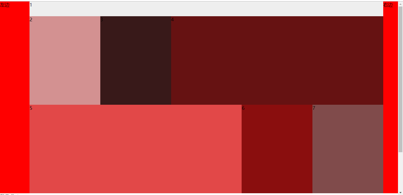
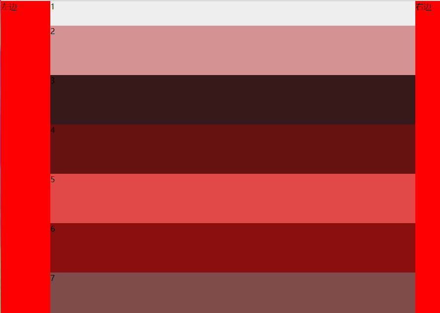
当大于960时布局样式如下,中间弹性布局,宽度可变,且排列如下,左边固定宽度100px, 右边固定宽度 50px
当宽度在768到960之间时,样式如下,中间弹性布局,宽度可变,左边固定宽度100px,右边固定宽度50px:
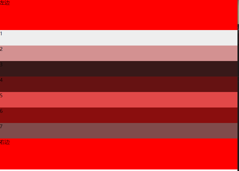
当宽度小于768时, 样式如下,正常按照标准流布局:
源码如下:
<!DOCTYPE html>
<html lang="en">
<head>
  <meta charset="UTF-8">
  <meta name="viewport" content="width=device-width, initial-scale=1.0">
  <meta http-equiv="X-UA-Compatible" content="ie=edge">
  <title>布局练习</title>

  <style>
    body {
      margin: 0;
    }

    .left {
      float: left;
      width: 100px;
      height: 650px;
      background-color: red;
    }
    .right {
      float: right;
      width: 50px;
      height: 650px;
      background-color: red;
    }
    .center {
      height: 650px;
      background-color: blue;
      margin-left: 100px;
      margin-right: 50px;
    }
    .center1 {
      width: 100%;
      height: 50px;
      background-color: #eee;
    }
    .center2 {
      float: left;
      width: 20%;
      height:  300px;
      background-color: rgb(211, 145, 145);
    }
    .center3 {
      float: left;
      width: 20%;
      height:  300px;
      background-color: rgb(56, 25, 25);
    }
    .center4 {
      float: right;
      height:  300px;
      width: 60%;
      background-color: rgb(102, 18, 18);
    }
    .center5 {
      float: left;
      height:  300px;
      width: 60%;
      background-color: rgb(226, 72, 72);
    }
    .center6 {
      float: left;
      height:  300px;
      width: 20%;
      background-color: rgb(138, 14, 14);
    }
    .center7 {
      float: left;
      height:  300px;
      width: 20%;
      background-color: rgb(128, 75, 75);
    }
    @media screen and (max-width: 960px) {

    .left {
      float: left;
      width: 100px;

      background-color: red;
    }
    .right {
      float: right;
      width: 50px;

      background-color: red;
    }
    .center {
      margin-left: 100px;
      margin-right: 50px;
      height: 650px;
      background-color: blue;
    }
    .center1 {
      width: 100%;
      height: 50px;
      background-color: #eee;
    }
    .center2 {
      width: 100%;
      height:  100px;
      background-color: rgb(211, 145, 145);
    }
    .center3 {
      width: 100%;
      height:  100px;
      background-color: rgb(56, 25, 25);
    }
    .center4 {
      height:  100px;
      width: 100%;
      background-color: rgb(102, 18, 18);
    }
    .center5 {
      height:  100px;
      width: 100%;
      background-color: rgb(226, 72, 72);
    }
    .center6 {
      height:  100px;
      width: 100%;
      background-color: rgb(138, 14, 14);
    }
    .center7 {
      height:  100px;
      width: 100%;
      background-color: rgb(128, 75, 75);
    }
    }
    @media screen and (max-width: 768px) {

    .left {
      width: 100%;
      height: 100px;
      background-color: red;
    }
    .right {
      position: absolute;
      top: 450px;
      width: 100%;
      height: 100px;
      background-color: red;
    }
    .center {
      clear: both;
      width: 100%;
      height: 350px;
      background-color: blue;
      margin-left: 0;
      margin-right: 0;
    }
    .center1 {
      width: 100%;
      height: 50px;
      background-color: #eee;
    }
    .center2 {

      width: 100%;
      height:  50px;
      background-color: rgb(211, 145, 145);
    }
    .center3 {

      width: 100%;
      height:  50px;
      background-color: rgb(56, 25, 25);
    }
    .center4 {

      height:  50px;
      width: 100%;
      background-color: rgb(102, 18, 18);
    }
    .center5 {

      height:  50px;
      width: 100%;
      background-color: rgb(226, 72, 72);
    }
    .center6 {

      height:  50px;
      width: 100%;
      background-color: rgb(138, 14, 14);
    }
    .center7 {

      height:  50px;
      width: 100%;
      background-color: rgb(128, 75, 75);
    }
  }
  </style>
</head>
<body>
  <div class="container">
    <div class="left">左边</div>
    <div class="right">右边</div>
    <div class="center">
        <div class="center1">1</div>
        <div class="center2">2</div>
        <div class="center3">3</div>
        <div class="center4">4</div>
        <div class="center5">5</div>
        <div class="center6">6</div>
        <div class="center7">7</div>
    </div>
  </div>


</body>
</html>

