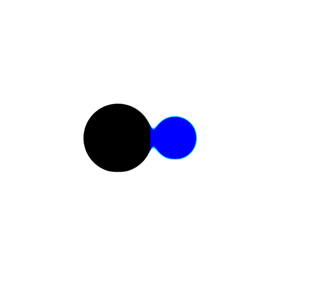
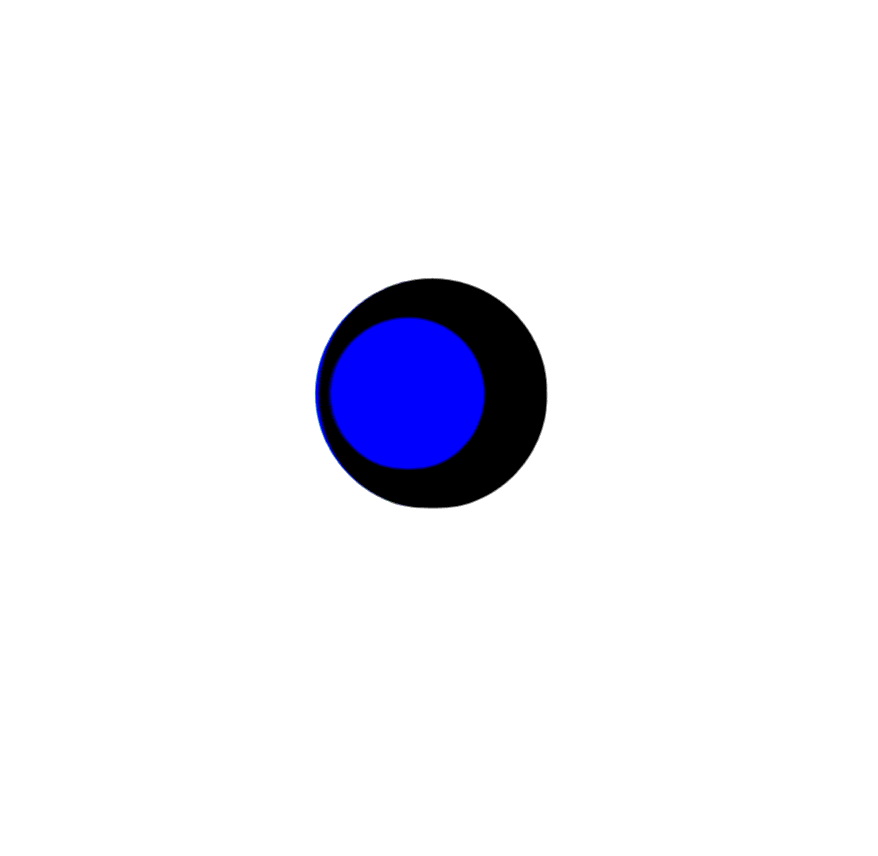
css实现的交互运动

<style type="text/css">
            .filter-mix {
                position: absolute;
                top: 50%;
                left: 50%;
                transform: translate(-50%, -50%);
                width: 300px;
                height: 200px;
                filter: contrast(20);
                background: #fff;
            }
            
            .filter-mix::before {
                content: "";
                position: absolute;
                width: 120px;
                height: 120px;
                border-radius: 50%;
                background: #333;
                top: 40px;
                left: 40px;
                z-index: 2;
                filter: blur(6px);
                box-sizing: border-box;
                animation: filterBallMove 4s ease-out infinite;
            }
            
            .filter-mix::after {
                content: "";
                position: absolute;
                width: 80px;
                height: 80px;
                border-radius: 50%;
                background: #3F51B5;
                top: 60px;
                right: 40px;
                z-index: 2;
                filter: blur(6px);
                animation: filterBallMove2 4s ease-out infinite;
            }
            
            @keyframes filterBallMove {
                50% {
                    left: 140px;
                }
            }
            
            @keyframes filterBallMove2 {
                50% {
                    right: 140px;
                }
            }
            

</style>
<div class="container">
        <div class="filter-mix"></div>
</div> 


效果图:


posted @ 2017-10-15 11:52  shengnan_2017  阅读(446)  评论(0编辑  收藏  举报