

按钮特效
在慕课网学习了一个小的效果-按钮特效,总体来说还是挺简单的。其中用到了CSS3中transform、transition、box-sizing、border-radius。
效果图(动态效果图可以去原网站看):
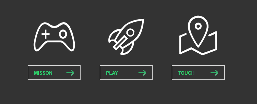
当鼠标移到图片上,图片会自动旋转。鼠标移动到按钮上会在上放出现提示信息并伴有四条线条移动的动画
可以把结构分为三个相同的块:图片和下方的按钮
图片用<span>标签 class="icon"
按钮用<a>标签,在其中包含四条线条用<span>标签
基本结构:
 1         <div class="link link-miss">
 2             <span class="icon"></span>
 3             <a href="#" class="button" data="My misson is color">
 4                 <span class="line line-top"></span>
 5                 <span class="line line-right"></span>
 6                 <span class="line line-bottom"></span>
 7                 <span class="line line-left"></span>
 8                 MISSON
 9             </a>
10         </div>
其中大多数动画都用transform实现相对简单
在三个大块下还有一个<div class="tip"></div>是鼠标移动到按钮上出现的提示信息(data中的信息),jquery也都是用来定位他的位置。
html源码:
 1 <!DOCTYPE html>
 2 <html lang="en">
 3 <head>
 4     <meta charset="UTF-8">
 5     <title>幽灵按钮</title>
 6     <link type="text/css" rel="stylesheet" href="css/style.css" />
 7     <script type="text/javascript" src="js/jquery-3.1.1.min.js"></script>
 8     <script type="text/javascript" src="js/script.js"></script>
 9 </head>
10 <body>
11     <div class="box">
12         <div class="link link-miss">
13             <span class="icon"></span>
14             <a href="#" class="button" data="My misson is color">
15                 <span class="line line-top"></span>
16                 <span class="line line-right"></span>
17                 <span class="line line-bottom"></span>
18                 <span class="line line-left"></span>
19                 MISSON
20             </a>
21         </div>
22         <div class="link link-play">
23             <span class="icon"></span>
24             <a href="#" class="button" data="This is my playGroup">
25                 <span class="line line-top"></span>
26                 <span class="line line-right"></span>
27                 <span class="line line-bottom"></span>
28                 <span class="line line-left"></span>
29                 PLAY
30             </a>
31         </div>
32         <div class="link link-touch">
33             <span class="icon"></span>
34             <a href="#" class="button" data="This is my touchDemo">
35                 <span class="line line-top"></span>
36                 <span class="line line-right"></span>
37                 <span class="line line-bottom"></span>
38                 <span class="line line-left"></span>
39                 TOUCH
40             </a>
41         </div>
42         <!-- 这里相对于box 定位因为长度可能要比button的长度要长,所以不在每个button中添加tip -->
43         <div class="tip">
44             <em></em><span></span>
45         </div>
46     </div>
47
48 </body>
49 </html>
CSS源码:
  1 *{
  2     padding:0;
  3     margin: 0;
  4 }
  5 body{
  6     background-color: #333;
  7 }
  8 .box{
  9     width: 800px;
 10     height:280px;
 11     margin: 50px auto;
 12     position: relative;
 13 }
 14 .box .link{
 15     width: 205px;
 16     height: 280px;
 17     float: left;
 18     margin: 0 20px;
 19 }
 20 .link .icon{
 21     display: inline-block;
 22     width: 100%;
 23     height: 190px;
 24     transition: all 0.4s ease-out;
 25     -moz-transition: all 0.4s ease-out;
 26     -webkit-transition: all 0.4s ease-out;
 27     -o-transition: all 0.4s ease-out;
 28 }
 29 .link-miss .icon{
 30     background: url(../images/mission.png) no-repeat center center;
 31 }
 32 .link-play .icon{
 33     background:  url(../images/play.png) no-repeat center center;
 34 }
 35 .link-touch .icon{
 36     background:  url(../images/touch.png) no-repeat center center;
 37 }
 38 .link .icon:hover{/*CSS3新增加的方法使图片旋转,放大*/
 39     transform:rotate(360deg)  scale(1.2);
 40     -ms-transform:rotate(360deg)  scale(1.2);
 41     -moz-transform:rotate(360deg)  scale(1.2);
 42     -webkit-transform:rotate(360deg)  scale(1.2);
 43     -o-transform:rotate(360deg)  scale(1.2);
 44 }
 45 .button{
 46     display: block;
 47     width: 180px;
 48     height: 50px;
 49     line-height: 50px;
 50     text-decoration: none;
 51     color: #2DCB70;
 52     font-family: Arial;
 53     font-weight: bolder;
 54     border: 2px solid rgba(255,255,255,0.8);
 55     padding-left: 20px;
 56     margin:0 auto;
 57     position: relative;
 58
 59     box-sizing:border-box;
 60     -ms-box-sizing:border-box;
 61     -o-box-sizing:border-box;
 62     -webkit-box-sizing:border-box;
 63     -moz-box-sizing:border-box;
 64
 65     transition: all 0.4s ease;/*新增加方法*/
 66     -moz-transition: all 0.4s ease;
 67     -webkit-transition: all 0.4s ease;
 68     -o-transition: all 0.4s ease;
 69
 70     background:url(../images/allow.png) no-repeat 130px  center;
 71 }
 72 .button:hover{
 73     border: 2px solid rgba(255,255,255,1);
 74     background-position: 140px center;
 75 }
 76 .button .line{
 77     display: block;
 78     position: absolute;
 79     background:none;
 80     transition: all 0.4s ease;
 81     -moz-transition: all 0.4s ease;
 82     -webkit-transition: all 0.4s ease;
 83     -o-transition: all 0.4s ease;
 84 }
 85 .button:hover .line{
 86     background:#fff;
 87 }
 88 .button .line-top{
 89     height: 2px;
 90     width:0px;
 91     left:-110%;
 92     top:-2px;
 93 }
 94 .button:hover .line-top{
 95     width:100%;
 96     left:-2px;
 97 }
 98 .button .line-right{
 99     height: 0px;
100     width:2px;
101     right:-2px;
102     top:-110%;
103 }
104 .button:hover .line-right{
105     height:100%;
106     top:-2px;
107 }
108 .button .line-bottom{
109     height: 0px;
110     width:2px;
111     left:-2px;
112     bottom:-110%;
113 }
114 .button:hover .line-bottom{
115     height:100%;
116     bottom:-2px;
117 }
118 .button .line-left{
119     height: 2px;
120     width:0px;
121     right:-110%;
122     bottom:-2px;
123 }
124 .button:hover .line-left{
125     width:100%;
126     right:-2px;
127 }
128 .tip{
129     position: absolute;
130     padding: 0 14px;
131     height: 35px;
132     line-height: 35px;
133     background:#2DCB70;
134     color:#fff;
135     font-size: 18px;
136     margin: 0 auto;
137     border-radius: 3px;
138
139     -ms-border-radius: 3px;
140     -webkit-border-radius: 3px;
141     -moz-border-radius: 3px;
142     -o-border-radius: 3px;
143
144     top:100px;
145     opacity: 0;
146 }
147 .tip em{
148     font-style: normal;
149 }
150 .tip span{
151     display: block;
152     width:0;
153     height:0;
154     overflow:hidden;
155     border:7px solid transparent;
156     border-top-color: #2DCB70;
157     position: absolute;
158     top:35px;
159     left:50%;
160     margin-left: -3px;
161 }
js源码:
 1 $(function(){
 2     $('.link .button').hover(function(){
 3         var title = $(this).attr('data');
 4         $('.tip em').text(title);
 5         var pos = $(this).position().left + 10;
 6         var dis = ($('.tip').outerWidth() - $(this).outerWidth())/2;
 7         var l = pos - dis;//这里是tip宽度大于button情况,若小于则是另外一个公式
 8         $('.tip').css({'left':l + 'px'}).stop(true,true).animate({'top': 145,'opacity': 1},500);
 9     },function(){
10         $('.tip').stop(true,true).animate({'top': 100,'opacity': 0},500);
11     })
12 })
不要在该奋斗的年纪而选择了安逸
