

flex弹性布局(一)
最近有点小偷懒,已经好久没有写博客啦!为了消除我的惰性,今天就算天塌下来我也要。。。。。写博客!!!
由于最近刚把flex从头到尾复习一遍,所以今天就来谈一谈flex弹性布局好了。相信道友们在面试的时候,肯定已经被垂直水平居中这个千古大题所折磨,虽然纯css可以解决垂直水平居中的问题,但是和flex一比较就显得有点复杂了,所以在写样式时,我们要多用flex弹性布局。
flex布局可以简便、完整、响应式地实现各种页面布局,任何一个容器都可以指定为flex布局,但是要注意的是:设为flex布局以后,子元素的float、clear 和 vertical-align属性会失效。
(一) 容器(父元素)的属性
flex-direction、flex-wrap、flex-flow、justify-content、align-items、align-content这六个属性设置在容器(父元素)上。
下面我就分别来分析这六个属性是怎么用的,这六个属性中常用的当然是水平垂直居中了,所以就先分析水平居中和垂直居中怎么实现。
1、justify-content属性 设置主轴(横轴)对齐方式
它有5个值:
flex-start(默认值):左对齐
flex-end:右对齐
center:居中
space-between:两端对齐,项目之间的间隔都相等
space-around:每个项目每侧的间隔相等,所以,项目之间的间隔比项目与边框的间隔大一倍
实践出真知,下面就上代码和运行结果来看一下效果吧~~~
(1)center 水平居中
代码:
//html代码
<div class="parent">
    <div class="children"></div>
</div>
//css代
.parent {
    width: 500px;
    height: 500px;
    border: 1px solid red;
    display: flex;
    justify-content: center; /*水平居中*/
}
.children {
    width: 200px;
    height: 200px;
    border: 1px solid blue;
}
运行效果:
从运行效果图片上可以看到已经水平居中啦!
(2)flex-start 左对齐
由于代码差不多,下面就不重复上代码了,但是运行效果还是要滴~~~

(3)flex-end 右对齐

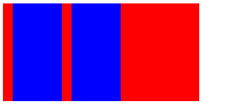
(4)space-between 两端对齐
代码:
<div class="parent">
    <div class="children"></div>
    <div class="children"></div>
    <div class="children"></div>
</div>
.parent{
    width: 500px;
    height: 200px;
    background: red;
    display: flex;
    justify-content: space-between;
}
.children{
    width: 100px;
    height: 100px;
    background: blue;
}
(5)space-around 每侧的间隔相等
代码同上,将space-between改成space-around即可
下面是运行效果:

2、 align-items属性 定义属性在交叉轴(纵轴)上如何对齐
它也有5个值:
flex-start:交叉轴的起点对齐
flex-end:交叉轴的终点对齐
center:交叉轴的中点对齐
baseline:项目的第一行文字的基线对齐
stretch(默认值):如果项目未设置高度或设为auto,将占满整个容器的高度
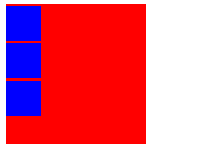
(1)flex-start 交叉轴 纵轴起点对齐
.parent{
    width: 200px;
    height: 200px;
    background: red;
    display: flex;
    align-items: flex-start;
}
.children{
    width: 100px;
    height: 100px;
    background: blue;
}

(2)flex-end 交叉轴终点对齐

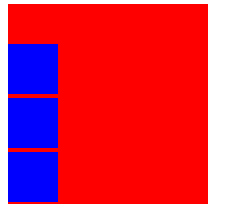
(3)center 交叉轴中点对齐
(4)baseline 第一行文字的基线对齐
<div class="parent">
    <div class="children1">
        <p>我是第一行</p>
        <p>我是第二行</p>
    </div>
    <div class="children2">
        <p>我是第一行</p>
        <p>我是第二行</p>
    </div>
</div>
.parent{
    width: 300px;
    height: 300px;
    background: red;
    display: flex;
    align-items: baseline;
}
.children1{
    width: 100px;
    height: 100px;
    background: blue;
}
.children1 p{
    font-size: 20px;
}
.children2{
    width: 100px;
    height: 150px;
    background: blue;
}
(5)stretch 子元素未设置高度或为auto,高度占满整个容器
.parent{
    width: 400px;
    height: 200px;
    background: red;
    display: flex;
    align-items: stretch;
}
.children{
    width: 100px;
    background: blue;
    margin-left: 20px;
}
3、flex-direction属性 决定主轴的方向即项目的排列方向
它有4个值:
row(默认值):主轴为水平方向,起点在左端
row-reverse:主轴为水平方向,起点在右端
column:主轴为垂直方向,起点在上沿
column-reverse:主轴为垂直方向,起点在下沿
(1)row(默认值) 从左向右排列
.parent{
    width: 600px;
    height: 200px;
    background: red;
    display: flex;
    flex-direction: row;
}
.children{
    width: 100px;
    height: 100px;
    background: blue;
    margin-left: 20px;
}

(2)row-reverse 从右向左排列

(3)column 从上向下排列
(4)column-reverse 从下向上排列
4、flex-wrap属性 定义了一条轴线放不下的情况下,如何换行
它有3个值:
nowrp(默认):不换行
wrap:换行,第一行在上方
wrap-reverse:换行,第一行在下方
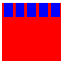
(1)nowrap(默认) 不换行
<div class="parent">
    <div class="children"></div>
    <div class="children"></div>
    <div class="children"></div>
    <div class="children"></div>
    <div class="children"></div>
</div>
.parent{
    width: 200px;
    height: 200px;
    background: red;
    display: flex;
    flex-wrap: nowrap;
}
.children{
    width: 50px;
    height: 50px;
    background: blue;
    margin:0px 5px 0px 5px;
}
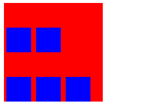
(2)wrap 换行,第一行在上方
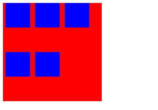
(3)wrap-reverse 换行,第一行在下方
5、flex-flow属性 它是flex-direction和flex-wrap属性的简写形式, 默认值为row nowrap
.parent {
flex-flow: <flex-direction> <flex-wrap>;
}
至此,父元素(容器)的5个属性终于完结了~~~
