图片 响应式图像 Images Figures
响应式图像
Bootstrap中的图像响应 .img-fluid
<img class="img-fluid" src="http://lorempixel.com/1024/580/business" alt="">
图像会随着父元素一起缩放
圆角边框
使用.img-thumbnail为图像提供圆形1px边框外观
<img class="img-fluid img-thumbnail" src="http://lorempixel.com/1024/580/business" alt="">
圆角图片
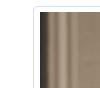
<img class="img-fluid rounded" src="banner1.jpg" alt="">

图片浮动 清除浮动
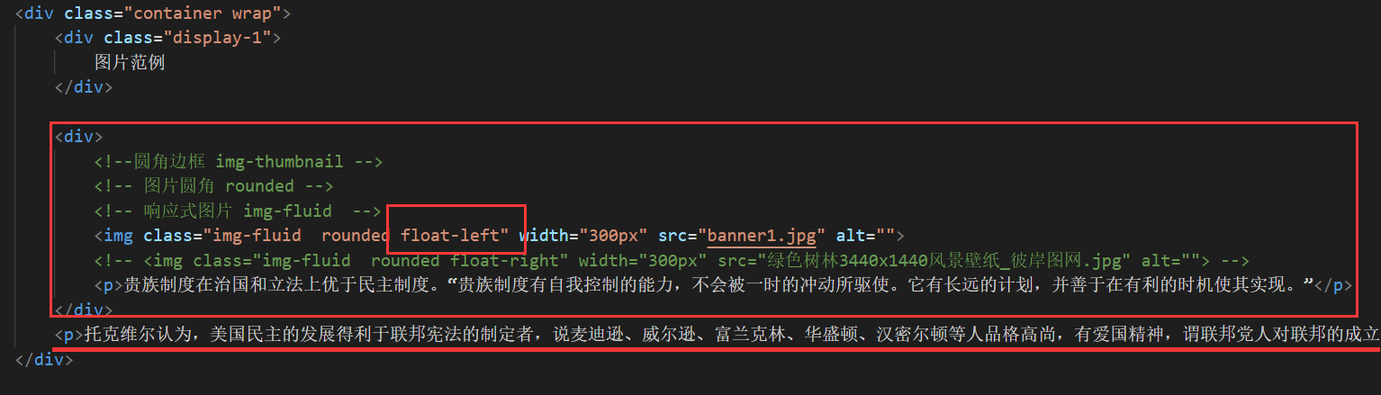
div中的img标签使用了float-left
此时p元素在div的外面
但是却在页面中浮动上去了
此时必须在其外层div补上清除浮动
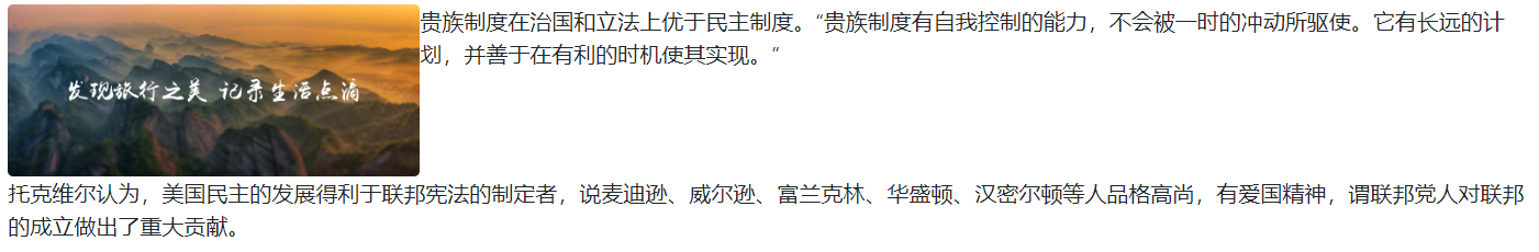
这样div内的排版不会对其他部分造成影响 而造成跑版问题
图片置中
方式一
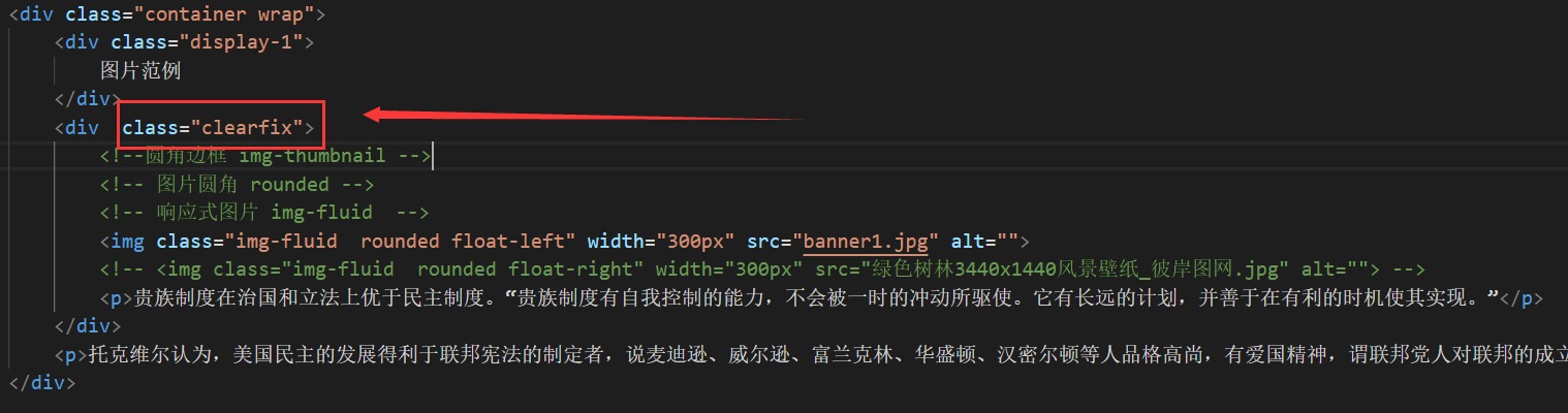
<div class="clearfix">
<!-- 左右margin设置为auto 将图片的display设置为block-->
<img class="img-fluid rounded mx-auto d-block" width="300px" src="banner1.jpg" alt="">
</div>

方式二
<!--方式二: 将图片视为文字的一部分 在外层的部分设置 class="text-center"-->
<div class="text-center">
<img class="img-fluid rounded" width="300px" src="绿色树林3440x1440风景壁纸_彼岸图网.jpg" alt="">
</div>
Figures
任何时候你需要显示一段内容 - 如带有可选标题的图像,请考虑使用<figure>。
使用附带的.figure,.figure-img以及.figure-caption类为HTML5的<figure>和<figcaption>元素提供了一些基线的风格
请务必将该.img-fluid类添加到您的内容中<img>以使其具有响应性
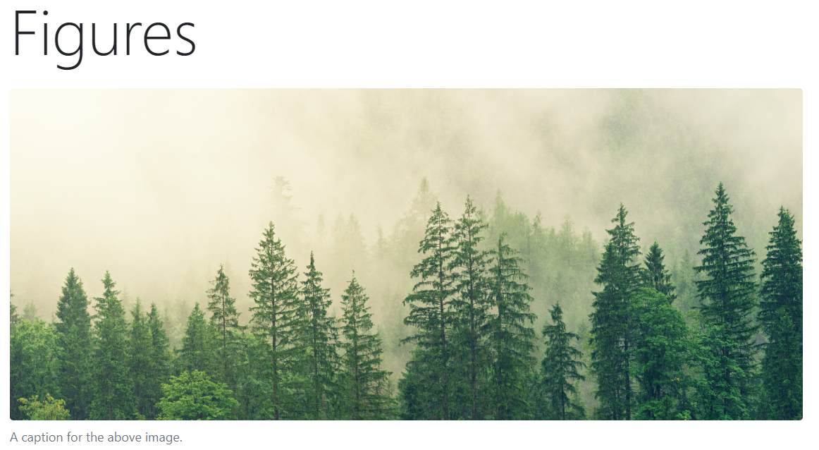
  <figure class="figure">
            <img class="img-fluid rounded figure-img" width="900px" src="绿色树林3440x1440风景壁纸_彼岸图网.jpg"
                alt="A generic square placeholder image with rounded corners in a figure.">
            <figcaption class="figure-caption">A caption for the above image.</figcaption>
  </figure>