css中的几个小tip(一)
原博:http://www.webhek.com/post/7-tips-web-front-developer-must-know__trashed.html
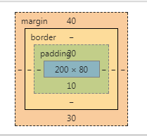
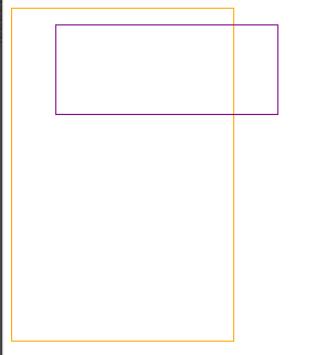
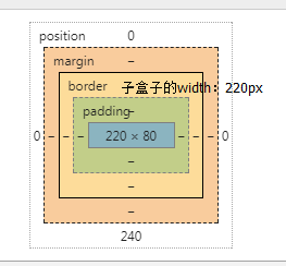
1.元素的margin-top、margin-bottom及padding-top、padding-bottom使用百分比作为单位时,其是相对父元素的宽度width,而不是我们想象的高度height;如图
<style type="text/css">
        .parent{
            outline: 1px solid orange;
            width: 200px;
            height: 300px;
            padding: 10px;
            margin: 10px;
        }
        .child{
            outline: 1px solid purple;
            width: 200px;
            height: 80px;
            padding-top: 10%;      /*20px = 父容器的width值200px * 10% */
            padding-bottom: 5%;     /*10px = 200px * 5% */
            margin-top: 20%;      /*40px = 200px * 20%*/
            margin-bottom: 15%;    /*30px = 200px * 15%*/
        }
<body>
    <div class="parent">
        <div class="child"></div>
    </div>
</body>

子盒子参数如下:
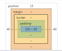
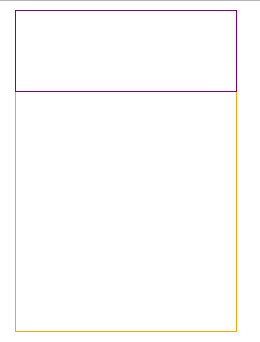
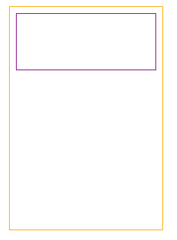
2.含有定位属性的元素,其top、bottom单位为百分比时,该百分比是相对父元素的高度height。left、right则是相对父元素的宽度width.
.parent{
            outline: 1px solid orange;
            width: 200px;
            height: 300px;
            padding: 0px;
            margin: 0px;
            position: relative;
        }
        .child{
            outline: 1px solid purple;
            width: 200px;
            height: 80px;
            position: absolute;
            top: 5%;  /* 15px = 300px * 5% 上边框离父盒子上边框15px的距离*/
            left: 20%;  /*  40px = 200px * 20% 左边框离父盒子左边框40px的距离
                   也就是子盒子左上角的坐标为x=15,y=40(父盒子左上角为原点)  */

        }
3.边框宽度不能用百分比表示
4.width:100%
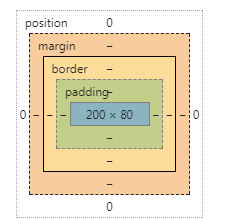
4.1当父容器里有绝对定位的子元素时,子元素设置width:100%实际上指的是相对于父容器的padding+content的宽度。
r如图:
 1 <style type="text/css">
 2     .parent{
 3         outline: 1px solid orange;
 4         width: 200px;
 5         height: 300px;
 6         padding: 10px;
 7         margin: 10px;
 8         position: relative;
 9     }
10     .child{
11         outline: 1px solid purple;
12         width: 100%;  /* width = 220px = 父容器的padding+content*/
13         height: 80px;
14         position: absolute;
15         top: 0;
16         left: 0;
17     }
18 </style>
4.2 当子元素是非绝对定位的元素时(可以是相对定位),或者如果都没有定位,width:100%才是指子元素的 content ,其等于父元素的 content宽度。
.parent{
    outline: 1px solid orange;
    width: 200px;
    height: 300px;
    padding: 10px;
    margin: 10px;
}
.child{
    outline: 1px solid purple;
    width: 100%;  /* width:200px = 父盒子的content*/
    height: 80px;
}
.parent{
    outline: 1px solid orange;
    width: 200px;
    height: 300px;
    padding: 10px;
    margin: 10px;
    position: relative;
}
.child{
    outline: 1px solid purple;
    width: 100%;
    height: 80px;
    position: relative;
}
5. 设为flex布局后,子元素的float、clear和vertical-align属性将失效
6. vertical-align直接使用将失效,要搭配display:inline-block使用;或者将line-heigth设置的和height一样高,文字也可以垂直居中。
