


Unity_UGUI翻译(2) Basic Layout(基本布局)
Basic Layout(基本布局)
In this section we’ll look at how you can position UI elements relative to the Canvas and each other. If you want to test yourself while reading, you can create an Image using the menu
The Rect Tool(矩形工具)
Every UI element is represented as a rectangle for layout purposes. This rectangle can be manipulated in the Scene View using the Rect Tool in the toolbar. The Rect Tool is used both for Unity’s 2D features and for UI, and in fact can be used even for 3D objects as well.
每个UI元素都在视图中显示为一个矩形.可以通过使用toolbar里的矩形工具,在Scene视图改变这个代表UI元素的矩形.这个矩形工具同时适用于Unity2D特征和UI元素,事实上它也能适用于3D物体
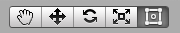
Toolbar buttons with Rect Tool selected(在Toolbar中被选择的矩形工具)
The Rect Tool can be used to move UI element around, resize them, and rotate them, all in one. Once you have selected a UI element, you can move it by clicking anywhere inside the rectangle and dragging. You can resize it by clicking on the edges or corners and dragging. The element can be rotated by hovering the cursor slightly away from the corners until the mouse cursor indicates a rotation symbol. You can then click and drag in either direction to rotate.
Rect工具可以同时用来移动UI,改变UI大小也可以旋转UI.一旦你选择了一个UI元素,你可以点击在UI矩形区域内的任意位置拖动它到别的地方.可以把鼠标放在UI矩形的边框或者四角通过拖动改变UI的大小.如果要是想旋转UI元素,要把鼠标慢慢移动到一个角外面,直到鼠标显示为一个旋转图标,然后你通过点击加拖动的方式来旋转UI.
Just like the other tools, the Rect Tool uses the current pivot mode and space, set in the toolbar. When working with UI it’s usually a good idea to keep those set to Pivot and Local.
就像其他工具一样,通过工具栏设置,Rect工具也可以使用当前中心点(pivot)模式和空间模式.在操作UI的时候,将工具栏设置为Pivot和Local是一个很好的选择
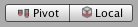 Toolbar buttons set to Pivot and Local(在工具栏中设置为Pivot和Local)
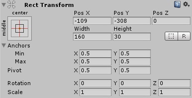
Rect Transform
The Rect Transform is a new transform component that is used for all UI elements instead of the regular Transformcomponent.
Rect transform是一个新的transform组件,在对所有UI元素操作的时候,它取代了常规的transform组件
Rect Transforms have position, rotation, and scale just like regular Transforms, but it also has a width and height, used to specify the dimensions of the rectangle.
Rect Transform组件有位置,角度,大小这些属性就像普通Transform组件一样,但是它还有宽度,高度这些属性,用于指定UI矩形的尺寸
Resizing Versus Scaling (Resizing和Scaling间的抉择)
When the Rect Tool is used to change the size of an object, normally for Sprites in the 2D system and for 3D objects it will change the local scale of the object. However, when it’s used on an object with a Rect Transform on it, it will instead change the width and the height, keeping the local scale unchanged. This resizing will not affect font sizes, border on sliced images, and so on.
对于2D精灵系统和3D物体,当使用Scale改变物体尺寸的时候,会改变物体本地的尺寸,然而,用Rect组件去改变大小的时候,将会改变物体的宽度和长度,然后本身的尺寸不会发生改变.这样不会改变字体的大小,被修剪过的图片的边框,等等之类的

经过实验3个Text UI :都是Hello World文字,最下方是对照组,width100 height100 scale : x=1,y=1,可以看到缺少字母"d",最上方的是通过Rect工具把width修改为200,可以观察看到hello world的全部文字,并且文字大小没有改变,中间的是通过Scale,把Scale中的x改为2,可以观察看到字母"d"还是看不到,但是字体的大小被改变
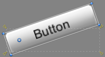
Pivot(
Rotations, size, and scale modifications occur around the pivot so the position of the pivot affects the outcome of a rotation, resizing, or scaling. When the toolbar Pivot button is set to Pivot mode, the pivot of a Rect Transform can be moved in the Scene View.
旋转,size和scale的改变都是围绕Pivot来进行的,所以pivot的位置改变也会影响到旋转,size和scale改变的效果,当在工具栏中选择pivot模式,可以通过Rect工具在Scene是视图中改变Pivot的位置.
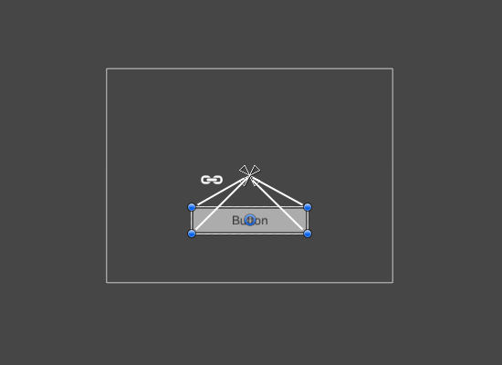
Anchors(锚点)
Rect Transforms include a layout concept called anchors. Anchors are shown as four small triangular handles in the Scene View and anchor information is also shown in the Inspector.
Rect组件还包括一个布局概念,叫做锚点.锚点在Scene场景中通过四个小的三角形状的工具表示出来,关于锚点的信息也可以在Inspector中看到.
If the parent of a Rect Transform is also a Rect Transform, the child Rect Transform can be anchored to the parent Rect Transform in various ways. For example, the child can be anchored to the center of the parent, or to one of the corners.
如果Rect组件的父类游戏物体也有Rect组件,那么子类物体的Rect组件可以通过锚点以不同的方式固定在父类物体的Rect组件中,例如子类固定在父类中间,或者一个角.
UI element anchored to the center of the parent. The element maintains a fixed offset to the center.
UI元素的锚点固定在父类的中心,当父类改变的时候,它始终和父类保持一定距离
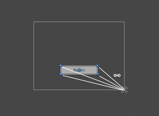
UI element anchored to the lower right corner of the parent. The element maintains a fixed offset to the lower right corner.
UI元素的锚点固定在父类的改变的时候,它始终和右下角保持一定的偏离
The anchoring also allows the child to stretch together with the width or height of the parent. Each corner of the rectangle has a fixed offset to its corresponding anchor, i.e. the top left corner of the rectangle has a fixed offset to the top left anchor, etc. This way the different corners of the rectangle can be anchored to different points in the parent rectangle.
设置锚点可以使子类物体随着父类物体同时改变宽度和高度,矩形的四个角和它相对应的锚点都有着一个固定的偏移,比如像矩形的左上角对应左上角的锚点有着一个固定的偏移.通过这种方式,矩形的不同角就和父类相对应的不同锚点固定下来了.
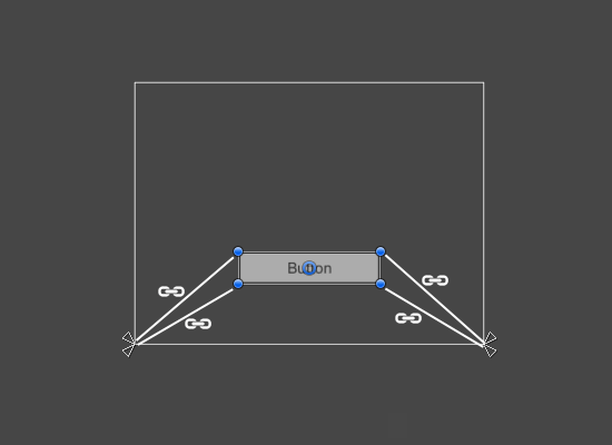
UI element with left corners anchored to lower left corner of the parent and right corners anchored to lower right. The corners of the element maintains fixed offsets to their respective anchors.
UI元素的左边两个角将父类元素的左下角设为锚点,子类元素的右边两个角将父类元素的右下角设为锚点.元素的每个角和它们对应的锚点都会保持一定的偏移.
The positions of the anchors are defined in fractions (or percentages) of the parent rectangle width and height. 0.0 (0%) corresponds to the left or bottom side, 0.5 (50%) to the middle, and 1.0 (100%) to the right or top side. But anchors are not limited to the sides and middle; they can be anchored to any point within the parect rectangle.
锚点的位置,可以通过在父类中用分数或者百分数设置,0.0对应着左边和底边,1,0对应着右边或者上边,左右的时候,0代表最左边,1代表最右边,上下的时候,0代表下边,1代表上边,不过锚点不仅可以在父类物体的边框或者中间设置,也可以将锚点设置在父类矩形框内的任何位置.
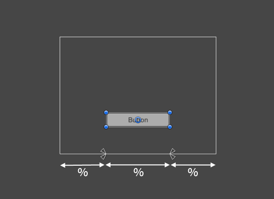
UI element with left corners anchored to a point a certain percentage from the left side of the parent and right corners anchored to a point a certain percentage from the right side of the parent rectangle.
UI元素的左边两个角和父类物体的左边框,保持一个固定的比例,右边也同样.
You can drag each of the anchors individually, or if they are together, you can drag them together by clicking in the middle in between them and dragging. If you hold down
A useful feature of the anchor handles is that they automatically snap to the anchors of sibling rectangles to allow for precise positioning.
你可以分别设置每一个锚点,也可以把鼠标放在锚点中间并且拖动,同时设置所有锚点.如果你摁住Shift键,同时拖动一个锚点的时候,那么和这个锚点相对应的父类物体的顶点也会随着移动.锚点有一个非常有用的特征,他们会自动地和其他兄弟界别的UI矩形对齐,并且保持一个准确的位置
Anchor presets(锚点预设)
In the Inspector, the Anchor Preset button can be found in the upper left corner of the Rect Transform component. Clicking the button brings up the Anchor Presets dropdown. From here you can quickly select from some of the most common anchoring options. You can anchor the UI element to the sides or middle of the parent, or stretch together with the parent size. The horizontal and vertical anchoring is independent.
在Inspector面板上,锚点预设按钮在意在Rect Transform组件的左上方看见,点击这个按钮,可以看到锚地预设面板打开,从这里你可以快速选择几种最常用的锚点放置方式.这样你就可以把UI元素固定在父类物体的边框或者中心,它也会随着父类物体尺寸的改变而灵活的变化,水平方向的锚点设置和垂直方向的锚点设置是相互独立的.
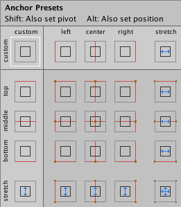
The Anchor Presets buttons displays the currently selected preset option if there is one. If the anchors on either the horizontal or vertical axis are set to different positions than any of the presets, the custom options is shown.
如果选择了一个预制的锚点预设,那么锚点预设按钮会显示出来.若果锚点的水平方向或者垂直方向,选择的不是预制的几种锚点设置,那么在锚点按钮处会相对应的显示为Custom
Anchor and position fields in the Inspector
You can click the Anchors expansion arrow to reveal the anchor number fields if they are not already visible. Anchor Mincorresponds to the lower left anchor handle in the Scene View, and Anchor Max corresponds to the upper right handle.
如果你看不到锚点Min,Max数字,你也点击锚点扩展按钮将这些显示出来.ancher的最小值(0,0)对应左下角,(1,1)对应着右上角.
The position fields of rectangle are shown differently depending on whether the anchors are together (which produces a fixed width and height) or separated (which causes the rectangle to stretch together with the parent rectangle).
在Postion框中会依据锚点的是否放置在一起显示出不同数值(会显示出一个修正过的宽度和高度),或者分别显示出来(这会使得UI元素的矩形框随着父类物体的矩形框一起改变

When all the anchor handles are together the fields displayed are Pos X, Pos Y, Width and Height. The Pos X and Pos Y values indicate the position of the pivot relative to the anchors.
当所有的锚点图标在Pos框显示出来时,会显示出Pos X, Pos Y, 宽度和长度.Pos X和Y的数值代表pivot和锚点之间的关系.
When the anchors are separated the fields can change partially or completely to Left, Right, Top and Bottom. These fields define the padding inside the rectangle defined by the anchors. The Left and Right fields are used if the anchors are separated horizontally and the Top and Bottom fields are used if they are separated vertically.
可以在输入框内分别设置锚点,使得完全靠左边或者右边或者上边或者下边.这些输入框代表着锚点和边框的距离.Left和Right输入框能够设置左右,Top和Bottom能设置上下
Note that changing the values in the anchor or pivot fields will normally counter-adjust the positioning values in order to make the rectangle stay in place. If cases where this is not desired, the Raw Mode can be enabled using a small button in the Inspector. This causes the anchor and pivot value to be able to be changed without any other values changing as a result. This will likely cause the rectangle to be visually moved or resized, since its position and size is dependent on the anchor and pivot values.
当你改变anchor和pivot输入框内的数值时,position的数值也会随着改变,这是为了让UI矩形边框保持位置.如果这导致矩形位置不在想要的位置上,Raw模式(就是Inspector的R图标)可以在Inspector里激活,这会让anchor和pivot不会随着其他数值的改变而改变,这样可以使得UI矩形框在可视化地改变,因为它的位置和尺寸与anchor和pivot相互独立
