

用rem开发响应式设计
IE 9+
效果图:
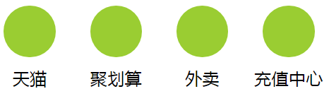
<!DOCTYPE html>
<html lang="en">
<head>
    <meta charset="UTF-8">
    <meta http-equiv="X-UA-Compatible" content="IE=edge,chrome=1" />
    <meta name="viewport" content="width=device-width, initial-scale=1, user-scalable=no" />
    <title>用rem开发响应式设计</title>
    <style type="text/css">
        *{margin: 0;padding: 0;}
        li{list-style: none;}
        *, *:after, *:before {
            -webkit-box-sizing: border-box;
            box-sizing: border-box;
        }
        *{zoom:1}

        /*清除浮动*/
        .clearfix:after {
            content: " ";
            display: block;
            clear: both;
            height: 0;
        }

        .clearfix {
            zoom: 1;
        }

        .box{
            width: 10rem;
            margin: 0 auto;
        }
        .box>li{
            float: left;
            padding: 0.2rem;
            width: 2.5rem;
            text-align: center;
        }
        .box>li>i{
            display: inline-block;
            width: 1.5rem;
            height: 1.5rem;
            border: 1px solid transparent;
            border-radius:50% ;
            background: yellowgreen;
        }
        .box>li>p{

            font-size:0.5rem;
        }
    </style>
    <script type="text/javascript" src="https://cdn.bootcss.com/jquery/1.12.4/jquery.min.js"></script>
    <script type="text/javascript">
        $(function () {
             var ResetFontSize=function () {
                 var $width=$(window).width();
                 //防止过度放大
                 if($width>640) $width=640;
                 //防止过度缩小
                 if($width<300) $width=300;
                 //设置根元素字号
                 $("html").css("fontSize",($width/10)+"px");
             };
            ResetFontSize();

            $(window).resize(function() {
                ResetFontSize();
            });
        });
    </script>
</head>
<body>
    <ul class="box clearfix">
        <li><i></i><p>天猫</p></li>
        <li><i></i><p>聚划算</p></li>
        <li><i></i><p>外卖</p></li>
        <li><i></i><p>充值中心</p></li>
    </ul>
</body>
</html>
思路参考:《移动Web前端高效开发实战》 P115
将设计稿的任意 px 值转成 rem 值:
页面的基准 font-size 值设置为页面根元素的 1/10 宽度
假设设计稿宽度是 640 像素,1rem = (640/10)px = 64px ,那么 px 值转成 rem 值:rem 值 = px 值 / 64 * 1rem
思路参考:《移动Web前端高效开发实战》 P290
