
html+css 毛玻璃效果
B站那个毛玻璃效果挺不错的,尝试着弄了一下
两种方法原理一样
方法一:
效果图:
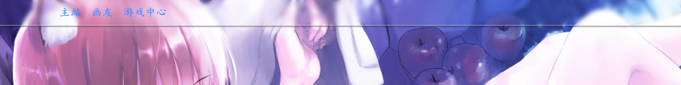
html 代码
<!DOCTYPE html>
<html>
    <head>
        <meta charset="utf-8" />
        <title></title>
        <link rel="stylesheet" type="text/css" href="css/index.css"/>
    </head>
    <body>
        <div class="all">
            <div class="a">
                <div class="b">
                </div>
                <div class="c">
                    <ul>
                        <li>
                            <a href="#">主站</a>
                        </li>
                        <li>
                            <a href="#">画友</a>
                        </li>
                        <li>
                            <a href="#">游戏中心</a>
                        </li>
                    </ul>
                </div>
            </div>
        </div>
        <div class="d"></div>
    </body>
</html>
css代码:
body ,.b{
    background-image: url(../img/1010655.jpg);
    background-attachment: fixed;
    background-repeat: no-repeat;
    background-size: cover;
    margin: 0;
    padding: 0;
    font-family: "楷体";
}
ul, li{
    margin: 0;
    padding: 0;
}
.a{
    height: 50px;
    border-bottom: 2px  solid rgba(225,225,225,.6);
    box-shadow: 0px 2px 1px rgba(0,0,0,.5);
    position: relative;
}
.b{
    height: 50px;
    width: 100%;
    filter: blur(4px);
    position: absolute;
}
.c{
    height: 50px;
    width: 100%;
    position: absolute;
/*    background-color: black;*/

}
.c ul li{
    height: 50px;
    list-style-type: none;
    float: left;
    margin-left: 20px;
    line-height: 50px;
    font-size: 21px;
}
.c ul{
    margin-left:100px ;
}
.c  li>a{
    text-decoration: none;
    color: dodgerblue;
    text-align: center;
}
.c ul li:hover{
transform: scale(1.5);
transition: transform  .5s ;
text-shadow: 4px 6px 5px rgba(100,100,100,.8);

}
/*.d{
    height: 1000px;
}*/
感觉还不错的样子!!!!!!!!
方法二:
效果图:
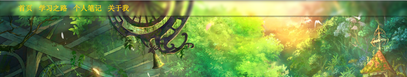
html代码:
 1 <!DOCTYPE html>
 2 <html>
 3     <head>
 4         <meta charset="utf-8" />
 5         <title></title>
 6         <link rel="stylesheet" href="css/index.css" />
 7     </head>
 8     <body>
 9        <div class="nav">
10             <ul class="nav-bar">
11                 <li><a href="#">首页</a></li>
12                 <li><a href="#">学习之路</a></li>
13                 <li><a href="#"></a></li>
14                 <li><a href="#">个人笔记</a></li>
15                 <li><a href="#">关于我</a></li>
16             </ul>
17         </div>
18         <div class="">
19
20         </div>
21     </body>
22 </html>
css代码:
 1 *{
 2     margin: 0px;
 3     padding: 0px;
 4 }
 5 body,div::before{
 6     background-image: url(../img/nav-warp.jpg);
 7     background-repeat: no-repeat;
 8     background-attachment: fixed;
 9 }
10
11 .nav{
12     position: relative;
13     width: 100%;
14     height: 50px;
15 /*    background-color: rgba(255,255,255,.1);*/
16     border: 1px solid rgba(0,0,0,.1);
17 /*    border-radius:50px ;*/
18     box-shadow: 2px 2px 2px 2px rgba(0,0,0,.3);
19     overflow: hidden;
20
21 }
22 div::before{
23     content: '';
24     width: 100%;
25     height: 50px;
26     filter:blur(4px);
27     position:absolute;
28     top: 0; right: 0; bottom: 0; left: 0;
29     z-index: -1;
30 }
31 a{
32     text-decoration: none;
33 }
34 ul li{
35     list-style: none;
36 }
37 .nav-bar{
38     margin-left:50px;
39 }
40 .nav-bar>li{
41     position: relative;
42 }
43 .nav-bar>li{
44     float:left;
45     height:inherit;
46
47     text-align: center;
48 }
49 .nav-bar a{
50     display: block;
51     font-size: 24px;
52     line-height: 50px;
53     padding: 0px 10px;
54     color: #FFD700;
55 }
56 .nav-bar>li:hover a{
57     color: white;
58     transform: scale(1.5);
59     transition: all .5s;
60 }
