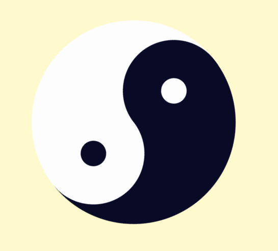
纯CSS 阴阳鱼
//动画生效后,其效果不可该变,只有换其动画名

鼠标移入前顺时针旋转

鼠标移入后动画效果改变(逆时针旋转):
HTML代码
<!DOCTYPE html>
<html>
<head lang="en">
<meta charset="UTF-8">
<title></title>
<link rel="stylesheet" href="yu.css"/>
</head>
<body>
<div class="hot">
<div class="news">
<div class="trap"></div>
</div>
<div class="subnav">
<div class="eye"></div>
</div>
</div>
</body>
</html>
CSS代码
body{
background-color:lemonchiffon;
}
.hot{
width: 0;
height: 400px;
border-left:200px solid #fdfdfe;
border-right:200px solid #090a26;
border-radius: 50%;
margin: auto;
margin-top: 100px;
position: relative;
animation:move 3s linear infinite;
}
.news{
width: 200px;
height: 200px;
background-color:#fdfdfe;
border-radius: 50%;
position: absolute;
top: 0;
left:-100px ;
}
.trap{
width: 50px;
height: 50px;
border-radius: 50%;
background-color: #090a26;
margin-top: 75px;
margin-left: 75px;
}
.subnav{
width: 200px;
height: 200px;
background-color: #090a26;
border-radius: 50%;
position: absolute;
bottom: 0;
left:-100px ;
}
.eye{
width: 50px;
height: 50px;
border-radius: 50%;
background-color: #eaeaea;
margin-top: 75px;
margin-left: 75px;
}
@keyframes move{
0%{
transform:rotate(0deg);
}100%{
transform:rotate(360deg);
}
}
.hot:hover .news{
background-color: #090a26;
}
.hot:hover .trap{
background-color: #fdfdfe;
}
.hot:hover .subnav{
background-color:#fdfdfe;
}
.hot:hover .eye{
background-color: #090a26;
}
.hot:hover{
animation:move01 3s linear infinite;
}
@keyframes move01 {
0% {
transform: rotate(360deg);
}
100% {
transform: rotate(0deg);
}
}
