knowladge_网站开发_jQuery插件_Clock Demo
今天要用jQuery做一个Clock Demo. 查了查相关的资料
找到了一个很好的插件设计 http://css-tricks.com/css3-clock
转发一下这个文章
Old School Clock with CSS3 and jQuery
PUBLISHED NOVEMBER 17, 2008 BY GUEST AUTHOR
Hi everyone, my name is Toby Pitman and Chris has asked me to write a post about a recent experiment that I posted up on the forum a little while ago. It all started when I was looking at the WebKit blog and saw an article on the new CSS3 animations and the one that caught my eye was 'rotate'. I started thinking what the hell can you rotate on a webpage (it's animated GIF's times ten!). Then it hit me - a clocks hands rotate! Bingo!

CSS3 transform: rotate
transform: rotate; is a new feature of CSS 3 which lets you... well, rotate stuff. Transform will also allow you to scale, skew and translate (move) objects in your web page. All these can be animated by the Transition property (complete with easing and duration).
Sound familiar? Well it should, it's the same thing we are currently using frameworks like jQuery to animate elements on our web pages. As with jQuery you can animate pretty much any CSS property worth animating with Transition. Think of a :hover effect and you should get some ideas. It's nowhere near as powerful as jQuery or Mootools etc but can still do some cool stuff. I doubt John Resig will lose any sleep!
And no, this won't work in IE6... ever! OK let's go!
The Graphics
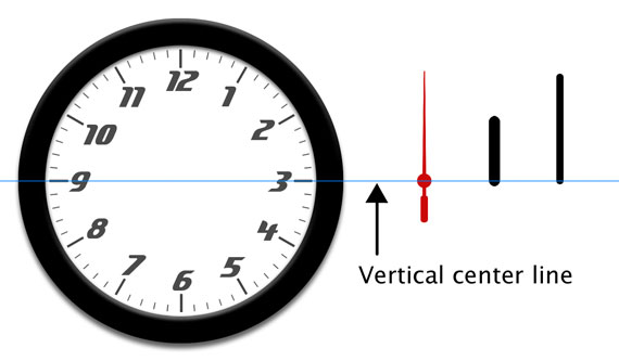
First we'll need some graphics for our clock interface. We have a face and three hands. All the moving parts are sliced in Photoshop at 600px high and 30px wide and are positioned vertically dead center as by default the rotate property 'rotates' from the center of the element. You can use 'transform-origin' to set a rotate point if you want.
I've gone with a generic clock thing here but there's nothing to stop you going for a Micky Mouse clock if you like. The moving parts are all PNG images making this effect possible.

The HTML Markup
The mark-up for the clock is a simple un-ordered list. Each list item will hold a moving part and is given a relevant id. Here it is.
<ul id="clock">
  <li id="sec"></li>
  <li id="hour"></li>
  <li id="min"></li>
</ul>
NOTE: The forum post had a bit more of a clunky mark-up as it has realistic drop shadows on the hands. I've refined some of the code a bit for this demo and the forum one has been left as is.
The CSS
#clock {
  position: relative;
  width: 600px;
  height: 600px;
  margin: 20px auto 0 auto;
  background: url(clockface.jpg);
  list-style: none;
}

#sec, #min, #hour {
  position: absolute;
  width: 30px;
  height: 600px;
  top: 0px;
  left: 285px;
}

#sec {
  background: url(sechand.png);
  z-index: 3;
}

#min {
  background: url(minhand.png);
  z-index: 2;
}

#hour {
  background: url(hourhand.png);
  z-index: 1;
}
The CSS is really simple too. As the moving parts share the same dimensions and start positions we can declare these together to avoid repeating ourselves making the CSS a bit leaner. The <ul> is given a position of relative allowing us to absolutely position the clock hands inside it.
NOTE: Rotate doesn't effect layout and the object behaves like an absolutely positioned element outside the normal flow when rotated.
So where is is the CSS3 stuff? Well we’re going to apply that using some simple jQuery.
The jQuery JavaScript
- Get the timing information for the clock.
- Calculate and inject the CSS style (rotation angle) for each element.
- Update the CSS style info at regular intervals.
It should be noted that jQuery has no problem at all using these new CSS3 properties. Also as the styles are allocated dynamically and not from the stylesheet this clock still validates as CSS2.1!
Getting the time
Some of you might (well I did!) equate date and time info with PHP, and when I started this PHP was my first thought, but then I discovered javascript has it's own built in functionality for getting date and time data too. Note with JavaScript the time is local to the machine not the server.
We're going to get this info using the Date() syntax and assigning that to a variable. We can get each hands specific data by attaching GetSeconds(), GetMinutes() orGetHours() to the Date() syntax like this example.
var seconds = new Date().getSeconds();The above code will return a number between 0 and 59 and store it inside the variable 'seconds'.
Getting the angle
Next we have calculate the angle for each hand. In the case of the seconds and minutes which have 60 increments per rotation we just divide 360 by 60 which gives us 6. This means that for each second or minute we have to rotate the hand by 6 degrees. We're going to to store this equation inside another variable. For the seconds it will look like this.
var sdegree = seconds * 6;The hour hand throws up a different scenario. Because there are 12 increments per rotation the angle for each hour is 30 degrees. That's 360/12=30. Now that would be simple if a clocks hour hand moved in hour increments but it does't. It moves in smaller amounts based on the minute value. Say at 4:30 the hour hand will be half way between 3 and 4. So how do we do this. Here's the code.
var hdegree = hours * 30 + (mins / 2);Basically we're going to add the current number of minutes divided by two which should give us a number between 0.5 and 29.5 ('rotate' can handle all floating point numbers) this puts the hand somewhere between any given 30 degree (hour) increment.
Example:
| 2.40 would be: | 2 * 30 | = | 60 degrees | |
| + | 40 / 2 | = | 20 degrees | |
| --------- | --- | ---------- | ||
| hdegree | = | 80 degrees |
I did think that the clock might explode when it got past 12 as it would be a number higher then 360 but it worked fine.
So now we've figured the math lets inject the new CSS.
Set the style
Here is the CSS3 rotate as if it were in a style sheet.
#sec {
   -webkit-transform: rotate(45deg);
   -moz-transform: rotate(45deg);
   -ms-transform: rotate(45deg);
   -o-transform: rotate(45deg);
   transform: rotate(45deg);
}
Here it is injected by jQuery (NOTE: As of jQuery 1.8, the proper vendor prefixes will be applied when using the .css() function. Older versions of jQuery will need to apply them manually).
$("#sec").css({
  "transform": "rotate(45deg)"
});
The problem we have here is getting the variable 'sdegree' (which holds our angle) into this syntax to replace the (45deg). At first I just tried putting the variable between the brackets but it wouldn't have it. To make this work we need to build a 'string' inside another variable called 'srotate' and completely replace the second argument. Here's how we make it.
var srotate = "rotate(" + sdegree + "deg)";The jQuery will now be written as this.
$("#sec").css({ "transform": srotate });Putting it all together (in time!)
The whole jQuery code looks like this.
$(function() {

      setInterval( function() {
      var seconds = new Date().getSeconds();
      var sdegree = seconds * 6;
      var srotate = "rotate(" + sdegree + "deg)";

      $("#sec").css({ "transform": srotate });

      }, 1000 );

      setInterval( function() {
      var hours = new Date().getHours();
      var mins = new Date().getMinutes();
      var hdegree = hours * 30 + (mins / 2);
      var hrotate = "rotate(" + hdegree + "deg)";

      $("#hour").css({ "transform": hrotate});

      }, 1000 );

      setInterval( function() {
      var mins = new Date().getMinutes();
      var mdegree = mins * 6;
      var mrotate = "rotate(" + mdegree + "deg)";

      $("#min").css({ "transform" : mrotate });

      }, 1000 );

});
Notice how we've used a JavaScript setInterval so the function is run every second. The variables that get the time data have to be inside the function so they update too. If not they would only gather that data on page load once, making a pretty rubbish clock.
Our clock should now work (in Safari and other modern browsers).
Alternatives
Flash is the obvious one but unless you've got ActionScript chops I'd give it a swerve. This may even be possible with PHP using the GD image library to rotate the hands but that's way above my level.
Incidentally, Soh Tanaka posted this a few days after by pure coincidence: CSS clock. His clock uses JavaScript to add classes and sprite images for the hands.
UPDATE Nov 2012: Daniel Bakan has a very similar article "How To Write a Full Screen Web App Optimized For iOS Devices" in which he builds an old timey clock as well. If you're super interested in this, that's worth checking out as well.
Conclusion
So there you have it folks, a real and (probably the only) practical use for the new CSS3 property transform:rotate. I for one can't wait for upside down and sideways websites (Yes, you can even rotate the HTML tag! Although look what that does to Safari) and my personal favorite the spinning/zooming cartoon newspaper blog posts.
So go on, give some of those new CSS3 features a try!
小结一下: 做了一下 非常好用 关于计算那的代码还没有细看 如果要将钟的size变小 只需要改一下背景图片 然后用PS将背景中的白色空白p掉即可。


