前端开发遇到的各类问题汇总

一、JS获取滚动条位置

1、获取坐标:

   IE  (event.x  event.y) 

2、获取滚动条位置(网页最前面没有<! DOCTYPE html >):

     document.body.scrollTop (滚动条离页面最上方的距离)

     document.body.scrollLeft   (滚动条离页面最左方的距离)

  当我用js获取当前垂直或者水平方向滚动条位置的时候,使用"document.body.scrollTop"或者"document.body.scrollLeft"是无效的,得到的数值永远是0。但是,当写在“onscroll”事件里面的时候,上述方法可以获得当前滚动条的位置。

3、当网页最前面有以下内容:

  <! DOCTYPE html >

     document.documentElement.scrollTop (滚动条离页面最上方的距离)

     document.documentElement.scrollLeft   (滚动条离页面最左方的距离)

所以为了准确取得当前滚动条的位置,正确的使用方法是:

     document.documentElement.scrollTop:垂直方向
     document.documentElement.scrollLeft:水平方向


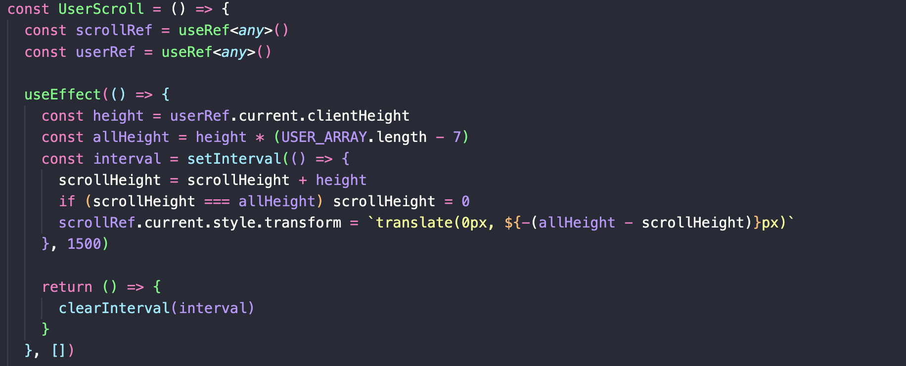
二、通过window.onscroll来实现部分内容的适时显示

1、实现代码

 window.onscroll=function(){
   var fixed=document.getElementById("fixed");    //获取需要适时显示的元素节点
   var scrollTop = document.documentElement.scrollTop||window.pageYOffset||document.body.scrollTop;    //滚动条与页面顶部距离(包括pc端和移动端),window.pageYOffset和document.body.scrollTop用于获取移动端距离
   var allHeight=window.screen.height;    //获取整个页面的高度
   console.log("滚动条与页面顶部距离:"+scrollTop);
   console.log("整个屏幕的高度:"+allHeight);
   if(scrollTop>allHeight*1.2){    //给出判断条件,即高度如何时进行以下逻辑
     fixed.className="fix";     //给获取的元素节点加上相应的样式
   }else{
     fixed.className=" ";    //给获取的元素节点去除相应的样式
   }
 }


三、clipboard.js(插件)实现复制粘贴

1、 引入插件

  <script src="js/clipboard.min.js"></script>

2、基本使用

首先需要您需要通过传递DOM选择器,HTML元素或HTML元素列表来实例化它。

  new Clipboard('.btn');


  1、用一个元素当触发器来复制另一个元素的文本,data-clipboard-target属性后需要跟属性选择器

  <input id="foo" value="https://github.com/zenorocha/clipboard.js.git">

  <button class="btn" data-clipboard-target="#foo">
  </button>

  另外还有另外一个属性data-clipboard-action属性,以指定是要要么copy还是要cut操作。默认情况下是copy。cut操作只适用于<input>或<textarea>元素。


  <textarea id="bar">Mussum ipsum cacilds...</textarea>

  <button class="btn" data-clipboard-action="cut" data-clipboard-target="#bar">
    Cut to clipboard
  </button>


  2、从属性中复制文本,不需要另一个元素当触发器,可以使用data-clipboard-text属性,在后面放上需要复制的文本.

  <button class="btn" data-clipboard-text="Just because you can doesn't mean you should — clipboard.js">
    Copy to clipboard
  </button>

3、其他说明

  1、通过运行检查clipboard.js是否支持Clipboard.isSupported(),返回true则可以使用。
  2、显示一些用户反馈或捕获在复制/剪切操作后选择的内容。操作,文本,触发元素

  var clipboard = new Clipboard('.btn');

  clipboard.on('success', function(e) {
      console.info('Action:', e.action);
      console.info('Text:', e.text);
      console.info('Trigger:', e.trigger);

      e.clearSelection();
  });

  clipboard.on('error', function(e) {
      console.error('Action:', e.action);
      console.error('Trigger:', e.trigger);
  });


  3、该插件使用的是事件委托的方式来触发,所以大大减少了对dom的操作。

4、高级使用

如果你不想修改你的HTML,那么你可以使用一个非常方便的命令API。所有你需要做的是声明一个函数,写下你想要的操作,并返回一个值。下面是一个对不同id的触发器返回不同的值的例子。具体的使用方法请看https://clipboardjs.com

  <body>
    <input id="foo" value="https://github.com/zenorocha/clipboard.js.git">
    <button id='foo_1' class="btn" data-clipboard-target="#foo">
    </button>
  </body>
  <script>
    new Clipboard('.btn', {
      text: function(trigger) {
        if(trigger.getAttribute('id')=='foo_1'){
          return 1;
        }else{
          return 2;
        }
      }
    });
  </script>

四、微信遮罩层提示浏览器下载(H5开发)

1、基本代码
  (1)、原生js
         var Terminal = {
           // 辨别移动终端类型
           platform : function(){
             var u = navigator.userAgent;
                     var app = navigator.appVersion;
             return {
               trident: u.indexOf('Trident') > -1, //IE内核
               presto: u.indexOf('Presto') > -1, //opera内核
               webKit: u.indexOf('AppleWebKit') > -1, //苹果、谷歌内核
               gecko: u.indexOf('Gecko') > -1 && u.indexOf('KHTML') == -1,//火狐内核
               mobile: !!u.match(/AppleWebKit.*Mobile.*/), //是否为移动终端
               iOS: !!u.match(/\(i[^;]+;( U;)? CPU.+Mac OS X/), //ios终端
               Android: u.indexOf('Android') > -1 ,//android终端
                           Uc: u.indexOf('Linux') > -1, //uc浏览器
               iPhone: u.indexOf('iPhone') > -1 , //是否为iPhone或者QQHD浏览器
               iPad: u.indexOf('iPad') > -1, //是否iPad
               webApp: u.indexOf('Safari') == -1, //是否web应用程序,没有头部与底部
               weixin: u.indexOf('MicroMessenger') > -1, //是否微信 (2015-01-22新增)
               qq: u.match(/\sQQ/i) == " qq" //是否QQ
             };
           },
           // 辨别移动终端的语言:zh-cn、en-us、ko-kr、ja-jp...
           language : (navigator.browserLanguage || navigator.language).toLowerCase()
         }
          // 根据不同的终端,跳转到不同的地址
           var styles ='<style>.pop-weixin{position: fixed; z-index:10; left: 0px; top: 0px; width: 100%; height: 100%; filter:alpha(opacity= 50);-moz-opacity:0.5; opacity: 0.5;}</style>',
                 domDiv = styles +'<div class="pop-weixin">',
                 doms = domDiv +'<img src="http://pic.zhangyu.tv/upload/1534489187387481.png" width=100%>';
                 doms +='</div>',
                      domh =  domDiv +'<img src="http://pic.zhangyu.tv/upload/1534488743525331.png" width=100%>';
                 domh +='</div>',
                 theUrl = '',
                 isThis = Terminal.platform;
            //判断是否为移动终端
                 if(!isThis.mobile){
                      theUrl = 'http://resource.ws.kukuplay.com/zhangyu/download/zhangyutv-3.1.1-main-release.apk';
                 }else if(isThis.Android){                      //判断是否为Android设备
                 if(isThis.weixin){                            //判断是否为微信端
                     $("body").append(doms);
                          self.downloadInWeixin = true;                     //让微信浏览器识别下载
                window.location.hash = 'download';
                return;
              }else{
                     $(".pop-weixin").hide();
                }
             theUrl = 'http://resource.ws.kukuplay.com/zhangyu/download/zhangyutv-3.1.1-main-release.apk';     //安卓下载链接
           }else if(isThis.iPhone || isThis.iPad){                                                 //判断是否为ios端
              if(isThis.weixin){                                                                                //判断是否为微信端
                   $("body").append(domh);
                        self.downloadInWeixin = true;                        //让微信浏览器识别下载
                window.location.hash = 'download';
                return;
              }else{
                   $(".pop-weixin").hide();
              }
             theUrl = 'https://apk.zhangyu.tv/download/ota/';    //ios下载链接
           }
           if(theUrl != ""){
                     if(!isThis.mobile){
                          location.href = theUrl;
                   }else if(isThis.iPhone || isThis.iPad){
                     location.href = theUrl;
                }else if(isThis.Android){
                     location.src = theUrl;
                }
           }else{
                theUrl="" ;
           }
         }
 
  补充:
  ES6语法
    export function browser() {
      const u = navigator.userAgent;

      return {
        mobile: !!u.match(/AppleWebKit.*Mobile.*/),
        ios: !!u.match(/\(i[^;]+;( U;)? CPU.+Mac OS X/),
        android: u.indexOf('Android') > -1 || u.indexOf('Linux') > -1,
        iPhone: u.indexOf('iPhone') > -1,
        iPad: u.indexOf('iPad') > -1,
        isWx: u.indexOf('MicroMessenger') > -1,
        isQQ: u.indexOf('QQ/') > -1,
        isQQbrowser: u.indexOf('QQBrowser'),
        isWeiBo: u.indexOf('weibo') > -1,
        isLive: window.location.href.indexOf('islive') > -1
      };
    }

 五、腾讯营销QQ解决方案(网页上的客服聊天功能)

1、官网链接

https://id.b.qq.com/login/index

2、说明文档

 https://files.cnblogs.com/files/huangfeihong/%E8%85%BE%E8%AE%AF%E8%90%A5%E9%94%80QQ%E4%BA%A7%E5%93%81%E5%B8%AE%E5%8A%A9%E6%96%87%E6%A1%A3.rar


六、H5移动页面自适应手机屏幕的方法


七、iOS/Android 微信及浏览器中唤起本地APP


八、pc端实现轮播效果

1、使用swiper插件

<link rel="stylesheet" href="https://cdnjs.cloudflare.com/ajax/libs/Swiper/4.0.2/css/swiper.min.css">
<script src="https://cdnjs.cloudflare.com/ajax/libs/Swiper/4.0.2/js/swiper.min.js"></script>
 
2、主要代码:

html:

<%-- 挂件广告位 --%>
<div class=" swiper-container ">
  <div class="swiper-wrapper">
    <div class="swiper-slide">
      <img src="" class="floatAdImg">
    </div>
    <div class="swiper-slide">
    <img src="" class="floatAdImg">
    </div>
  </div>
</div>
 
css:
  自己定义
 
js:
//初始化Swiper对象
var mySwiper = new Swiper('.swiper-container', {
  autoplay:{
    dalay:1000,
  },
  loop:true,
});
//鼠标移进去的时候停止轮播
$(".swiper-container").mouseenter(function(){
  mySwiper.autoplay.stop();
});
//鼠标移出的时候开始轮播
$(".swiper-container").mouseleave(function(){
  mySwiper.autoplay.start();
});
 
九、css的层级问题
可以通过选择器具有的专用性的量来判定选择器的优先级,这种专用性的量是用四种不同的值来衡量的。它们可以被认为是千位、百位、十位和个位——在四个列种的简单数字:
1、千位:  如果声明实在style属性中该列加1分(这样的声明没有选择器,所以它们的专用性总是1000)否则为0
2、百位:在整个选择器中每包含一个ID选择器就在该列中加1分
3、十位:在整个选择器中每包含一个类选择器、属性选择器、或者伪类就在该列种加1分
4、个位:在整个选择器中每包涵一个元素选择器或者伪元素就在该列中加1分
选择器千位百位十位个位合计值
h1(元素选择器) 0 0 0 1 0001
#indentifier(ID选择器) 0 1 0 0 0100
h1(元素选择器) + p(元素选择器)::first-letter(伪类) 0 0 0 3 0003
li(元素选择器)> a(元素选择器)[href*="zh-CN"](属性选择器) > .inline-warning(类选择器) 0 0 2 2 0022
没有选择器, 规则在一个元素的 <style> 属性里 1 0 0 0 1000


 十、禁止ios全屏播放 
在video标签中加上  x5-video-player-type="h5" x5-video-player-fullscreen="true" playsinline="true" webkit-playsinline="true" x-webkit-airplay="true"  即可


十一、pc端屏幕分辨率适配问题

1、电脑屏幕及尺寸(分辨率)通常有下列几种

  1024       1280          1366      1440       1680       1920 

2、可以通过简单的媒体查询方式来进行屏幕适配

  PC端响应式媒体断点 

  @media (min-width: 1024px){
    body{font-size: 18px}
  } /*>=1024的设备*/

  @media (min-width: 1100px) {
    body{font-size: 20px}
  } /*>=1100的设备*/

  @media (min-width: 1280px) {
    body{font-size: 22px;}
  } /*>=1280的设备*/

  @media (min-width: 1366px) {
    body{font-size: 24px;}
  } /*>=1366的设备*/

  @media (min-width: 1440px) {
    body{font-size: 25px !important;}
  } /*>=1440的设备*/

  @media (min-width: 1680px) {
    body{font-size: 28px;}
  } /*>=1680的设备*/

  @media (min-width: 1920px) {
    body{font-size: 33px;}
  } /*>=1920的设备*/
  
  注意: 用min-width时,小的放上面大的在下面,同理如果是用max-width那么就是大的在上面,小的在下面


十二、CSS3修改单选框radio默认颜色

<!DOCTYPE html>

<html lang="en">

    <head>

        <meta charset="utf-8">

            <title>Document</title>

        </meta>

        <style media="screen" type="text/css">

            .real-radio{

                  display: inline-block;

     width: 15px;

     height: 15px;

        background-color: #fff;

     border: 1px solid #000;

     border-radius: 8px;

       cursor: pointer;

            }

            .radio > input[type=radio]:checked ~ .real-radio{

     border: 1px solid red;

     background-color: red;

            }

            .radio > input[type=radio]{

             display: none;

            }

        </style>

    </head>

    <body>

        <label class="radio">

            <input name="" type="radio" value="a"/>

            <span class="real-radio"></span>

        </label>

    </body>

</html>


十三、vue中实现缓慢回到顶部

<template>
  <div v-if="showOrHide">
    <p class="go-top" @click="scrollToTop"><i class="el-icon-arrow-up"></i></p>
    <p class="app-download">章鱼体育</p>
  </div>
</template>

<script>
export default {
  name: 'returnTop',
  data() {
    return {
      showOrHide: false,
      scrollTop: 0
    }
  },
  mounted() {
    window.addEventListener('scroll', this.getTopHeight);
  },
  destroyed() {
    window.removeEventListener('scroll', this.getTopHeight);
  },
  methods: {
    getTopHeight: function () {
      //vue中获取导航条到页面顶部的距离
      let topHeight = window.pageYOffset || document.documentElement.scrollTop || document.body.scrollTop;
 
      this.scrollTop = topHeight;
      //按钮的显示和隐藏
      if (this.scrollTop > 400) {
        this.showOrHide = true;
      } else {
        this.showOrHide = false;
      }
    },
    scrollToTop: function () {
      let that = this;
      //定时器,实现缓慢回到顶部
      let timer = setInterval(function(){
        let speed = Math.floor(-that.scrollTop/15);
 
        if (that.scrollTop === 0) {  //到达顶部时清除定时器
          clearInterval(timer);
        } else {
          document.documentElement.scrollTop = document.body.scrollTop= that.scrollTop + speed;
        }
      }, 20)
    }
  },
}
 
十四、js 通过数组中的对象的属性来去重
  
  let  hash = { };
 
  arr = arr.reduce((item, next) => {
    hash[next.a] ? ' ' : hash[next.a] = true && item.push(next);
    return item;
  }, [ ]);
  
  a是数组arr中对象共有的一个属性,即要通过该属性来去重
 
十五、vue中判断终端类型
新建一个utils.js文件,抛出一个browser方法

export function browser() {
  const u = navigator.userAgent;

  return {
    mobile: !!u.match(/AppleWebKit.*Mobile.*/),
    ios: !!u.match(/\(i[^;]+;( U;)? CPU.+Mac OS X/),
    android: u.indexOf('Android') > -1 || u.indexOf('Linux') > -1,
    iPhone: u.indexOf('iPhone') > -1,
    iPad: u.indexOf('iPad') > -1,
    isWx: u.indexOf('MicroMessenger') > -1,
    isQQ: u.indexOf('QQ/') > -1,
    isQQbrowser: u.indexOf('QQBrowser'),
    isWeiBo: u.indexOf('weibo') > -1,
    isLive: window.location.href.indexOf('islive') > -1
  };
}
 
十六、用flex布局实现内容不满一屏时的footer吸底
1、对外部容器
  display: flex;
  flex-direction: column;
  min-height: 100vh;
2、对内部主体内容元素
  flex: 1;
3、代码例子
  html
  <div id="app">
    <div class="header">
      页面头部
    </div>
    <div class="main">
      页面内容
    </div>
    <div class="footer">
      页面底部
    </div>
  </div>
 
  css
  #app {
    display: flex;
    flex-direction: column;
    min-height: 100vh;

    .main {
      flex: 1;
    }
  }
 
十七、自定义radio组件
 
1、html(使用了element-ui中的icon
  <label class="radio">
    <input name="" type="checkbox" v-model="currentFlag" />
    <span class="real-radio">
      <i class="el-icon-check"></i>
    </span>
  </label>
 
2、css
  .real-radio {
    display: inline-block;
    width: 15px;
    height: 15px;
    background-color: #fff;
    border: 1px solid #BFBFBF;
    border-radius: 8px;
    cursor: pointer;
  }

  .radio>input[type=checkbox]:checked~.real-radio {
    border: 1px solid #F03D37;
    background-color: #F03D37;
  }

  .radio>input[type=checkbox] {
    display: none;
  }

  .real-radio {
    i {
      padding-top: 1px;
      color: #fff;
    }
  }
 
十八、获取某一个cookie
  getCookie(cookiename) {
    let name = cookiename + "=";
    let cs = document.cookie.split(';');
    for (let i = 0; i < cs.length; i++) {
      let c = cs[i].trim();
      if (c.indexOf(name) == 0) {
        return c.substring(name.length,c.length);
      }
    }
  }
 
十九、 如何解决图片防盗链
 1、webpack配置(未实现)
 
 2、axios配置(未实现)
 
 3、增加元标签
    
1  <meta name="referrer" content="no-referrer">


二十、传参说明
 
二十一、特殊时期全网站变素装
 
通用方法,增加全局样式(css的filter(滤镜)属性):
 
 html { 
  filter: grayscale(100%); 
  -webkit-filter: grayscale(100%); 
  -moz-filter: grayscale(100%); 
  -ms-filter: grayscale(100%); 
  -o-filter: grayscale(100%); 
  filter: url("data:image/svg+xml;utf8,#grayscale"); 
  filter:progid:DXImageTransform.Microsoft.BasicImage(grayscale=1); 
  -webkit-filter: grayscale(1);
  
 
二十二、对css动画的一些思考
 
1、transition和animation的区别
  transition:过度,是css样式的变化的过程,只有开始和结束,只能触发一次,没有循环播放。需要一个js事件来触发(例如:hover、click、useEffect等)。
  代码示例:transition: property duration timing-function delay;
 
 transition-property  指定CSS属性的name,transition效果
 transition-duration  transition效果需要指定多少秒或毫秒才能完成
 transition-timing-function  指定transition效果的转速曲线
 transition-delay  定义transition效果开始的时候


  animation:动画,可以设置很多的属性,比如循环次数,动画结束的状态等等。
  代码示例:animation: name duration timing-function delay iteration-count direction fill-mode play-state;
 
animation-name 指定要绑定到选择器的关键帧的名称
animation-duration 动画指定需要多少秒或毫秒完成
animation-timing-function 设置动画将如何完成一个周期
animation-delay  设置动画在启动前的延迟间隔。
animation-iteration-count 定义动画的播放次数。
animation-direction 指定是否应该轮流反向播放动画。
animation-fill-mode 规定当动画不播放时(当动画完成时,或当动画有一个延迟未开始播放时),要应用到元素的样式。)
animation-play-state 指定动画是否正在运行或已暂停。
 
  性能发面:通常情况下,transition优于animation
 
 
二十三、h5键盘遮挡输入框问题
1、底部添加空白
 
二十四、屏幕文案滚动效果


二十五、快速切换tab导致接口数据混淆
  问题描述:快速切换tab时,接口响应比较慢,导致两次请求的数据混淆了
  解决方法:请求开始的时候,定义一个变量,该变量的值为当前tab位置。切换tab并请求接口之后,判断该变量是否等于当前tab位置,相等的话继续执行后续逻辑,不想等的话不执行后续逻辑
 
二十六、flex布局导致图片压缩变形
  问题描述:flex弹性布局情况下,左侧为文字内容,右侧为图片。在不固定两侧宽度的情况下,左侧文字内容过多,会导致右侧图片压缩变形
  解决方法:flex-shrink属性设置为0,内容不会被压缩


posted @ 2018-08-14 17:40  狮子爱吃草  阅读(5313)  评论(0编辑  收藏  举报