呼吸灯演示
几种不同类型的呼吸灯
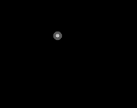
第一种:
<!DOCTYPE html>
<html lang="en">
<head>
    <meta charset="UTF-8">
    <title>Document</title>
    <style>
        body{
            font-family:'Segoe UI Light','Segoe UI',Arial,'微软雅黑',sans-serif;
            font-size: 20px;
            color:#333333;
            background: black;
        }
        .breath {
            width: 50px;
            height:50px;
            margin:100px auto;
            overflow:hidden;
            background: #99dd33;
            opacity:0.1;
            -webkit-box-shadow: 0 0 5px #99dd33;
            /*-moz-box-shadow: 0 0 5px #99dd33;
            -ms-box-shadow: 0 0 5px #99dd33;
            -o-box-shadow: 0 0 5px #99dd33;
            box-shadow: 0 0 5px #99dd33;*/
            -webkit-border-radius:50%;
            /*-moz-border-radius:2px;
            -ms-border-radius:2px;
            -o-border-radius:2px;
            border-radius:50%;*/

            /*动画名称*/
            -webkit-animation-name: breath;
            /*动画时长6秒*/
            -webkit-animation-duration: 6s;
            /*动画速度曲线:以低速开始和结束*/
            -webkit-animation-timing-function: ease-in-out;
            /*播放次数:无限*/
            -webkit-animation-iteration-count: infinite;
        }

        @-webkit-keyframes 'breath' {
            /*动画开始时的不透明度*/
            from {
                opacity:0.1;
            }
            /*动画50%时的不透明度*/
            50% {
                opacity:1;
            }
            /*动画结束时的不透明度*/
            to {
                opacity:0.1;
            }
        }
    </style>
</head>
<body>
    <div class="breath" title="呼吸线"></div>
</body>
</html>
效果:
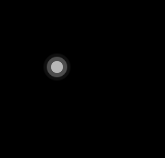
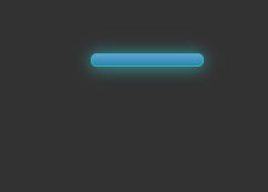
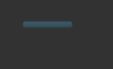
第二种:
<!DOCTYPE html>
<html lang="en">
<head>
    <meta charset="UTF-8">
    <title>Document</title>
    <style>
        * {
            margin:0;
            padding:0;
        }
        body {
            font-size:12px;
            font-family:Arial,Helvetica,sans-serif;
            background:#333;
            -webkit-text-size-adjust:none;
        }
        .breathe-btn {
            width:100px;
            height:10px;
            margin:50px auto;
            color:#fff;
            text-align:center;
            cursor:pointer;
            border-radius:5px;
            border:1px solid #2b92d4;
            box-shadow:0 1px 2px rgba(0,0,0,.3);
            overflow:hidden;
            background-image:-webkit-gradient(linear,left top,left bottom,from(#6cc3fe),to(#21a1d0));
            /*动画名称*/
            -webkit-animation-name:breathe;
             /*动画速度曲线:以低速开始和结束*/
            -webkit-animation-timing-function:ease-in-out;
            /*动画时长2700ms*/
            -webkit-animation-duration:2700ms;
            /*播放次数:无限*/
            -webkit-animation-iteration-count:infinite;
            /*animation-direction 属性定义是否应该轮流反向播放动画
            如果 animation-direction 值是 "alternate",则动画会在奇数次数(1、3、5 等等)正常播放,而在偶数次数(2、4、6 等等)向后播放*/
            -webkit-animation-direction:alternate;
        }
        @-webkit-keyframes breathe {
            0% {
                opacity:.2;
                box-shadow:0 1px 2px rgba(255,255,255,0.1);
            }
            100% {
                opacity:1;
                border:1px solid rgba(59,235,235,1);
                box-shadow:0 1px 30px rgba(59,255,255,1);
            }
        }
    </style>
</head>
<body>
    <div class="breathe-btn"></div>
</body>
</html>
效果:
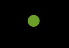
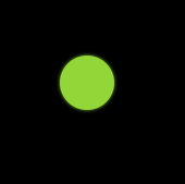
第三种:
<!DOCTYPE html>
<html lang="en">
<head>
    <meta charset="UTF-8">
    <title>Document</title>
    <style>
        body{
            background: black;
        }
        #breathLight{
            width: 20px;
            height: 20px;
            position: fixed;
            left: 660px;
            bottom: 120px;
          }
        #breathLight:hover{
            cursor: pointer;
        }
        #circle-1,#circle-2,#circle-3{
            background-color: rgb(255,255,255);
            width: 20px;
            height: 20px;
            display: block;
            transform: scale(0);
            position: absolute;
            border-radius: 100%;
            transform-origin: 50% 50%;
        }
        #circle-1{
            animation: clickCircle  3s ease-in-out infinite;
            opacity: 0.6;
        }
        #circle-2{
            animation: clickCircle 3s ease-in-out infinite .5s;
            opacity: 0.8;
        }
        #circle-3{
            animation: clickCircle 3s ease-in-out infinite 1s;
            opacity: 1;
        }
        @keyframes clickCircle{
            0%{
                transform: scale(0);
            }
            100%{
                transform: scale(1.5);
                opacity: 0;
            }
        }
    </style>
</head>
<body>
    <div id = "breathLight">
        <i id="circle-1" class="c"></i>
        <i id="circle-2" class="c"></i>
        <i id="circle-3" class="c"></i>
    </div>
</body>
</html>
效果: