
修改checkbox样式
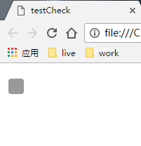
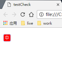
效果如下:
代码如下:
<span style="font-size:14px;"><!DOCTYPE html>
<html>
<head>
    <meta charset="UTF-8">
    <title>testCheck</title>
    <style type="text/css">
        input[type=checkbox] {
            position: relative;
            width: 10px;
            height: 1px;
        }
        input[type=checkbox]::before{
            content:'';
            position: absolute;
            top: 0;
            left: 0;
            width: 22px;
            height: 22px;
            line-height:22px;
            text-align: center;
            color:white;
            font-size:16px;
            background-color:#999;
            border-radius: 4px;
        }
        input[type=checkbox]:checked::before {
            color:white;
            background-color:red;
            content: '中';
        }
    </style>
</head>

<body>
<input type="checkbox"/>
</body>
</html></span>
稍微解释一下:
其实checkbox的样式还是浏览器的原始样式,只是它的大小和位置改了一下,然后在它的上面(::before)重画了一个假象。
-------------------------------------------------------------------- 以下为 2017/1/17 更新 --------------------------------------------------------------------
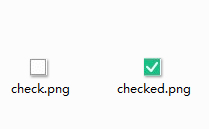
预备素材:
两张图片,分别为正常状态和选中状态的样式。
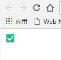
效果如下:

代码如下:
<html>
<head>
    <meta charset="UTF-8">
    <title>testCheck</title>
    <style type="text/css">
    input[type=checkbox] {
        position: relative;
    }
    input[type=checkbox]::before{
        content:'';
        position: absolute;
        width: 18px;
        height: 18px;
        background: url("check.png") no-repeat;
    }
    input[type=checkbox]:checked::before {
        background: url("checked.png") no-repeat;
        content: '';
    }
    </style>
</head>

<body>
    <input id="test" type="checkbox"/>
</body>
</html>
测试是否可用:
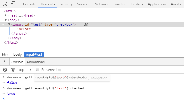
可以通过 document.getElementById('test').checked 来判断该复选框是否被选中
