flex中align-content属性
在flex弹性盒模型中align-content属性控制容器内多行在交叉轴上的排列方式
默认值:stretch
可用值:
属性值:flex-start
属性值:flex-end
属性值:center
属性值:stretch (默认值)
属性值:space-between
属性值:space-around
下面用具体案例代码案例来详细说明。
HTML代码以及相应的CSS代码:
<div class="container flex">
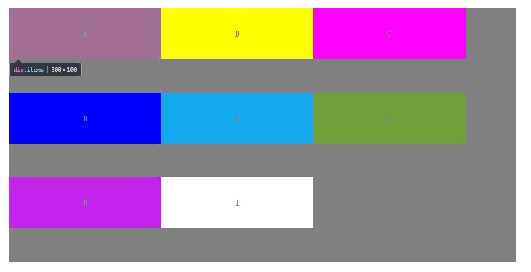
<div class="items">A</div>
<div class="items">B</div>
<div class="items">C</div>
<div class="items">D</div>
<div class="items">E</div>
<div class="items">G</div>
<div class="items">H</div>
<div class="items">I</div>
</div>
.container {
    display: flex;
    width: 1000px;
    height: 500px;
    background-color: gray;
    margin: 20px auto;
}

.flex {
    flex-wrap: wrap;
    align-content: flex-end;
}

.items {
    width: 300px;
    height: 100px;
    text-align: center;
    line-height: 100px;
    font-weight: 900;
    color: gray;
}

.items:nth-child(1) {
    background-color: #ff0000;
}

.items:nth-child(2) {
    background-color: #ffff00;
}

.items:nth-child(3) {
    background-color: #ff00ff;
}

.items:nth-child(4) {
    background-color: #0000ff;
}

.items:nth-child(5) {
    background-color: #14a9ee;
}

.items:nth-child(6) {
    background-color: #71a03b;
}

.items:nth-child(7) {
    background-color: #c323eb;
}

.items:nth-child(8) {
    background-color: #ffffff;
}
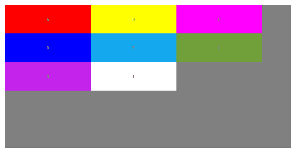
(1)align-content:flex-start;
描述:元素位于容器的开头。
各行向弹性盒容器的起始位置堆叠。弹性盒容器中第一行的侧轴起始边界紧靠住该弹性盒容器的侧轴起始边界,之后的每一行都紧靠住前面一行。
.flex {
    flex-wrap: wrap;
    align-content: flex-end;
}
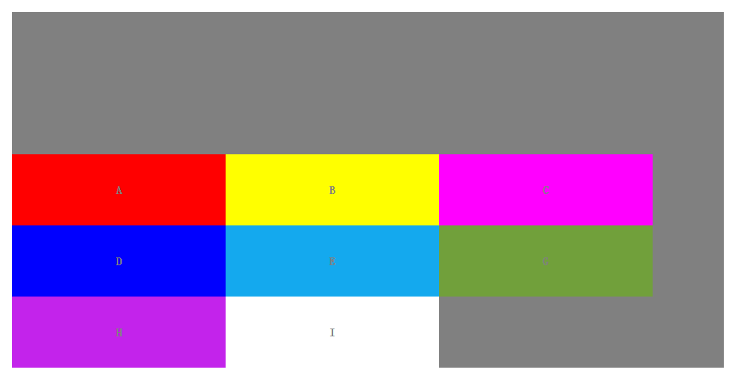
(2)align-content:flex-end;
描述:元素位于容器的结尾。
各行向弹性盒容器的结束位置堆叠。弹性盒容器中最后一行的侧轴起结束界紧靠住该弹性盒容器的侧轴结束边界,之后的每一行都紧靠住前面一行。
.flex {
    flex-wrap: wrap;
    align-content:flex-end;
}
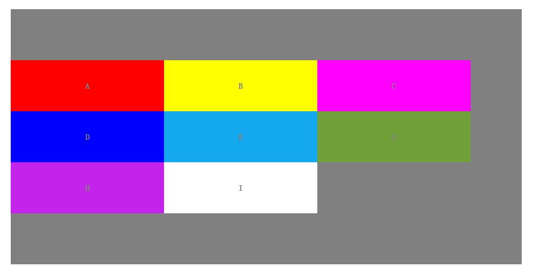
(3)align-content:center;
描述:元素位于容器的中心。
各行向弹性盒容器的中间位置堆叠。各行两两紧靠住同时在弹性盒容器中居中对齐,保持弹性盒容器的侧轴起始内容边界和第一行之间的距离与该容器的侧轴结束内容边界与第最后一行之间的距离相等。(如果剩下的空间是负数,则各行会向两个方向溢出的相等距离。)
.flex {
    flex-wrap: wrap;
    align-content:center;
}
(4)align-content:stretch;
描述:默认值。元素被拉伸以适应容器。
各行将会伸展以占用剩余的空间。如果剩余的空间是负数,该值等效于'flex-start'。在其它情况下,剩余空间被所有行平分,以扩大它们的侧轴尺寸。
.flex {
    flex-wrap: wrap;
    align-content: stretch;
}
(5)align-content:space-between;
描述:元素位于各行之间留有空白的容器内。
各行在弹性盒容器中平均分布。如果剩余的空间是负数或弹性盒容器中只有一行,该值等效于'flex-start'。在其它情况下,第一行的侧轴起始边界紧靠住弹性盒容器的侧轴起始内容边界,最后一行的侧轴结束边界紧靠住弹性盒容器的侧轴结束内容边界,剩余的行则按一定方式在弹性盒窗口中排列,以保持两两之间的空间相等。
.flex {
    flex-wrap: wrap;
    align-content: space-between;
}

(6)align-content:space-around;
描述:元素位于各行之前、之间、之后都留有空白的容器内。
各行在弹性盒容器中平均分布,两端保留子元素与子元素之间间距大小的一半。如果剩余的空间是负数或弹性盒容器中只有一行,该值等效于'center'。在其它情况下,各行会按一定方式在弹性盒容器中排列,以保持两两之间的空间相等,同时第一行前面及最后一行后面的空间是其他空间的一半。
.flex {
    flex-wrap: wrap;
    align-content: space-around;
}