慕课网2-3编程练习:媒体查询用法响应式效果小案例-字体颜色随浏览器窗口宽度而变化
2-3编程练习
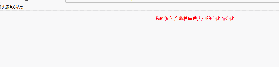
我们刚学习过了媒体查询的用法,接下来我们事先一个小的响应式效果吧。(建议到本地践行测试哦)
要求:
(1)浏览器窗口宽度大于1100px时,文字颜色为红色;
(2)小于1100px大于960px时,文字颜色为橙色;
(3)小于960px大于800px时,文字颜色为黄色;
(4)小于800px大于750px时,文字颜色为绿色;
(5)小于750px大于600px时,文字颜色为青色;
(6)小于600px大于450px时,文字颜色为蓝色;
(7)小于450px时,文字颜色为紫色;
参考代码:
<!DOCTYPE html>
<html lang="zh-CN">

<head>
    <meta charset="UTF-8">
    <style>
        p {
            color: red;
            text-align: center;
        }

        @media screen and (min-width:960px) and (max-width:1100px) {
            p {
                color: orange;
            }
        }

        @media screen and (min-width:800px) and (max-width:960px) {
            p {
                color: yellow;
            }
        }

        @media screen and (min-width:750px) and (max-width:800px) {
            p {
                color: green;
            }
        }

        @media screen and (min-width:600px) and (max-width:750px) {
            p {
                color: #126798;
            }
        }

        @media screen and (min-width:450px) and (max-width:600px) {
            p {
                color: blue;
            }
        }

        @media screen and (max-width:450px) {
            p {
                color: purple;
            }
        }
    </style>

</head>

<body>
    <div>
        <p>我的颜色会随着屏幕大小的变化而变化</p>
    </div>
</body>

</html>