基于 bootstrap 字体图标,用纯CSS实现星级评分功能
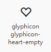
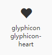
需要用到的图标
实现原理
关键属性是 text-overflow: clip;,表示直接截断文本。我们经常用这个属性的另一个值 text-overflow: ellipsis; 来做省略表示。
先平铺5个空心的图标
再层叠5个实心图标,控制实心图标的宽度来达到截断效果,结合 overflow:hidden 达到类似进度条的效果
优点是因为是字符,颜色大小很容易控制,而且不会影响其他内容
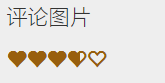
实心图标层的宽度需要根据实际总宽度按比例计算。比如总宽度是字体大小24px的情况下总宽度120,评分4.5(总分5分).实际宽度为 4.5*120/5
代码
<div style="position:relative; font-size: 20px;color:#985f0d;">
	<div>
		<span class="glyphicon glyphicon-heart-empty" aria-hidden="true"></span><span class="glyphicon glyphicon-heart-empty" aria-hidden="true"></span><span class="glyphicon glyphicon-heart-empty" aria-hidden="true"></span><span class="glyphicon glyphicon-heart-empty" aria-hidden="true"></span><span class="glyphicon glyphicon-heart-empty" aria-hidden="true"></span>
	</div>
	<div style="position:absolute; left:0;top:0;width: 73px; overflow: hidden;text-overflow: clip;white-space: nowrap;">
		<span class="glyphicon glyphicon-heart" aria-hidden="true"></span><span class="glyphicon glyphicon-heart" aria-hidden="true"></span><span class="glyphicon glyphicon-heart" aria-hidden="true"></span><span class="glyphicon glyphicon-heart" aria-hidden="true"></span><span class="glyphicon glyphicon-heart" aria-hidden="true"></span>
	</div>
</div>
效果
替换成任意字符
<div style="background: #CECECE; padding:50px;">
	<div style="position:relative; font-size: 20px; display: inline-block;">
	    <div style="font-weight: bold;color:#FFFFFF;">
	        必须五星好评
	    </div>
	    <div style="position:absolute; font-weight: bold; left:0;top:0;width: 73%; overflow: hidden;text-overflow: clip;white-space: nowrap;color:orangered;">
	        必须五星好评
	    </div>
	</div>
</div>