

margin合并及解决办法
外边距合并指的是,当两个垂直外边距相遇时,它们将形成一个外边距。
合并后的外边距的高度等于两个发生合并的外边距的高度中的较大者
水平方向不会发生合并
只有普通文档流中块框的垂直外边距才会发生外边距合并。行内框、浮动框或绝对定位之间的外边距不会合并。
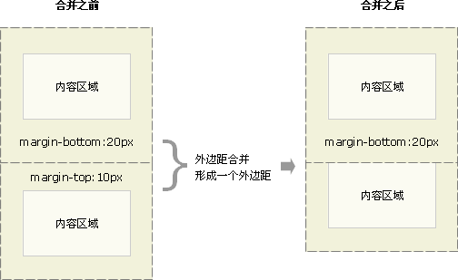
情况1
当一个元素出现在另一个元素上面时,第一个元素的下外边距与第二个元素的上外边距会发生合并。
<!DOCTYPE html>
<html lang="en">
<head>
    <meta charset="UTF-8">
    <meta name="viewport" content="width=device-width, initial-scale=1.0">
    <meta http-equiv="X-UA-Compatible" content="ie=edge">
    <title>Document</title>
    <style>
        *{
            margin: 0px;
            padding: 0px;
        }
        div{
            border: 1px solid black;
        }
        .div1{
            margin-bottom: 20px;
        }
        .div2{
            margin-top: 10px;
        }
    </style>
</head>
<body>
    <div class="div1">divtest1</div>
    <div class="div2">divtest2</div>
</body>
</html>
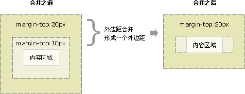
情况2
当一个元素包含在另一个元素中时(假设没有内边距或边框把外边距分隔开),它们的上和/或下外边距也会发生合并。
合并后的外边距加在父元素上
<!DOCTYPE html>
<html lang="en">
<head>
    <meta charset="UTF-8">
    <meta name="viewport" content="width=device-width, initial-scale=1.0">
    <meta http-equiv="X-UA-Compatible" content="ie=edge">
    <title>Document</title>
    <style>
         *{
            margin: 0px;
            padding: 0px;
        }

        .div1{
            margin-top: 20px;
            background: blue;
        }
        .div2{
            margin: 10px;
            background: green;
        }
    </style>
</head>
<body>
    <div class="div1">
        <div class="div2">test</div>
    </div>
</body>
</html>
如果子元素margin为30,总margin就是30,而且也会加在父元素上
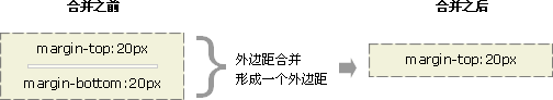
情况3
外边距也可以与自身发生合并。
假设有一个空元素,它有外边距,但是没有边框或填充。在这种情况下,上外边距与下外边距就碰到了一起,它们会发生合并。
<!DOCTYPE html>
<html lang="en">
<head>
    <meta charset="UTF-8">
    <meta name="viewport" content="width=device-width, initial-scale=1.0">
    <meta http-equiv="X-UA-Compatible" content="ie=edge">
    <title>Document</title>
    <style>
         *{
            margin: 0px;
            padding: 0px;
        }

        .div1{
            margin-top: 20px;
            margin-bottom: 10px;
            background: blue;
        }

        .div2{
            background: red;
        }

    </style>
</head>
<body>
    <div class="div1"></div>
    <div class="div2">div2</div>
</body>
</html>
消除外边距合并
方法1:使用float
<!DOCTYPE html>
<html lang="en">
<head>
    <meta charset="UTF-8">
    <meta name="viewport" content="width=device-width, initial-scale=1.0">
    <meta http-equiv="X-UA-Compatible" content="ie=edge">
    <title>Document</title>
    <style>
        *{
            margin: 0px;
            padding: 0px;
        }
        div{
            border: 1px solid black;
        }
        .div1{
            margin-bottom: 20px;
        }
        .div2{
            margin-top: 10px;
            float: left;
            width: 100%;
        }
    </style>
</head>
<body>
    <div class="div1">divtest1</div>
    <div class="div2">divtest2</div>
</body>
</html>
float:left后div1的位置不会改变,始终在div2下面
<!DOCTYPE html>
<html lang="en">

<head>
    <meta charset="UTF-8">
    <meta name="viewport" content="width=device-width, initial-scale=1.0">
    <meta http-equiv="X-UA-Compatible" content="ie=edge">
    <title>Document</title>
    <style>
        * {
            margin: 0px;
            padding: 0px;
        }

        .div1 {
            width: 200px;
            height: 200px;
            margin-top: 30px;
            background: blue;
        }

        .div2 {
            width: 100px;
            height: 100px;
            margin-top: 20px;
            background: green;
            float: left;
        }
    </style>
</head>

<body>
    <div class="div1">
        <div class="div2">test</div>
    </div>
</body>

</html>
可以看到float的元素,margin是相对其包含框的
float会脱离文档流,后面的元素会占据它的位置,但是它不能占据前面的元素的位置
上例改成div1 float left,div2不变,则div2会占据div1的位置,反生重叠
方法2:使用绝对定位
上面的float:left改成position: absolute效果一样
position: absolute不设置位置的情况下,默认还在正常文档流的位置
方法3:使用inline-block
上面的float:left改成display: inline-block效果一样
方法四:使用伪元素把盒子上下封起来,封起来的盒子不会发生margin合并
<!DOCTYPE html>
<html lang="en">

<head>
    <meta charset="UTF-8">
    <meta name="viewport" content="width=device-width, initial-scale=1.0">
    <meta http-equiv="X-UA-Compatible" content="ie=edge">
    <link rel="stylesheet" href="bootstrap.min.css">
    <title>Document</title>
    <style>
        .div1 {
            height: 200px;
            width: 200px;
            margin-top: 30px;
            background: blue;
        }

        .div1::before{
            display: table;
            content: "";
        }

        .div2 {
            height: 100px;
            width: 100px;
            margin-top: 20px;
            background: green;
        }
    </style>
</head>

<body>
    <div class="div1">
        <div class="div2">abc</div>
    </div>
</body>

</html>
before伪元素显示为table相当于把div盒子顶部封起来,防止嵌套顶部margin合并
同理,after伪元素可以把下面封起来
