

常用CSS布局(1.左右高度固定,中间自适应 2.上下高度固定,中间自适应)
1.左右高度固定,中间自适应
一般有五种方法:
第一种利用浮动:
分为两种情况:
文本高度未超过自适应div最小高度:
     <section class="layout float">
         <style>
             .layout.float .left{
                 float: left;
                 width: 300px;
                 background-color: #333;
             }
             .layout.float .right{
                 float: right;
                 width: 300px;
                 background-color: #333fff;
             }
             .layout.float .center{
                 background-color: #666;
             }

         </style>
         <article>
             <div class="left">
                 <p>111</p>
             </div>
             <div class="right"></div>
             <div class="center">
                 <p>浮动</p>
             </div>
         </article>
     </section>

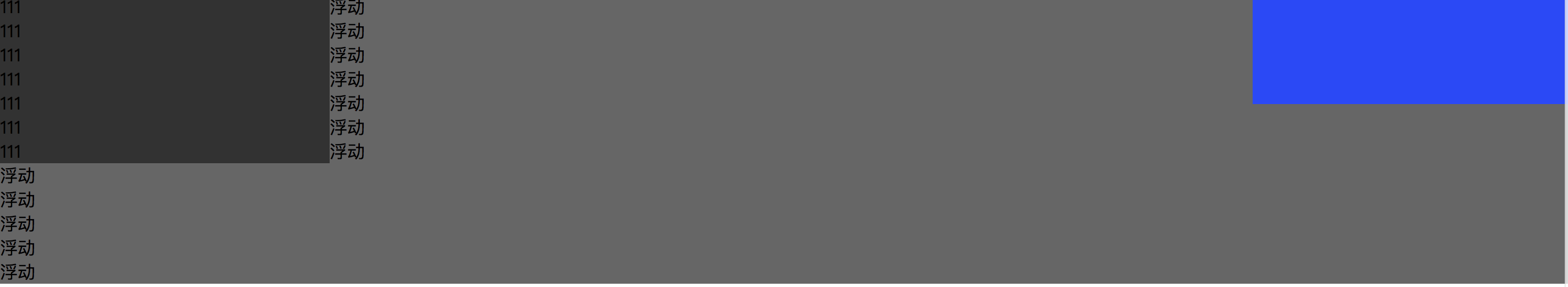
文本高度超过自适应div最小高度:
<!-- 1.利用浮动 -->
<!-- 1.利用浮动 -->
     <section class="layout float">
         <style>
             .layout.float .left{
                 float: left;
                 width: 300px;
                 background-color: #333;
             }
             .layout.float .right{
                 float: right;
                 width: 300px;
                 background-color: #333fff;
             }
             .layout.float .center{
                 background-color: #666;
             }

         </style>
         <article>
             <div class="left">
                 <p>111</p>
                <p>111</p>
                <p>111</p>
                <p>111</p>
                <p>111</p>
                <p>111</p>
                <p>111</p>
             </div>
             <div class="right"></div>
             <div class="center">
                 <p>浮动</p>
                <p>浮动</p>
                <p>浮动</p>
                <p>浮动</p>
                <p>浮动</p>
                <p>浮动</p>
                <p>浮动</p>
                <p>浮动</p>
                <p>浮动</p>
                <p>浮动</p>
                <p>浮动</p>
                <p>浮动</p>
             </div>
         </article>
     </section>
样式:
第二种利用绝对定位:
文本高度未超过自适应div最小高度:
<section class="layout position">
         <style>
             .layout.position article div{
                 position: absolute;
             }
             .layout.position .left{
                 left: 0;
                 width: 300px;
                 background-color: #333;
             }
             .layout.position .right{
                 right: 0;
                 width: 300px;
                 background-color: #333fff;
             }
             .layout.position .center{
                 left: 300px;
                 right: 300px;
                 background-color: #666;
             }

         </style>
         <article>
             <div class="left"></div>
             <div class="center">
                 <p>定位</p>
             </div>
             <div class="right"></div>
         </article>
     </section>
文本高度超过自适应div最小高度:
 position
第三种利用flex布局:
文本高度未超过自适应div最小高度:

 <section class="layout flex">
         <style>
             .layout.flex{
                 margin-top: 140px;
             }
             .layout.flex article{
                 display: flex;
             }
             .layout.flex .left{
                 width: 300px;
                 background-color: #333;
             }
             .layout.flex .right{
                 width: 300px;
                 background-color: #333fff;
             }
             .layout.flex .center{
                 flex: 1;
                 background-color: #666;
             }

         </style>
         <article>
             <div class="left"></div>
             <div class="center">
                 <p>flex</p>
             </div>
             <div class="right"></div>
         </article>
     </section>
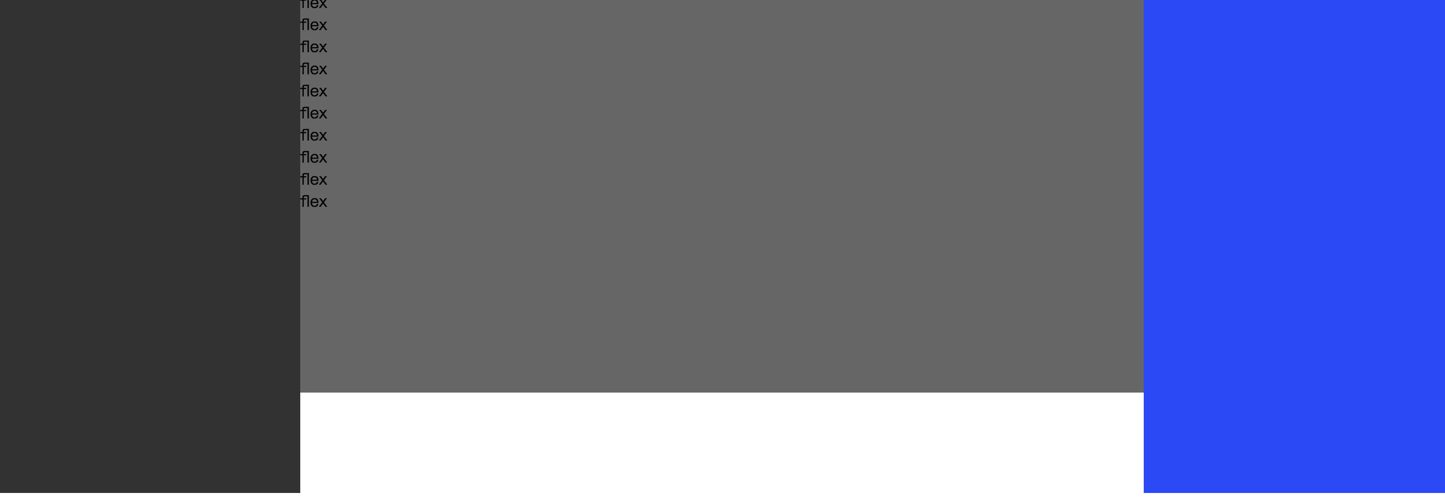
文本高度超过自适应div最小高度:
flex
     <!-- 3.利用flex布局 -->
     <section class="layout flex">
         <style>
             .layout.flex{
                 margin-top: 140px;
             }
             .layout.flex article{
                 display: flex;
             }
             .layout.flex .left{
                 width: 300px;
                 height: 500px;
                 background-color: #333;
             }
             .layout.flex .right{
                 width: 300px;
                 background-color: #333fff;
             }
             .layout.flex .center{
                 flex: 1;
                 background-color: #666;
                 height: 400px;
             }

         </style>
         <article>
             <div class="left"></div>
             <div class="center">
                 <p>flex</p>
                 <p>flex</p>
                 <p>flex</p>
                 <p>flex</p>
                 <p>flex</p>
                 <p>flex</p>
                 <p>flex</p>
                 <p>flex</p>
                 <p>flex</p>
                 <p>flex</p>
             </div>
             <div class="right"></div>
         </article>
     </section>
第四种利用table属性:
文本高度未超过自适应div最小高度:
<section class="layout table">
         <style>
             .layout.table article{
                 height: 100px;
                 display: table;
                 width: 100%;
             }
             .layout.table article>div{
                 display: table-cell;
             }
             .layout.table .left{
                 width: 300px;
                 background-color: #333;
             }
             .layout.table .right{
                 width: 300px;
                 background-color: #333fff;
             }
             .layout.table .center{
                 background-color: #666;
             }

         </style>
         <article>
             <div class="left"></div>
             <div class="center">
                 <p>table</p>
             </div>
             <div class="right"></div>
         </article>
     </section>
文本高度超过自适应div最小高度:
<section class="layout table">
         <style>
             .layout.table article{
                 height: 100px;
                 display: table;
                 width: 100%;
             }
             .layout.table article>div{
                 display: table-cell;
             }
             .layout.table .left{
                 width: 300px;
                 height: 500px;
                 background-color: #333;
             }
             .layout.table .right{
                 width: 300px;
                 background-color: #333fff;
             }
             .layout.table .center{
                 background-color: #666;
                 height: 300px;
             }

         </style>
         <article>
             <div class="left"></div>
             <div class="center">
                 <p>table</p>
                <p>table</p>
                <p>table</p>
                <p>table</p>
                <p>table</p>
                <p>table</p>
                <p>table</p>
                <p>table</p>
                <p>table</p>
             </div>
             <div class="right"></div>
         </article>
     </section>
第五种利用网格grid布局:
文本高度未超过自适应div最小高度:
     <section class="layout grid">
         <style>
             .layout.grid article{
                 min-height: 100px;
                 display: grid;
                 grid-template-rows: 100px;
                 grid-template-columns: 300px auto 300px;
             }
             .layout.grid .left{
                 background-color: #333;
             }
             .layout.grid .right{
                 background-color: #333fff;
             }
             .layout.grid .center{
                 background-color: #666;
             }

         </style>
         <article>
             <div class="left"></div>
             <div class="center">
                 <p>grid</p>
             </div>
             <div class="right"></div>
         </article>
     </section>
文本高度超过自适应div最小高度:
<!-- 5.利用grid属性 -->
     <section class="layout grid">
         <style>
             .layout.grid article{
                 min-height: 100px;
                 display: grid;
                 grid-template-rows: 100px;
                 grid-template-columns: 300px auto 300px;
             }
             .layout.grid .left{
                 background-color: #333;
             }
             .layout.grid .right{
                 background-color: #333fff;
             }
             .layout.grid .center{
                 background-color: #666;
             }

         </style>
         <article>
             <div class="left"></div>
             <div class="center">
                 <p>flex</p>
                 <p>flex</p>
                 <p>flex</p>
                 <p>flex</p>
                 <p>flex</p>
                 <p>flex</p>
                 <p>flex</p>
                 <p>flex</p>
                 <p>flex</p>
                 <p>flex</p>
             </div>
             <div class="right"></div>
         </article>
     </section>
根据以上示例,我们可以总结他们各自存在什么优缺点:
当div中的文本元素的高度超过容器div的高度时,
1.定位,网格布局不能撑高所在div的高度
2.浮动只能撑高所在div的高度
3.flex,和表格可以撑高整个div的高度
4.但是table不能设置每列的高度,始终高度都是一致的,为所写div的最大高度,
5.所以flex布局是最好的自适应布局
2.上下高度固定,中间自适应
第一种利用table:
 <section class="layouttop">
         <style>
             /*没有文本内容时,盒子需要被撑开,每个盒子都要被赋予100%的高度*/
             html,body,.layouttop,.layouttop article{
                 height: 100%;
             }
             /*可以被内容撑开*/
             .layouttop article{
                 display: table;
                 width: 100%;
             }
             .layouttop article div{
                 display: table-row;
             }
             .layouttop .top{
                 height: 200px;
                 background-color: #787878;
             }
             .layouttop .bottom{
                 height: 200px;
                 background-color: #565656;
             }
             .layouttop .middle{
                 background-color: #cd4d5d;
             }
         </style>
         <article>
             <div class="top">11</div>
             <div class="middle">
                 <p>table</p>
                 <p>table</p>
                 <p>table</p>
                 <p>table</p>
                 <p>table</p>
                 <p>table</p>
             </div>
             <div class="bottom">22</div>
         </article>
     </section>
第二种利用flex:
     <!-- 上下高度固定,中间自适应 -->
     <section class="layouttop">
         <style>
             /*flex上下自定义定位中,每个盒子都要被赋予100%的高度*/
             /*html,body,.layouttop,article{
                 height: 100%;
             }*/
             /*可以被内容撑开*/
             .layouttop article{
                 display: flex;
                 flex-direction: column;
             }
             .layouttop .top{
                 height: 100px;
                 background-color: #787878;
             }
             .layouttop .bottom{
                 height: 100px;
                 background-color: #565656;
             }
             .layouttop .middle{
                 flex: 1;
                 background-color: #cd4d5d;
             }
         </style>
         <article>
             <div class="top"></div>
             <div class="middle">
                 <p>flex</p>
                 <p>flex</p>
                 <p>flex</p>
                 <p>flex</p>
                 <p>flex</p>
                 <p>flex</p>
                 <p>flex</p>
                 <p>flex</p>
                 <p>flex</p>
                 <p>flex</p>
             </div>
             <div class="bottom"></div>
         </article>
     </section>
第三种利用绝对定位布局:
 <!-- 通过绝对定位和固定定位实现 -->
     <section class="layouttop">
         <style>
             /*flex上下自定义定位中,每个盒子都要被赋予100%的高度*/
             /*html,body,.layouttop,.layouttop article{
                 height: 100%;
             }*/
             /*可以被内容撑开*/
             .layouttop .top{
                 height: 100px;
                 top: 0;
                 background-color: #787878;
                 position: fixed;
                width: 100%;
             }
             .layouttop .bottom{
                 height: 100px;
                 bottom: 0;
                 background-color: #565656;
                 position: fixed;
                width: 100%;
             }
             .layouttop .middle{
                 top: 100px;
                 bottom: 100px;
                 background-color: #cd4d5d;
                width: 100%;
                 position: absolute;
                 /*当文本内容超出自定义高度时,出现自定义滚动条*/
                 overflow: auto;
             }
         </style>
         <article>
             <div class="top"></div>
             <div class="middle">
                 <p>position</p>
                 <p>position</p>
                 <p>position</p>
                 <p>position</p>
                 <p>position</p>
                 <p>position</p>
                 <p>position</p>
                 <p>position</p>
                 <p>position</p>
                 <p>position</p>
                 <p>position</p>
                 <p>position</p>
                 <p>position</p>
                 <p>position</p>
                 <p>position</p>
                 <p>position</p>
                 <p>position</p>
                 <p>position</p>
                 <p>position</p>
                 <p>position</p>
                 <p>position</p>
                 <p>position</p>
                 <p>position</p>
                 <p>position</p>
                 <p>position</p>
                 <p>position</p>
                 <p>position</p>
                 <p>position</p>
                 <p>position</p>
                 <p>position</p>
             </div>
             <div class="bottom"></div>
         </article>
     </section>
第四种利用grid网格布局:
grid