

【CSS3】CSS中的定位
一、css定位
CSS position 属性值:
- absolute:生成绝对定位的元素,脱离文档流,相对于 static 定位以外的第一个父元素进行定位。元素的位置通过 "left", "top", "right" 以及 "bottom" 属性进行规定。
- relative:生成相对定位的元素,不脱离文档流,相对于其正常位置进行定位。因此,"left:20" 会向元素的 LEFT 位置添加 20 像素。
- fixed:生成绝对定位的元素,相对于浏览器窗口进行定位。
- static:默认值。没有定位,元素出现在正常的流中(忽略 top, bottom, left, right 或者 z-index 声明)。元素的位置通过 "left", "top", "right" 以及 "bottom" 属性进行规定。
- inherit:规定应该从父元素继承 position 属性的值。
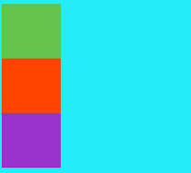
1.static
HTML元素的默认值,即没有定位,元素出现在正常的流中。静态定位的元素不会受到top, bottom, left, right影响。
<!DOCTYPE html>
<html lang="zh-CN">
<head>
    <meta charset="utf-8">
    <title>定位与浮动</title>
</head>
<body>
    <style>
        body{
            width:100%;
            height:1000px;
            background-color:#23edfa;
        }
        .page1{
            width:10%;
            height:10%;
            background-color:#65c34e;
        }
        .page2{
            width:10%;
            height:10%;
            background-color:#FF4500;
        }
        .page3{
            width:10%;
            height:10%;
            background-color:#9A32CD;
        }
    </style>
    <div class="page1">
    </div>
    <div class="page2">
    </div>
    <div class="page3">
    </div>
</body>
</html>
效果显示:
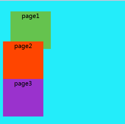
2.relative
生成相对定位的元素,通过top,bottom,left,right的位置相对于其正常位置进行定位。其中的相对指的是相对于元素在默认流中的位置。
注意:
1.将元素position属性设置为relative之后,再通过top,bottom,left,right属性对其进行相对于原来位置的偏移;
2.元素偏移之后,他本来在默认文档流中占据的位置仍然存在,其紧挨其后的元素的定位依据它本来的位置定位;
3.该元素偏移之后,可能存在覆盖其他元素的情况,可以使用z-index属性显示层级有限级别。
  <style>
        body{
            width:100%;
            height:1000px;
            background-color:#23edfa;
        }
        .page1{
            width:10%;
            height:10%;
            background-color:#65c34e;
            top:20px;
            left:20px;
            position:relative;
        }
        .page2{
            width:10%;
            height:10%;
            background-color:#FF4500;
        }
        .page3{
            width:10%;
            height:10%;
            background-color:#9A32CD;
        }

 </style>
显示效果:
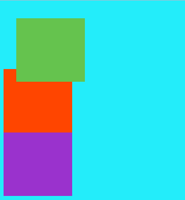
注意:如果在.page1中去掉position:relative,top与left作用就失效了
如上图所示,绿色方块的一部分在红色方块上面覆盖,如果想通过代码实现,使红色方块在上方,就要使用z-index属性设置,即在.page1中设置z-index:-1。
显示效果如下图:
3.absolute
生成绝对定位的元素,相对于static定位外的第一个父元素进行定位。
注意:
1.绝对定位的元素已经脱离了文档流,普通流中其他元素的布局就像绝对元素不存在一样;
2.绝对定位的元素的位置是相对于最近的已定位的祖先元素,如果元素没有已定位的祖先元素,它的位置就相对于body;
3.绝对定位的框可以覆盖页面的其他元素。
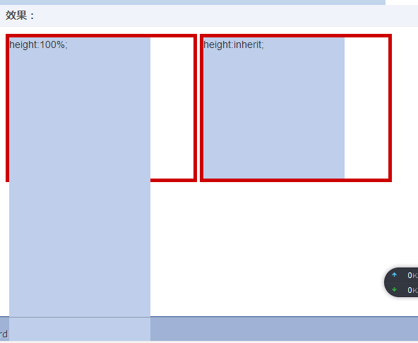
利用前端大神张鑫旭的一篇文章为开头,来解读absolute特性(实际上是height: 100%与 height: inherit区别)
盗用大神的解释:
CSS代码:
.outer {
    display: inline-block;
    height: 200px; width: 40%;
    border: 5px solid #cd0000;
}
.height-100 {
    position: absolute;
    height: 100%; width: 200px;
    background-color: #beceeb;
}
.height-inherit {
    position: absolute;
    height: inherit; width: 200px;
    background-color: #beceeb;
}
HTML代码:
<div class="outer"><div class="height-100"></div></div>
<div class="outer"><div class="height-inherit"></div></div>
显示效果:
废话不多说,来看看absolute的奇淫效果:
(1)使用absolute后默认宽度自适应
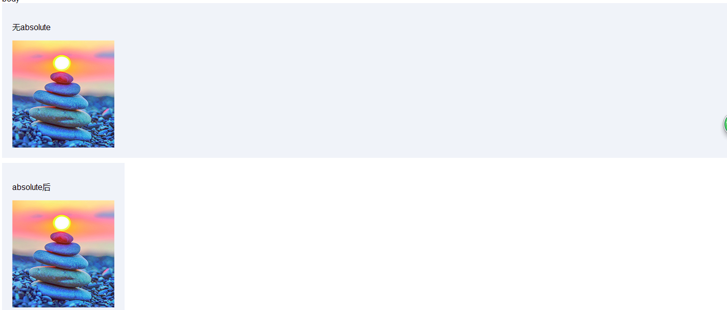
代码如下:
<html lang="en">
    <head>
      <meta charset="UTF-8">
    </head>
    <body>
    body
        <style>
            .div { padding:20px; margin-bottom:10px; background-color:#f0f3f9; }
            .abs { position:absolute; }
        </style>
        <div class="div">
            <p>无absolute</p>
            <img src="1.jpg">
        </div>
        <div class="div abs">
            <p>absolute后</p>
            <img src="1.jpg">
        </div>
        <script type="text/javascript">
        </script>
    </body>
</html>
div标签默认宽度是100%显示,第一幅图片显示结果正是如此,但是这时我们看到使用absolute后,则100%默认宽度就会变成自适应内部元素的宽度。
问题:出现塌陷
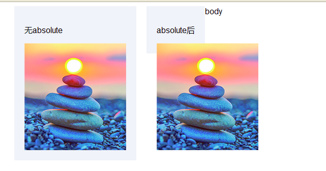
代码如下:
<html lang="en">
    <head>
      <meta charset="UTF-8">
    </head>
    <body>
    body
        <style>
            .div {
            padding:20px;
            margin-bottom:10px;
            background-color:#f0f3f9;
            float:left;
            margin-left:20px
            }
            .abs { position:absolute; }
        </style>
        <div class="div">
            <p>无absolute</p>
            <img src="1.jpg">
        </div>
        <div class="div">
            <p>absolute后</p>
            <img class="abs" src="1.jpg">
        </div>
        <script type="text/javascript">
        </script>
    </body>
</html>
(2)父元素与子元素
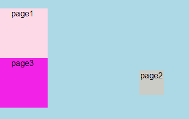
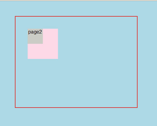
<html lang="en">
    <head>
      <meta charset="UTF-8">
    </head>
    <body>
    body
        <style>
            body{
                background: #ADD8E6;
                padding: 0;
                margin: 0;
                width:100%;
                height:3000px;
                text-align:center;
                }
             .page1{
                width:100px;
                height:100px;
                background-color: #fDD8E6;
                text-align:center;
                position:relative;
            }
            .page2{
                width:50px;
                height:50px;
                background-color: #ccccc6;
                text-align:center;
                top:20%;
                left:20%;
                position:absolute;
            }
            .page3{
                width:100px;
                height:100px;
                background-color: #f223E6;
                text-align:center;
                top:30px;
                left:20px;
        </style>
        <div class="page1">
            page1
                <div class="page2">
                    page2
                </div>
        </div>
        <div class="page3">
            page3
        </div>
    </body>
</html>
效果显示:
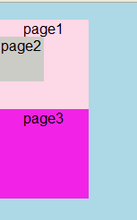
以上代码,当page2不设置top、left属性值时,absolute对page2的位置不会受到影响
page1位置不变,page2的位置设置为
top:20%; left:20%;
结果是设置absolute与不设置之后的效果一样。
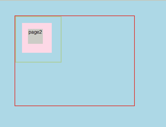
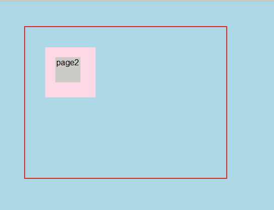
比如,在page1中添加代码:(也就是代码显示的效果)
position:relative;
而当我们去掉以上代码时,显示效果如下:
这时的top与left是以整个容器的宽度为标准(这里的宽高度指的是显示的宽高度),使用absoult定位的元素脱离文档流后,就只能根据祖先类元素(父类以上)进行定位,而这个祖先类还必须是以postion非static方式定位的, 举个例子,a元素使用absoulte定位,它会从父类开始找起,寻找以position非static方式定位的祖先类元素(注意,一定要是直系祖先才算哦~)
注意:relative和static方式在最外层时是以<body>标签为定位原点的,而absoulte方式在无父级是position非static定位时是以<html>作为原点定位(仔细揣摩这句话,在实例中学习,就是以上图展示的效果)
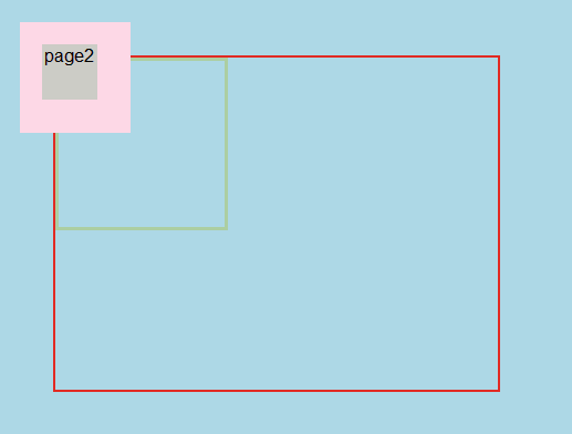
附上代码与图,害怕忘记
<html lang="en">
    <head>
      <meta charset="UTF-8">
    </head>
    <body>
        <style>
            body{
                background: #ADD8E6;
                padding: 0;
                width:400px;
                height:300px;
                border:2px solid #e12a23;
                margin-left:50px;
                margin-top:50px;
                }
            .page0{
                width:150px;
                height:150px;
                border:3px solid #accea1;
                position:relative;
            }
            .page1{
                width:100px;
                height:100px;
                background-color: #fDD8E6;
                top:20px;
                left:20px;
                position:absolute;
                text-align:rigsht;
            }
            .page2{
                width:50px;
                height:50px;
                background-color:#ccccc6;
                top:20%;
                left:20%;
                text-align:center;
                position:relative;
            }
        </style>
        <div class="page0">
            <div class="page1">
                    <div class="page2">
                        page2
                    </div>
            </div>
        </div>
    </body>
</html>
如下图所示:
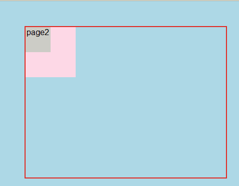
如果page0默认为static时,显示效果如下:
(3)关于absolute和relative的三种情况
第一种:附上代码:
<html lang="en">
    <head>
      <meta charset="UTF-8">
    </head>
    <body>
        <style>
            body{
                background: #ADD8E6;
                padding: 0;
                width:400px;
                height:300px;
                border:2px solid #e12a23;
                margin-left:50px;
                margin-top:50px;
                }
             .page1{
                width:100px;
                height:100px;
                background-color: #fDD8E6;
                position:absolute;
                text-align:right;
            }
            .page2{
                width:50px;
                height:50px;
                background-color:#ccccc6;
                text-align:center;
                position:relative;
            }
        </style>
        <div class="page1">
            page1
                <div class="page2">
                    page2
                </div>
        </div>
    </body>
</html>
显示效果如下:
第二种情况:仔细看代码的不同之处(定位发生改变)
 .page1{
    width:100px;
    height:100px;
    background-color:#fDD8E6;
    top:40px;
    left:40px;
    position:relative;
    text-align:right;
        }
.page2{
    width:50px;
    height:50px;
    background-color:#ccccc6;
    text-align:center;
    position:relative;
        }
显示效果:
第三种情况:
.page1{
    width:100px;
    height:100px;
    background-color: #fDD8E6;
    top:40px;
    left:40px;
    position:relative;
    text-align:right;
}
.page2{
    width:50px;
    height:50px;
    background-color:#ccccc6;
    top:20%;
    left:20%;
    text-align:center;
    position:relative;
}
显示结果:
4.fixed
fixed定位,又称为固定定位,它和absoult定位一样,都脱离了文档流,并且能够根据top、right、left、bottom属性进行定位,但不同的是fixed是根据窗口为原点进行偏移定位的,也就是说它不会根据滚动条的滚动而进行偏移
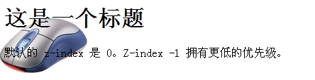
z-index
随后简单说一下z-index元素,z-index 属性设置元素的堆叠顺序
想通过z-index改变图层的显示顺序,引用w3c中的实例,当设置z-index=-1时,鼠标这张图片会至于文字底层
关于层叠顺序还有很大的学问,现在这份经还没有取到,等慢慢跟大神张鑫旭学习后,再来写博客。
每天坚持写技术博客,也是对指示的整理和在学习,希望每天下班后一个小时完成这个任务,现在尽管写的很烂,但是我会不断去学习的
